

- Home
- Illustrator
- Discussions
- How to create boomerang type shapes with good prop...
- How to create boomerang type shapes with good prop...

Copy link to clipboard
Copied
I'm trying to reproduce the two boomerang type shapes of the letter 'R' below:

The spine of the 'R' I had no problem creating. It's the two boomerang type shapes of the 'R' that's giving me fits. I've tried everything in my wheelhouse of AI knowledge - pen tool, lines, type (letter U), etc., - but I'm having a hard time with the proportion of the end cap roundness and the gap between the top shape (the sideways U).
Would appreciate any help
Thx


 1 Correct answer

I would do this just with a thick stroke and rounded ends..?
Here you can see the build up of the letter R, I just drew a line, then a circle and chopped it up and extended the lines (in grey section).
Then i just gave the stroke 100pt then lined up.
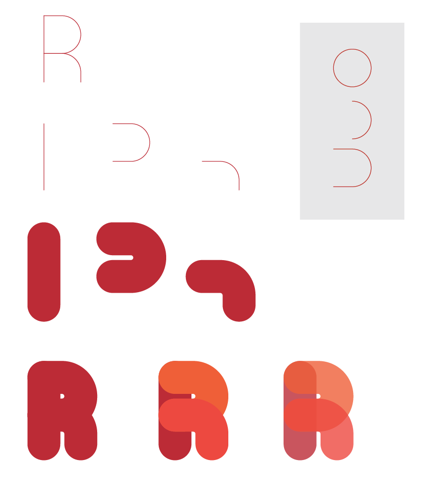
Once you have this you can then add the effects, etc to it.
Explore related tutorials & articles
 9
Replies
9
9
Replies
9

Copy link to clipboard
Copied
Please post a screenshot of what you have now.
Copy link to clipboard
Copied
I would do this just with a thick stroke and rounded ends..?
Here you can see the build up of the letter R, I just drew a line, then a circle and chopped it up and extended the lines (in grey section).
Then i just gave the stroke 100pt then lined up.

Once you have this you can then add the effects, etc to it.
Copy link to clipboard
Copied
Thx a million for the simple breakdown!
Copy link to clipboard
Copied
No problem.
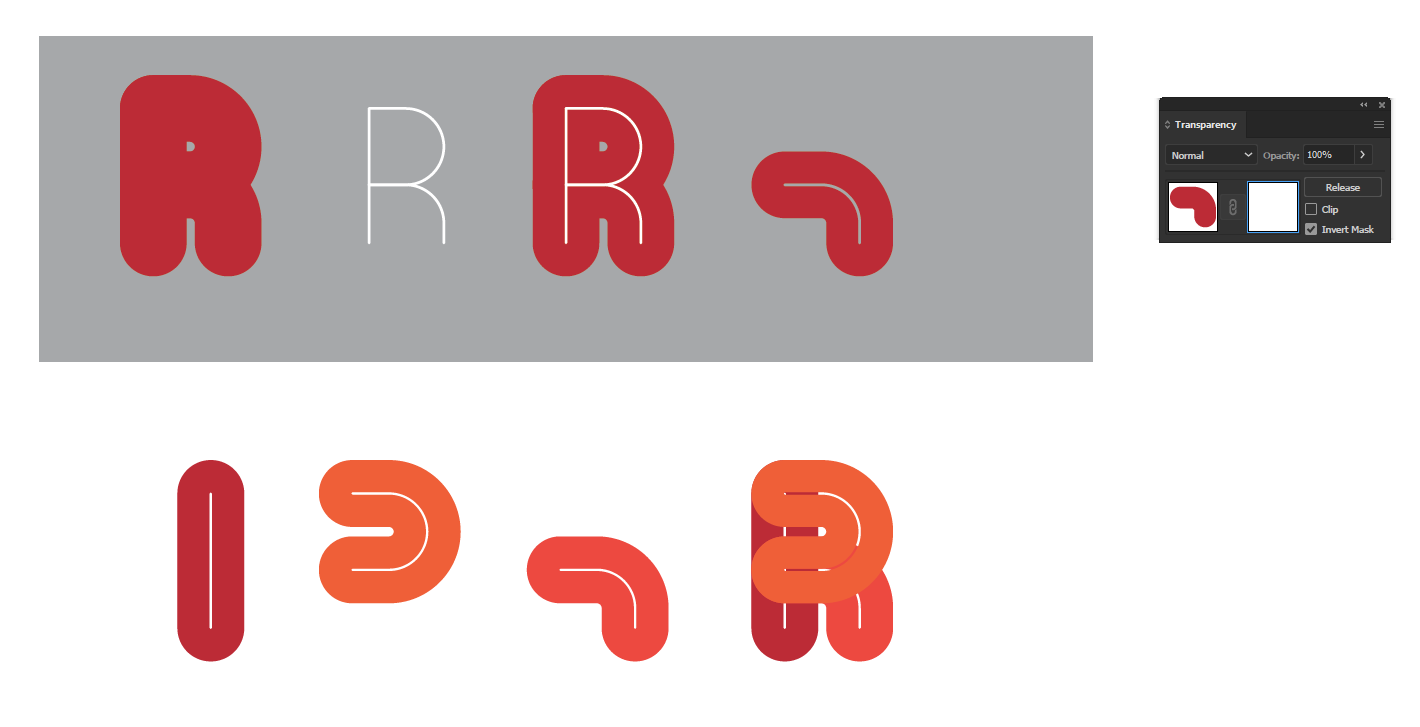
And if you want to create the internal hollow line you can just copy and paste in place and reduce the stroke to say 4pt then mask the stroke as shown to give you this effect..
Copy link to clipboard
Copied
One last question - how did you create this final shape below?

Thx
Copy link to clipboard
Copied
Hi Jeffrey,
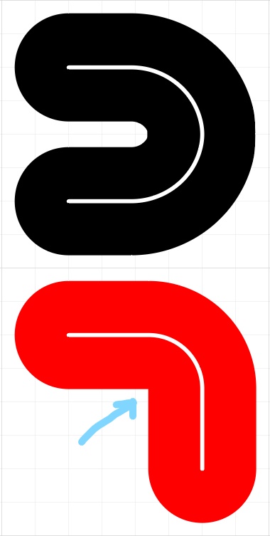
All you need to do is the same as the top section of the R but delete another anchor point with the direct selection tool so you end up with a quarter of the circle. Then use your pen tool and extend the line. Here's a quick video.
Copy link to clipboard
Copied
Thx so much again - I'm overthinking this as I was fighting to get the ratio perfect, but you (patiently) keep reminding me to break the problem down into smaller pieces (bad pun intended!) and make the shape I need that way.
Thx again!
Copy link to clipboard
Copied
Monika,
Thx for the reply.
I think I may have figured out the top part of the R using the pen tool - just took a while to get the correct proportion so that the curve looked smooth and proper.
The bottom part I also used the pen tool, but there is an inside corner I am fighting to round
Thx
Copy link to clipboard
Copied
Your radius is too small. You need to use a bigger radius for the curve. Maybe you could get away with just expanding the stroke and rounding off the inner radius, but it might also look awkward to do so. Try it.

 AdChoices