 Adobe Community
- Home
- Illustrator
- Discussions
- Re: Illustrator document duplicate lines show dark...
- Re: Illustrator document duplicate lines show dark...
Illustrator document duplicate lines show darker in InDesign

Copy link to clipboard
Copied
Hello,
I have been working in InDesign today and put some Illustrator drawings I have been working on for a long time in the InDesign document, and realized that in places where there are duplicate lines in Illustrator, the lines actually show darker in InDesign. This is not something that is visible in Illustrator. I have tried placing the actual ai files in Illustrator, as well as PDF versions, but the problem persists. These are pretty complex drawings, so going in and removing all of the duplicate lines would be a huge pain in the neck. Does anyone know how to address this? I thought it might be fixed in the overprint preview, but that makes ALL of the lines darker. My line weights range from about 0.25 to 1. I am very irritated because I have spent a lot of time carefully line-weighting my drawings, so I would like that to show accurately in InDesign. Any suggestions would be greatly appreciated! Thanks!!


Explore related tutorials & articles
 47
Replies
47
47
Replies
47

Copy link to clipboard
Copied
Are both documents in the same color mode, or is one RGB and the other CMYK?
Do both have the same color profile?
Copy link to clipboard
Copied
Thank you for getting back to me!!! There are three drawings in particular and all are having the problem - two converted to PDF format and one just the ai file placed into the InDesign document. All three say RGB in Illustrator
Copy link to clipboard
Copied
Are all 3 RGB or is one or more in sRGB?
When you converted to PDF, in the Save As PDF dialog box under Output, was there a color conversion?
Copy link to clipboard
Copied
Thanks for getting back to me again! It does not appear that there was any color conversion
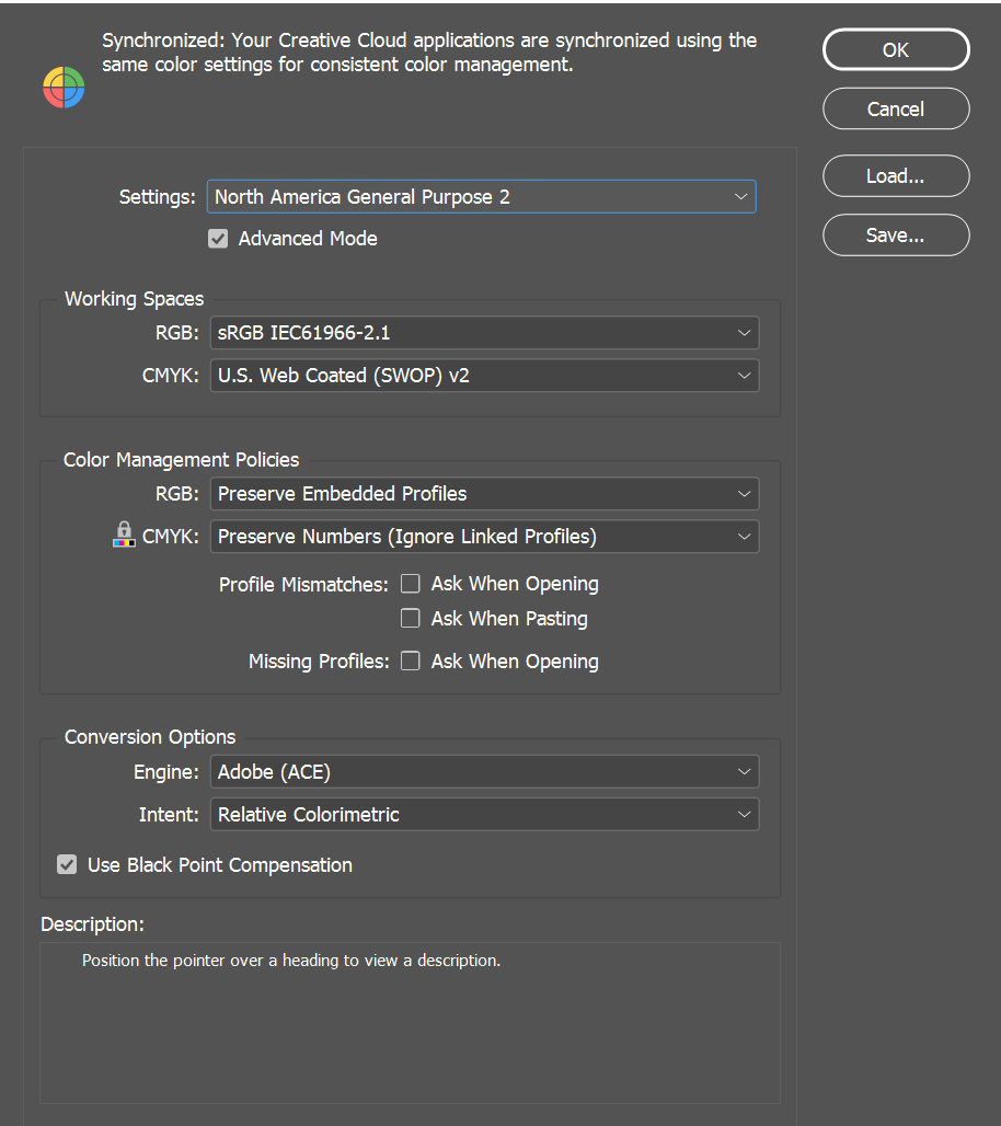
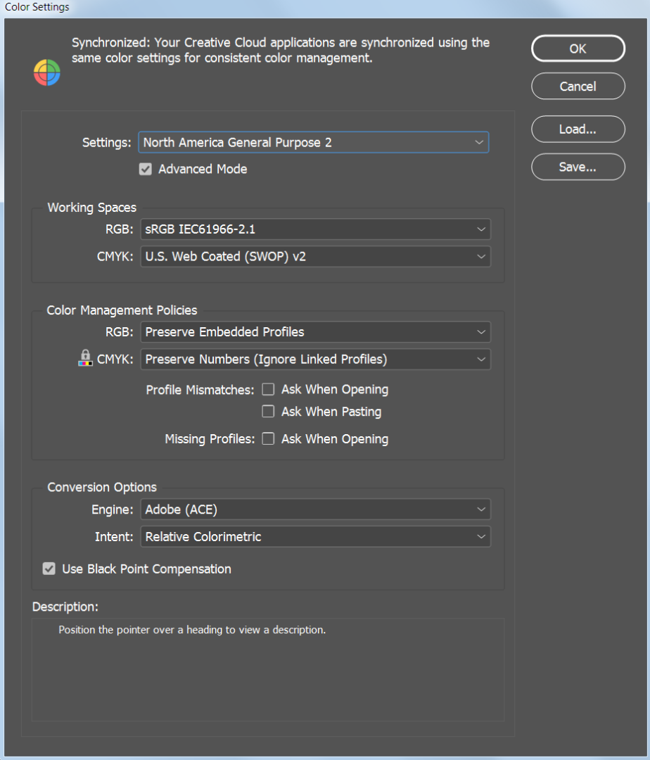
These are the color settings I had in Illustrator and InDesign respectively


Copy link to clipboard
Copied
In InDesign, are you using High-Quality Display? (View menu > Display Performance > High Quality Display)
Copy link to clipboard
Copied
Yes! Things often look blurry when I don't tick that
Copy link to clipboard
Copied
The lines match perfectly on my system. Everything is at the default settings.
These are my color settings in Illustrator.

And these are my color settings in InDesign.

Copy link to clipboard
Copied
Export a PDF (using the specifications handed to you by the printing service) and then open it in Acrobat.
Go to print preview and take the eyedropper to measure what's there.
Copy link to clipboard
Copied
Thanks so much for getting back to me. I am a little confused as to what you mean. It's not a color problem, but the fact that duplicate lines show thicker than they should. The drawings are all black and white

Copy link to clipboard
Copied
now I'm confused.
At first you wrote:
"… and realized that in places where there are duplicate lines in Illustrator, the lines actually show darker in InDesign …"
and now:
"… but the fact that duplicate lines show thicker than they should …"
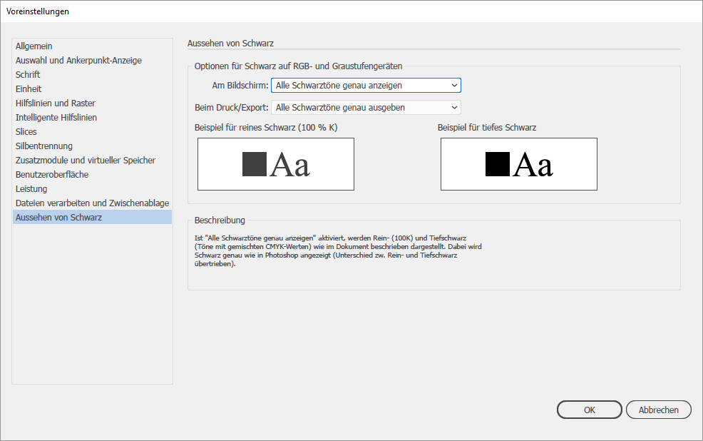
What my previous screenshot shown is the (monitor) view of Black - as 'normal black', or as 'deep black'.
Copy link to clipboard
Copied
It looks like the line weight where there are duplicates is much larger than what it should be, compared to surrounding lines that are the correct weight. That makes these lines look darker. However, when there are duplicates in 1pt, these lines also look darker from far away. I do not think it is a problem with true black vs deep black, but that is just a hunch. When you zoom in far enough in InDesign, the lines do not look any larger or thicker. It is very odd. I really appreciate your help
Copy link to clipboard
Copied
TheWaffleMan149 schrieb
It looks like the line weight where there are duplicates is much larger than what it should be, compared to surrounding lines that are the correct weight.
That looks like it's just a preview issue. You need to check the document without antialiasing.
And actually the preview issue should be present in Illustrator as well.
Copy link to clipboard
Copied
The preview issue is not present in Illustrator. That's why I was pretty alarmed when it was occurring in InDesign. How would I go about this antialiasing thing? I'm not too good with the Adobe suite in case you can't tell x)
Copy link to clipboard
Copied

Copy link to clipboard
Copied
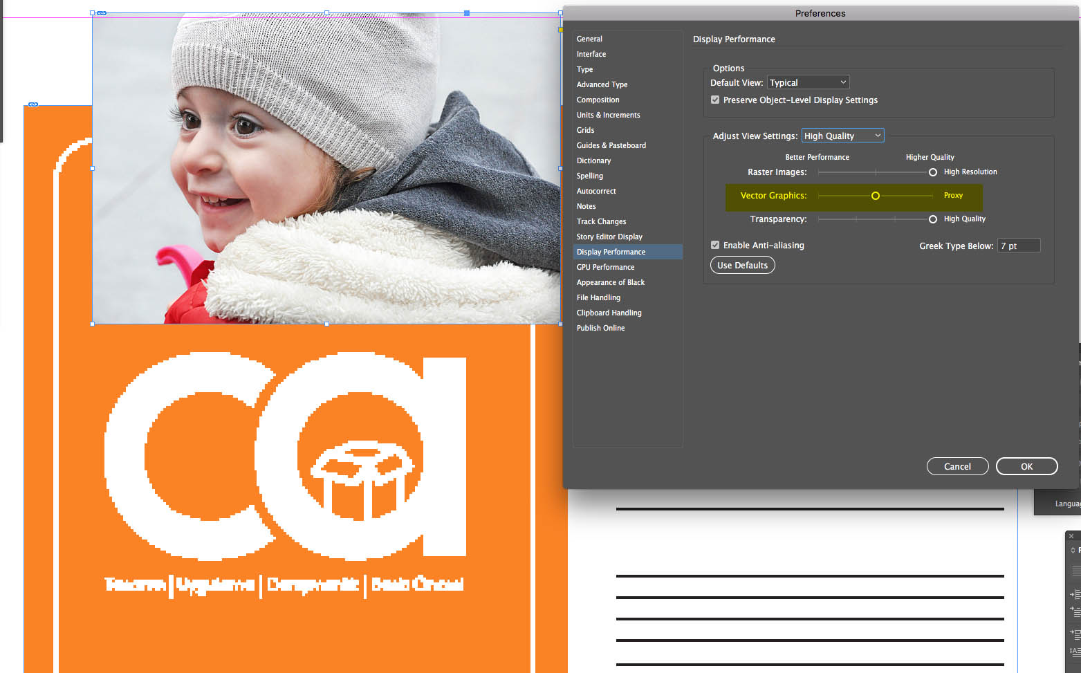
Preferences: Can you confirm that "Anti-Aliasing" is checked in the Display Performance section?
It has been suggested that Display Performance should be "High Quality Display" and Color Profiles should be the same.
In the Preferences options, Show high quality but vector graphics with lower quality may be selected.
Copy link to clipboard
Copied
In one of the Illustrator files, it says anti-aliased artwork is checked (this is in Illustrator, right?). Display performance is high and all files are RGB. I'm not sure where to find the third suggestion. Is that in Illustrator or InDesign? Thanks a lot!!
Copy link to clipboard
Copied
Copy link to clipboard
Copied
Hi Ceyhun,
I checked on my InDesign file and my vector graphics slider is in the same place as yours

Copy link to clipboard
Copied
In the screen shot I share, drag the section marked in yellow to the right to the small round circle.
Copy link to clipboard
Copied
I tried that and it still shows those portions darker in InDesign 😕
Copy link to clipboard
Copied
I think I found the problem 
Copy link to clipboard
Copied
The lines that appear thicker are doubled.
The lines that look thicker are twisted. That's why it looks thicker than the others. I open the Illustrator document, I look at the different values of convergence and divergence. I selected the lines that seem thicker than others, I shifted. There are other lines out of gold!

Copy link to clipboard
Copied
But why does it show thicker in InDesign than Illustrator?
Copy link to clipboard
Copied
InDesign% 1200
Illustrator% 1775
I got the same size measure and compared it. I made the smoothing options and all the settings the same.
I think it looks the same. Only different approximation values can show the lines and texts at different thicknesses, depending on the basic structure of the program.
A photo shows the best Photoshop. If it is wrong to compare Photoshop with InDesign in the quality of photo display, I think it is not very correct to look at a vector line, AI in InD.
Is there a problem with your screenshot I share?

-
- 1
- 2

 AdChoices