- Home
- Illustrator
- Discussions
- Re: Illustrator Won't Save In High Quality!?
- Re: Illustrator Won't Save In High Quality!?
Copy link to clipboard
Copied
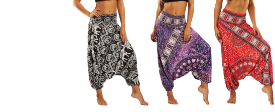
When I save my project in PNG-24 the quality is still terrible... Why?
As you can see here...
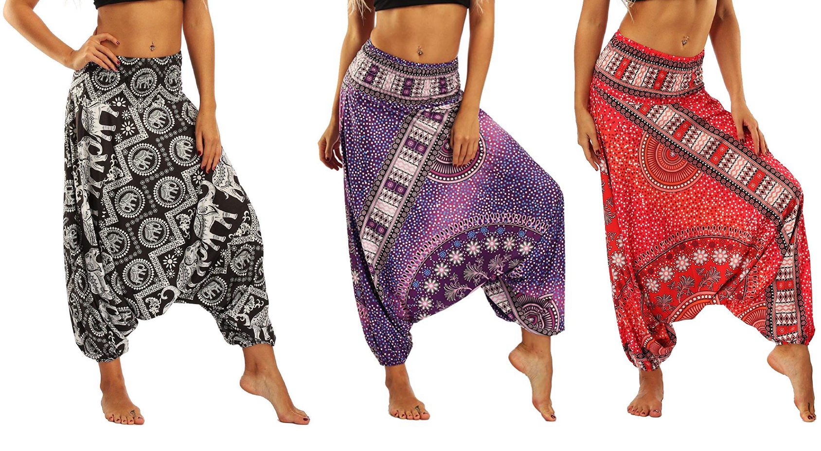
Yet, if I save the file to a PDF and then open it up in Photoshop and save it again as a PNG-24 the quality is perfect... but the artboard messes up?
As you can see here...
Why is this??
This is also the case with graphics in Illustrator...
As you can see here...
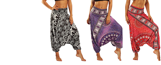
Compared to saving it in the same file format in photoshop, again PNG-24...
It's boggling my mind... Why is the quality terrible for PNG-24 in Illustrator???
 1 Correct answer
Thank you so much for all the help... I'm gonna try this out... Hopefully, it will work and save me a ton of time... As for now, I'm having to make designs in Canva, save them in PDF, then import them to Photoshop, then save them again to PNG-24...
It the only way to I can find to get the maximum quailty...
Explore related tutorials & articles
Copy link to clipboard
Copied
It’s smaller because of your export settings but I cannot see a quality difference. Please explain - you are the best judge of quality, but we need to know what you are looking for.
Copy link to clipboard
Copied
Seriously....... You can't see a difference in quality in the pictures!?
Look at the second picture of harem pants, compared to the first picture...
The second picture is perfect quality! compared to the first, yet, they're both saved in PNG-24!!! - WHY???
Copy link to clipboard
Copied
In both of your examples the second image is larger, not necessarily better quality.
I don't know what your workflow is for creating these images, but I'd check the resolution settings when you export.
Copy link to clipboard
Copied
Both of them are set to 548 x 223
Copy link to clipboard
Copied
In my experience, for varied reasons, Illustrator's raster image export is quite often misunderstood and the subject of complaints like yours. In my own workflows, I never output raster images from Illustrator, (there's really no need to if you have the whole suite of apps). In fact, I never even import raster images to Illustrator. Mixing raster and vector? That's what InDesign is for.
That said, my advice would have been the Photoshop route you already tried, but...
ricop16308131 wrote
...if I save the file to a PDF and then open it up in Photoshop and save it again as a PNG-24 the quality is perfect... but the artboard messes up?
As you can see here...
"The artboard messes up?"
What's messed up about it?
Copy link to clipboard
Copied
I need it like the first picture with some space at the start of the design for added text later... but when I opened it up in Photoshop, it came out like that... with no space to the left of the images... Do you know why that happened?
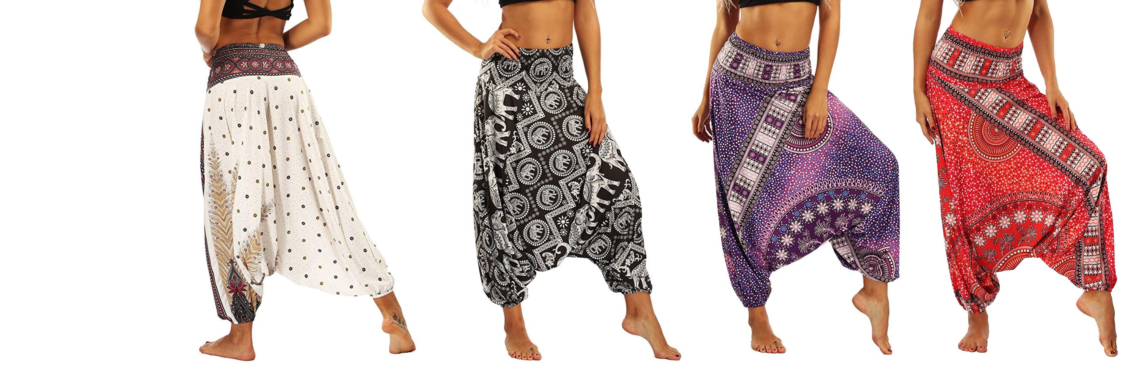
And I also tried making this same design in photoshop and saved it to PNG-24 and this was the quality this time...
Terrible... I have no idea what's going on... Photoshop and Illustrator are soooo un-userfriendly it's untrue!
Copy link to clipboard
Copied
ricop16308131 wrote
I have no idea what's going on...
Well, your workflow is a bit mysterious. Why would you need blank canvas to "add text later" when you're exporting to a deployment format? And even if you did need that, why couldn't you just add it?
Copy link to clipboard
Copied
It's for a slider for a website... So I need to use the web editor to add the text you see...
Copy link to clipboard
Copied
I am not sure, but to do what you want in the way that you want, you should:
Change/set your Illustrator workspace to be in pixels.
Make your artboard the size you want your final PNG to be. If that's 548 x 223 pixels, then make it that size.
Place your raster images (such as the harem pants) into the Illustrator file, size it as you want them to appear within the 548 x 223
(side note: Just add your type at this stage? but if not...)
Export as a png, making sure the "Use Artboards" option is checked in the Export box.
This will create the PNG as you expect it.
HOWEVER, you do seem to be confusing size with quality. Bigger images will always look better, but if your size is limited as you said above, then your images will always look a little blurry or lower-quality compared to the same image exported at a higher resolution. Don't compare apples to oranges, just make what you need to fit. If the small image size is unacceptable, then you'll have to change the size of your final product so you can use larger images.
Copy link to clipboard
Copied
Thank you so much for all the help... I'm gonna try this out... Hopefully, it will work and save me a ton of time... As for now, I'm having to make designs in Canva, save them in PDF, then import them to Photoshop, then save them again to PNG-24...
It the only way to I can find to get the maximum quailty...
Copy link to clipboard
Copied
Again, larger not better. Do you not see them as different sizes? ( Serious question, things are not always what you expect)
DO NOT ZOOM IN ON A PNG to check quality !!!
if exporting from AI set only 72 ppi.
Copy link to clipboard
Copied
Where is that, please?
Copy link to clipboard
Copied
Yes, they are not user friendly. This is by design. They are the top professional tools and to use them effectively needs a lot of training. Even minimal training would have told you to increase the canvas size if you wanted white space (unless artboards mess that up).
Copy link to clipboard
Copied
Thing is I can't increase the canvas size as I set it to 548 x 223 for a project...
'AI set only 72 ppi.'
Where is this setting, please?
Copy link to clipboard
Copied
ricop16308131 wrote
Thing is I can't increase the canvas size as I set it to 548 x 223 for a project...
But...when taking it to Photoshop and "the artboard messes up," don't you lose some of that canvas width? (Isn't that the 'mess up'?) Getting it back in Photoshop would take no more than a few seconds.
PS: The prints on those pants are quite intricate. I'm not sure you'll ever get a mere 122,204 pixels (minus those which are only white) to represent them satisfactorily.
Copy link to clipboard
Copied
I have no idea why you can't increase the canvas size if you want a bigger canvas.
The ppi setting you must set to 72 is in Illustrator's Export PNG settings.Please look closely at all settings.
Copy link to clipboard
Copied
Yes, please answer: are you just saying it's better because it's bigger (has more pixels)?
Copy link to clipboard
Copied
No, I seriously mean better...
Here is the end product from going through Canva as I said...
Sorry for the late reply, it was late where I live...
Again, thank you guys for all the help, much appreciated!
