• Global community
    • Language:
      • Deutsch
      • English
      • Español
      • Français
      • Português
  • 日本語コミュニティ
    Dedicated community for Japanese speakers
  • 한국 커뮤니티
    Dedicated community for Korean speakers
Exit
0

Issue with Color and different backgrounds

New Here ,
May 08, 2024 May 08, 2024

Copy link to clipboard

Copied

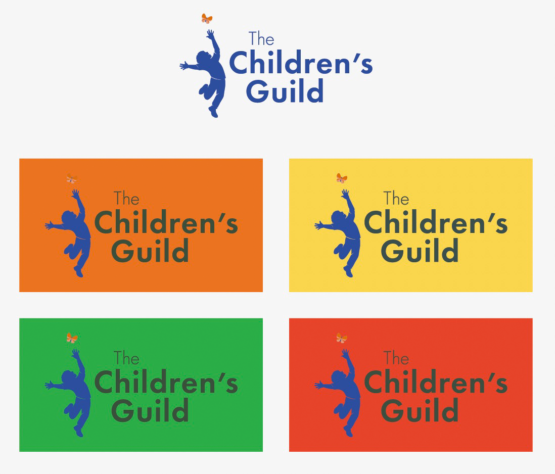
I’m having an issue with the color of this logo and I'm not sure how to resolve it. The logo looks fine on a white background, but once it is on top of certain colors (screenshot below), "The Children's Guild" turns a muddy color. The color profile is CMYK. I have opened it in Illustrator and cannot find the problem. I have tried exporting the .ai file as an EPS, but that did not correct it. The issue occurs when the file is placed in InDesign + View > Overprint Preview checked because as we know, Overprint Preview provides the most accurate representation of how the file will be printed. Also, there is no transparency difference in the settings. 

TOPICS
How-to , Performance

Views

72

Translate

Translate

Report

Report
Community guidelines
Be kind and respectful, give credit to the original source of content, and search for duplicates before posting. Learn more
community guidelines
Adobe
Community Expert ,
May 08, 2024 May 08, 2024

Copy link to clipboard

Copied

Can you share the original Illustrator file for inspection?

Votes

Translate

Translate

Report

Report
Community guidelines
Be kind and respectful, give credit to the original source of content, and search for duplicates before posting. Learn more
community guidelines
Community Expert ,
May 08, 2024 May 08, 2024

Copy link to clipboard

Copied

It looks like you have the background color of the individual set-ups overprinting the blue of the logotype as well as over the tan background. The blue should also be set to overprint. Will any of the colors being used be spot colors or is everything printing CMYK? If the blue is a spot color then it should be printed last to maintain its fidelity. As far as the logo set ups looking different against the tan background that is just a basic way that colors will look different against different background colors. It's a function of visual color perception known as simultaneous contrast.

Votes

Translate

Translate

Report

Report
Community guidelines
Be kind and respectful, give credit to the original source of content, and search for duplicates before posting. Learn more
community guidelines
Mentor ,
May 08, 2024 May 08, 2024

Copy link to clipboard

Copied

LATEST

Disregard overprint preview.  That logo will "knock-out" of any background color or an under layer of white will be used on dark substrates.

Votes

Translate

Translate

Report

Report
Community guidelines
Be kind and respectful, give credit to the original source of content, and search for duplicates before posting. Learn more
community guidelines