 Adobe Community
- Home
- Illustrator
- Discussions
- Re: Issues with Vectorizing Logo Raster Images
- Re: Issues with Vectorizing Logo Raster Images
Copy link to clipboard
Copied
I am attempting to vectorize a raster logo image (.png file that is 532 x 470 pixels), and am having an issue with getting smooth edges on the lettering, in addition to the edges of the overall design. I also have a one-color line logo version of the same image that is much bigger (.png file 4786 x 4263 pixels), and I can't even get that one to register the edges of the logo. I have attached both logo files for reference.
Perhaps what I am doing is utilizing the sliders for the advanced editing incorrectly, but I feel as though I have clicked through most of the settings with little to no improvement.
Can I please recieve some help/feedback on workarounds, or examinations of the logos to see if I am even able to make this work?
I do not have access to the original, large size logos unfortunately, it seems that our leadership team has lost the contact info for the original designer, so I am stuck using what I have to edit.
Please advise!!
 1 Correct answer
Your best bet is using the larger resolution white PNG image as a source to re-build a clean, vector-based version of the logo. That's really the only element that would be usable. The photo image in the background of the smaller file is a photograph and by nature not really worth the effort of converting to vector form. The lettering and circles in the logo can be superimposed over any number of photographs once they're re-built as vector objects.
I do not recommend live-tracing the white art
...Explore related tutorials & articles
Copy link to clipboard
Copied
When I look at your logos in the smallest size the lines seem pretty smooth. Since a PNG is a raster format you cannot expect that when you enlarge it that the quality of the lines will remain constant. The only way that a PNG logo will look really good at a large size is if it's either created at a very high resolution in the smaller size before enlargement or actually created at the large size in the first place. A logo created as a vector object in Illustrator and saved as either an .ai or pdf would not be resolution dependent and could be used at any size without a loss of quality.
Copy link to clipboard
Copied
Your best bet is using the larger resolution white PNG image as a source to re-build a clean, vector-based version of the logo. That's really the only element that would be usable. The photo image in the background of the smaller file is a photograph and by nature not really worth the effort of converting to vector form. The lettering and circles in the logo can be superimposed over any number of photographs once they're re-built as vector objects.
I do not recommend live-tracing the white artwork in the higher resolution image. Just place that image on one layer in Illustrator and lock it. Create a new layer above it and build clean artwork using the white art below as a guide. You can add layers containing dark objects below the white artwork to make it more visible. The circles are simple geometric objects. The fonts used in the lettering are pretty common. Palatino Linotype is a common Windows system typeface. The smaller lettering looks like it was set in Arial Bold (the most common of Windows system typefaces). Envelope effects were applied to the lettering in the original source artwork. It will be a bit tricky to get new lettering to match perfectly. But simply making the results pretty close to the original might be good enough, especially if the client lost the original artwork.
Copy link to clipboard
Copied
This was very helpful, and I am adopting the approach you listed here. Looks like re-creation is the best method.
I must say I am fairly impressed at your ability to recognize that font by glance. After my own comparison, I'm pretty sure Palatino Linotype is the exact font used in the original, well done!!
Copy link to clipboard
Copied
Thanks. It takes a bit of practice and on-going work with fonts to recognize the visual DNA of specific typefaces. Some fonts are pretty easy to ID. Then there are others that vary in the degree of difficulty to match. One issue is a classic typeface like Futura being distributed by numerous companies and none of those different versions of Futura are exactly the same. They look the same, but are all drawn with slight differences. There are multiple versions of Palatino and even "clones" of Palatino using different names (such as Zapf Calligraphic 801 or URW Palladio). There is a pretty tremendous number of free (or free-ish) fonts available online. Some of those can be particularly hard to track down. I've been seeing more and more of those typefaces being used in customer provided artwork. Usually their art is in some pixel-based format like PNG or JPEG and has to be re-built in vector format. Automated font ID tools like What the Font at the MyFonts website or the Matcherate feature at Font Squirrel are getting better.
Copy link to clipboard
Copied
Bobby,
I have a follow up - I managed to plot out my logo text, and successfully applied warp to the text so it matches the original logo. I am having the hardest time figuring out how to create an outline effect on my existing text after I have warped it. I need the text to be white, with a black outline surrounding the characters. I am finding suggestions to "create outline" in the "type" menu, but it is greyed out for me.
Can you please assist with some instructions on how to do this? Do I need to outline the text before I warp it?
Copy link to clipboard
Copied
Please disregard, I just figured it out! 🙂 Thanks anyways.
Copy link to clipboard
Copied
Glad to help. But, yeah, generally speaking some "live" effects on objects such as lettering need to be expanded before other effects (like outlines or the offset path effect) can be applied to them.
Copy link to clipboard
Copied
While I did figure that stuff out, I did encounter a challenge. I am like 99% finished with my logo redesign - but I can't find a way to isolate the drop shadow effects of my main text and to convert them into layers. In the original logo, the drop shadow effect fade isn't present on the R and D of "Rever Grand". I've got my current re-work uploaded here alongside the original for reference.
Any idea on how I can separate a drop shadow effect into a layer so I can erase parts of it? Or any other sort of creative workaround on how to get rid of the shadows in just those two spots?
Copy link to clipboard
Copied
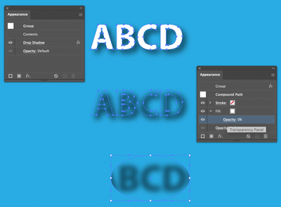
You may try this:
Make a copy of Rever Grand and hide the original.
Make the Rever Grand copy into a Compound path.
Fill with white and stroke with white (actually it can be any color).
Group it.
In the Apperance panel apply a drop shadow to the group.
Double click the Contents of the Group item in the Appearance panel.
Set the opacity of the white fill and stroke to 0%
This should leave you with the shadow only, which you can clip with a clipping mask.
Copy link to clipboard
Copied


