


Copy link to clipboard
Copied
Hello,
I am trying to make business cards in Adobe Illustrator using the Pantone Color System. In my logo, the middle circle is a dark grey: C20 Y20 M20 K80. I can't find a suitable Pantone grey that is this dark. Pantone 425U is too light. Do you have any suggestions? Also, which Pantone Black is the darkest? Thanks.


 1 Correct answer

David,
You may consider something like Pantone Black 7C or 439/440 for the dark grey and Pantone 6C for the black.
Explore related tutorials & articles
 21
Replies
21
21
Replies
21
Copy link to clipboard
Copied
David,
You may consider something like Pantone Black 7C or 439/440 for the dark grey and Pantone 6C for the black.
Copy link to clipboard
Copied
Thank you Jacob. What is the difference between U and C? I would imagine that C is coated and would not work on matte business cards?
Also, I just checked. Pantone Black 7C is: C0 M0 Y15 K82. This is as close to my original CMYK colors as I'm going to get. Thanks.
Copy link to clipboard
Copied
David,
Sorry, forget the C. It should just have been Pantone Black 7 or 439/440 for the dark grey and Pantone 6 for the black. Then U for Uncoated as implied in your OP.
I just happened to look in a solid to process for C(oated) and forgot about the OP.
Copy link to clipboard
Copied
You are welcome, David.
Copy link to clipboard
Copied
I did try Pantone Black 7C for the dark grey. It still is a bit too light.

Copy link to clipboard
Copied
Talk to the folks who will print this. They can still alter the colors. Also: they look different in print (depending on the stock) than on screen.
Copy link to clipboard
Copied
David,
Just another addition:
Also, which Pantone Black is the darkest? Thanks.
If you really want dark, you may consider dounle hit (2X). You may see where it gets you with the Pantone Blacks (2 through 7) in a formula guide.
Copy link to clipboard
Copied
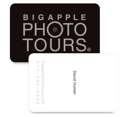
Well, I will be using Moo.com to make my business cards. I have been using their Luxe duplex paper but the problem with it is that the black just isn't very black. Apparently, this is due to it being digital printing? I don't know. I will ask them if they would do a double hit of black. That is a good idea. Here are the cards:
Copy link to clipboard
Copied
If it is being digitally printed, why use Pantone colors which will just be converted to CMYK?
Just mix a rich black for the background, a medium rich black for the biz name and a darker one for the dot.
You'll gain nothing spec'ing Pantones, except for using up time hunting for the right combo.
Mike
Copy link to clipboard
Copied
Yes, I agree with you. Moo.com is digital and they don't care about Pantone colors. What I want to do though is use Moo for proofing and then go to a letterpress company to make these cards. Moo does not offer letterpress.
Copy link to clipboard
Copied
I would proof on my Xerox Phaser, but if I didn't have it, I would just go down to a local quick printer that uses Xerox Docucenters. It's about the same thing. Inaccurate for Pantones.
In other words, these blackish colors will be sort of close (if the moon and stars are aligned just right) but you need the proof from whoever is doing the "real" printing. And should whoever you pay for the letterpress, make sure they do the pantones. Should, but check.
Good luck.
Mike
Copy link to clipboard
Copied
Mike,
I will probably be hiring someone out of the area to do the "real" letterpress printing. The problem is, how would I know they are using the Pantones? I live in NYC and I'm thinking about hiring someone in Romania to do this job? Apparently, 877U is metallic so I will be using:
Logo Front: Pantone Colors-
Black Background: Pantone Black 6U
Big Apple Photo Tours: Pantone Cool Gray 7U
Dark Grey Circle: Pantone Black 7U
Text Back: Pantone Colors-
David Hunter: Pantone Black 6U
bigapplephototours.com: Pantone Cool Gray 7U
212-942-3938: Pantone Cool Gray 7U
Copy link to clipboard
Copied
davidhunternyc wrote:
The problem is, how would I know they are using the Pantones? I live in NYC and I'm thinking about hiring someone in Romania to do this job?
We know Pantone in Europe as well. So when you give people a number, they will use that color. The problem will be that Pantone color will look different on different stock and sometimes even the swatches books differ.
So if you want to achieve a very specific color (which might even be a little different from the color book, i.e. darker), you need to be able to walk into the print shop, talk to the people and show each other samples. Then you can correct color even when they are about to print.
Copy link to clipboard
Copied
David,
To think ink, and before seeing the back and still wondering what the paler grey was supposed to be, I was about to suggest a possible simple way of getting a hard hit on the black, namely overprinting with a reversal of the front colours, using two inks, namely Black 7 with 100% for the dark grey aperture (slightly increased to form a spread) and 50% for (the rest of) the background (the latter might suit you or not, still leaning towards the golden to an obviously different degree) and (the non golden) Black 6 on top as a Compound Path with the actual aperture and Type as holes (total background ink coverage 287).
Seeing the need for a 100% paler grey ink on the back (and the choice of the (neutral) Cool Gray 7) changes this, so you may use the Black 7 with (sufficient) spread into the Cool Gray 7 of the background round the aperture and still with Black 6 on top as a Compound Path with the actual aperture and Type as holes; you may find this too tricky, especially if you are far from the print shop, although the sheer darkness may cover any misregistration/exaggerated trapping (total background ink coverage 285).
Apart from the obvious advantages of your being able to walk into a nearby print shop, the choice of printer is a matter of trust/reputation concerning the whole work, not only inks, and applying to the specific printer rather than country.
Copy link to clipboard
Copied
Now I am getting off topic a bit. I am in discussions about having these cards duplexed. One side using black card stock, the other side white card stock. This way, each side can be letterpressed seperately and then glued together so that the impressions wont flatten the other side out. Obviously, if I use black card stock for the logo then the Pantone color codes I am using for test prints will be useless. The black paper will make everything look darker.
Jacob, are you a printer? Wanna take this project on? ; )
Copy link to clipboard
Copied
David,
Nothing is off topic here, but black/white stock implying different inks, including opaque (white, even for mixing) ink, and gluing would introduce much more uncertainty/trouble.
A non printer in the Old World.
Copy link to clipboard
Copied
Thanks Jacob, I agree agree with you. I believe the job should just be done on white card stock for both sides. Mixing opaque ink sounds like a nightmare.

Copy link to clipboard
Copied
Actually, the duplex idea would solve your "darkness" problem. Letterpress is embedding ink directly into the paper, almost a stamp effect. A stamp would not be a bad idea either. The letterpress process with a solid Black on White could present a curl problem. Pantone ink is opaque ink. A card glued together also gives you a structural advantage. It was probably mentioned as an option because, for your particular application, it's not a bad idea. An easy way to prove someone has used a Spot color vs. a process color, view the print using a loupe. Spot color will show as a solid, process will show as a mixture of either solids or halftone screen percentages.

Copy link to clipboard
Copied
Please note that the Double-Impression (2X) colors were removed from the PANTONE FORMULA GUIDE back in 2000! Copies of the PANTONE FORMULA GUIDE which contain 2X colors are quite old and likely no longer color-accurate. Pantone recommends that the guides be replaced annually to insure most accurate color communication; this recommendation is clearly stated on the outside back covers of recent Guides.
Best regards,
John Stanzione
Manager - Technical Support
Pantone, LLC
Copy link to clipboard
Copied
David,
In addition to what Monika said,
Also, I just checked.
If that was in a Pantone colour guide/swatch book, you should be able to trust it (and compare the 425, 439/440, and 7).
Copy link to clipboard
Copied
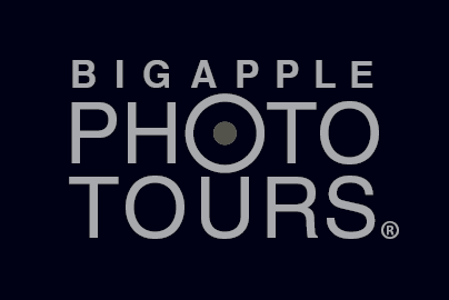
O.K. Thanks to all of you for your help. This is the solution I've come up so far for my business cards. We will see how it looks upon final printing. Here is a screenshot too:
Black Background: Pantone Black 6U
Grey Letters: Pantone 877U
Dark Grey Circle: Pantone Black 7U

 AdChoices