- Home
- Illustrator
- Discussions
- Re: Speedometer recreation of the dashed lines
- Re: Speedometer recreation of the dashed lines
Copy link to clipboard
Copied
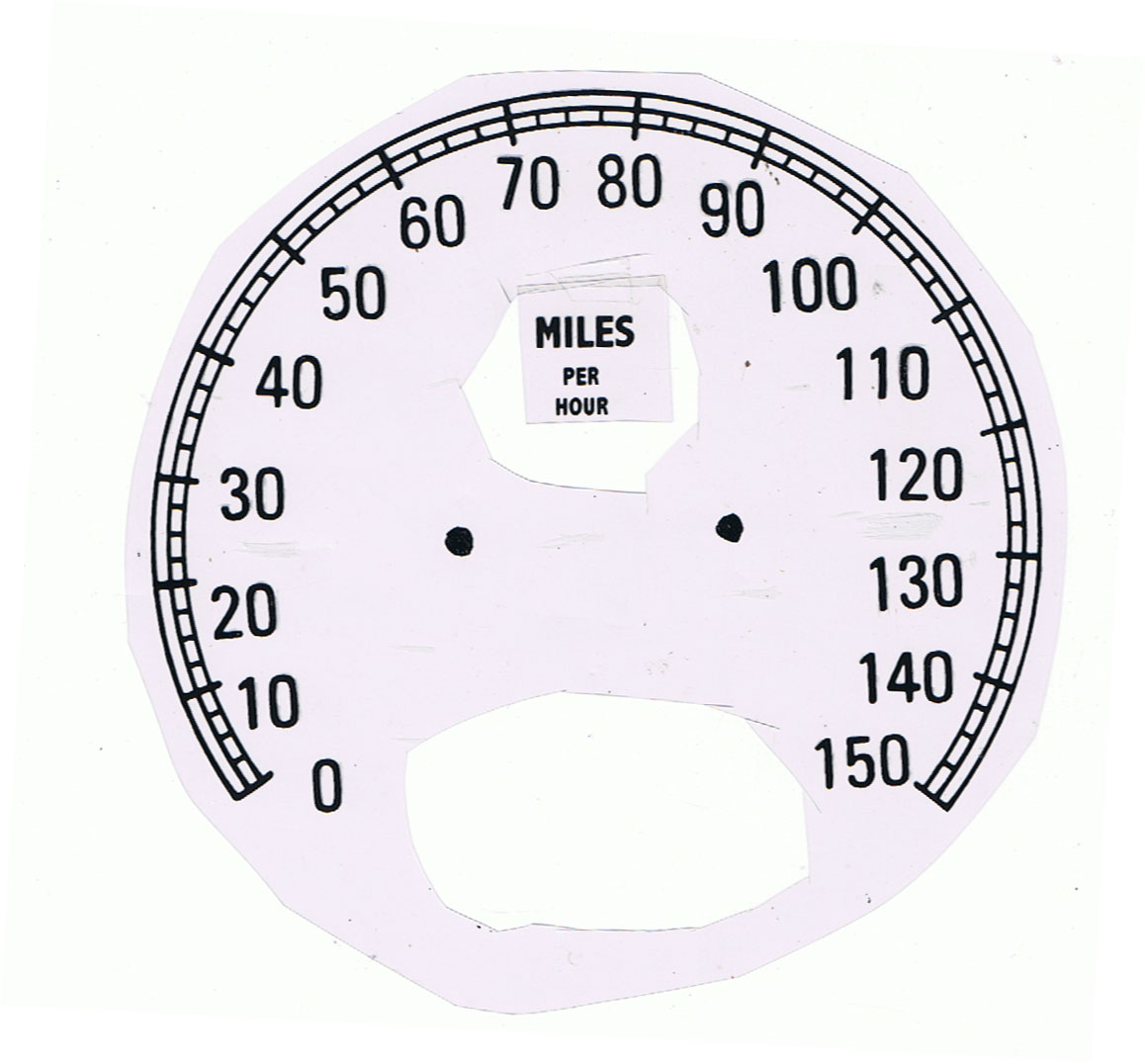
Hello; I'm fairly new to Illustrator and I'm trying to fiure out the best (balance of accuracy and time) method of recreating a vintage speedometer. This is the dial that I need to recreate and I need this to be in vector form which is why I've chosen Illustrator for the project. Is there anyone that could give me some pointers on how to best go about doing this. I did play around with the dashes/width point vs gap and that seem to work okay, but there must be a better more accurate way of accomplishing this. Here is the vintage dial that I'm trying to recreate. Also, the 3 semi-circles are not really the problem, it's the hash marks that I'm needing help with.
Thanks for any help that can be given, it is very much appreciated.
 1 Correct answer
Congratulations, Jber, and good luck with the font.
You may have a look at the following sites for (something like) it, or create the lettershapes.
Explore related tutorials & articles
Copy link to clipboard
Copied
Copy link to clipboard
Copied
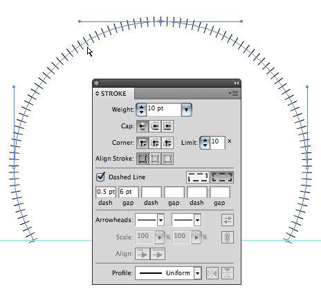
As an alternative you could also use blends with the replace spine option....
Mylenium
Copy link to clipboard
Copied
Jber,
You may use an Art Brush, with the following steps:
1) Create the unit of 10 MPH as if it were straight (you may use rectangles and straight paths),
2) Effect>Distort & Transform>Transform, move one width, 14 copies,
3) Object>Expand Appearance,
4) In the Brushes palette flyout select New Brush, tick proportional,
5) Create a circle with the same width as the speedometer,
6) Rotate the circle by 45 degrees,
7) Click the bottom segment with the Direct Selection Tool and delete it,
8) Apply the Art Brush.
The speedometer covers three quarters of a circle with 75 MPH at the top.
The basic unit shown is 30pt wide and 7.5 pt high; the rectangles are 2.5 pt high with a 0.75 pt stroke, and the vertical lines have a 1 pt stroke.
The 15 units Art Brush adapts to the three quarters of a 200 pt circle without stretching (only bending).
Note: You may use the centre of the basic unit as the basis for the circle (through the short rectangles), or you may add an invisible object to get the top line into the centre of the brush if you want to use a circle corresponding to the outer perimeter.
Copy link to clipboard
Copied
Wow! Thank you so much. I'm going to try this now.
Copy link to clipboard
Copied
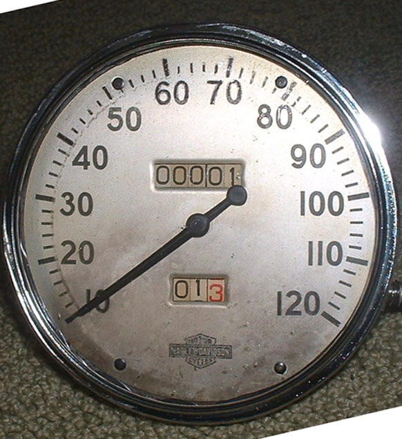
I should clarify, that yes this is a reproduction but it needs to be modern to fit modern speeds, etc. So It will be uniform and made up of the irregularies/variations in the lines. So not having to worry about an exact reproduction, I'm desperate to learn how to do this without each dial taking hours of time. You guys are amazing and I'm completely impressed with all of you. I'm hoping to take the tutorial from Jacob, learn it and then be able to apply it to many other styles of dials like this one. This one is very interesting, I would need an outside circle, the has marks, the numbers but the numbers need to go from 10 to 160 to fit modern day speeds. This original dial is from a 1938 Harley. The 10 must start on the modern dial in the same place as the vintage dial and the 160 must be where the old 120 is. It would be ok to add as many hash marks as needed. So what I'm getting at, would I be able to apply most of the tutorial from Dial A to this Dial B? I'm going to go and try to learn it now, thanks guys you have no idea how much your saving my life right now.
Copy link to clipboard
Copied
Assuming that the image shown is a scan of the original, and that you intend to achieve an accurate reproduction (as in restoration), I would not try to shortcut this with any of the methods suggested.
You can easily see from the image that the spacing of neither the major nor the minor tick marks is uniform. For example, compare the distance between 0 and 10 to the distance between 140 and 150.
Even if the spacing increased progressively (as is common on many modern speedometers), tricks involving Brushes and Blends would work. But in the case shown, it is not. The spacing between 10 and 20 is actually greater than that between 20 and 30. And the spacing takes a sudden leap between 30 and 40.
So although I'm all for "clever tricks" when they work (in fact, I recently employed another such method to make a faceplate decal to correct the calibration of my bike's speedo), in this case they are inaccurate. I would just set up some simple construction involving four circles and manually-drawn radii, and use path operations (Pathfinder palette) to cut the paths and draw the figure manually. It only takes a few minutes.
JET
Copy link to clipboard
Copied
Jber,
My suggestion in post #3 was (maybe too) heavily based on the condition:
(balance of accuracy and time)
In any case, it seemed to me to rule out the accurate reproduction with all its strangenesses, inaccuracies, and irregularities, needed for restoration or similar use.
James is certainly correct in that the image, which I saw as a possibly inaccurate drawing, shows irregularities.
There are even different patterns of spacings within the 10 MPH spacings; some of them almost appear progressive, others such as the 30 - 40 and 120 - 130 are far from that.
In addition, there are irregularities/variations in the lines themselves, including thickness and distances between the almost circular ones.
With the Art Brush method, you could get somewhat closer to the actual image, if it is representative, by using one (shorter) Art Brush for 0 - 30 (3 parts) and another one for 30 - 150 (12 parts), each of these two intervals consisting of roughly the same 10 MPH spacings.
Ultimately, the truest vector reproduction might be (based on), Argh, I am actually saying this, Live Trace.
Copy link to clipboard
Copied
Jber,
That Harley must be in an extraordinary condition, with that mileage.
For this simpler speedometer, where it is more crucial to have tick marks with uniform thickness, you may (it may be done differently, but this way should be failsafe):
1) Create an inner circle corresponding to the inner ends of the tick marks and an outer circle corresponding to the outer end of the 10MPH tick marks, these circles should be Nostroke/Nofill,
2) Create one 10MPH tick mark between the two at the very top, with the right thickness and copy it on top of itself,
3) Select the copy tick mark and the outer circle and Effect>Distort & Transform>Transform and rotate by -16 degrees with 15 copies, this will give you all the 10 MPH tick marks (and a lot of circles, do not worry),
4) Hide the copy tick mark (in the Layers palette/panel) and reduce the height and width of the original tick mark to match the intermediate ones (tick the bottom Reference Point in the Transform palette/panel),
5) Select the reduced tick mark and One of) the outer circle(s) and Effect>Distort & Transform>Transform and rotate by -3.2 degrees with 79 copies, this will give you all the intermediate tick marks (and more),
6) Show the copy tick mark again, and delete the circles apart from one outer one and the inner one (for use in 7) and for future reference/adjustment),
7) Rotate everything by 128 degrees.
This should leave you with all the tick marks, the 10MPH ones covering the short ones that coincide with them.
This is based upon the angle being 256 degrees (the open part at the bottom spanning (close to) 104 degrees, which is at least quite close; obviously it should fit at 0. You may measure the angle yourself and divide it by 16 and 80 to get the exact angles.
Copy link to clipboard
Copied
Jacob there must be a difference between the way the effects work in your version than the way it works in my version I was able o dothis your way but had to group the tick marks with the outer circle by making a copy of the outer circle to group with the other tick mark.
Since the circles have no fill and no stroke you do not actually see the circles so there is no need to ddelete them unles you expand the effect?
Here look
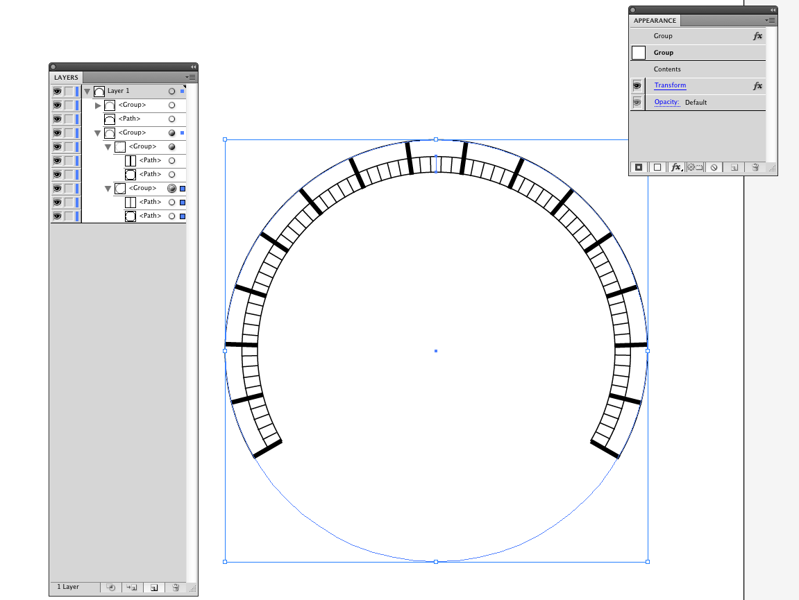
Perhaps you cut the circles before applying the transform to the tick marks?
I must have taken a wrong step somewhere?
Copy link to clipboard
Copied
Thank you so much for the pictures also, that really helps. I'm trying to learn all this on the fly and it's rather daunting. Once I get the Harley Dial done, I can take my time and actually learn the aspects of this program starting from the basics. This particular dial just happens to be a super rush job and the old way of doing these dials took a sudden turn for the worse (the ancient customized 1962 camera BROKE!) we are being forced into using modern technologies to accomplish our work. So all of this is very much appreciate, I just can't thank all of you enough.
Copy link to clipboard
Copied
Thank you very much, that is exactly what I need and I'm working on following your steps now.
Copy link to clipboard
Copied
Jber,
Wade is right. I forgot to mention the vital part of grouping the tick and the circle in step 3) and 5); the speedometer would be difficult to read without it.
Thank you Wade, no difference between versions. And it is true that it is unnecessary to delete the invisible circles; I just prefer to clean up, underway and in the final artwork (such as ungrouping and deleting superfluous circles after step 3) and 5). On the other hand I also prefer to keep unfinished steps tucked away somewhere so there is something to fall back on.
Copy link to clipboard
Copied
Here is a copy of the original picture. It has a lot of odd angles ( lines about center ). Good practice.
http://dl.dropbox.com/u/26850682/speedo.pdf
Ralph
Copy link to clipboard
Copied
Jber,
I found a few more inaccuracies in the description, so here is an amended version, and the procedure shown (with a small stroke weight on the outer circle:
1) Create an inner circle corresponding to the inner ends of the tick marks and an outer circle corresponding to the outer end of the 10MPH tick marks, these circles should be Nostroke/Nofill,
2) Create one 10MPH tick mark between the two at the very top, with the right thickness and copy it on top of itself,
3) Select the copy tick mark and the outer circle, group them, and Effect>Distort & Transform>Transform and rotate by -16 degrees with 16 copies, this will give you all the 10 MPH tick marks (and a lot of circles, do not worry),
4) Hide the copy tick mark (in the Layers palette/panel) and reduce the height and width of the original tick mark to match the intermediate ones (tick the bottom Reference Point in the Transform palette/panel),
5) Select the reduced tick mark and a copy of the outer circle(s), group them, and Effect>Distort & Transform>Transform and rotate by -3.2 degrees with 80 copies, this will give you all the intermediate tick marks (and more),
6) Show the copy tick mark again, and delete the circles apart from one outer one and the inner one (for use in 7) and for future reference/adjustment),
7) Rotate everything by 128 degrees.
Copy link to clipboard
Copied
I just tried to imagine what the 1938 tachometer makers would have thought about the methods of the 2012 tachometer makers.
They would probably have to drink more than one pint of beer to understand and endorse.
Copy link to clipboard
Copied
ok, thank you for the corrections to the tutorial because I was having a pretty difficult time with it lol. I'm going to start over and try the changes!
Copy link to clipboard
Copied
YAY!!! I did it!! woot woot. I just needing to keep deleting all the outter circles. Once again, thank you thank you thank you. Now, to tackle the font.....
Copy link to clipboard
Copied
Congratulations, Jber, and good luck with the font.
You may have a look at the following sites for (something like) it, or create the lettershapes.
Copy link to clipboard
Copied
Thank you again, and have a great night (what's left of it lol)!!!
Copy link to clipboard
Copied
You are welcome, Jber, and thank you.
Copy link to clipboard
Copied
I thought I would show a finished product since you guys helped me so much with this.
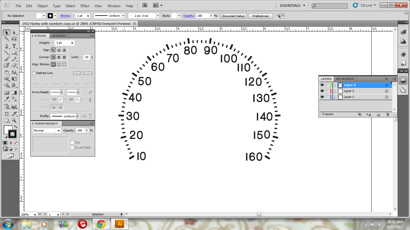
Thanks again all. I'm on to the next project.
by the way, I'm thinking of buying a graphics tablet to use with Illustrator, any suggestions that won't cost an arm, leg and first born child?
Copy link to clipboard
Copied
If your'e getting a tablet... there's only one answer.. Wacom. Get the best Wacom your budget allows. Don't even bother with other brands.
Copy link to clipboard
Copied
ok thank you!!! Also Scott, at the risk of sounding like a complete moron, can you explain how you made those brushes, they would be so helpful to me but I'm having trouble figuring all this out with CS5 (the last time I did anything with Illustrator was when I had Windows 97 ![]() ), if you have the time - I would completely appreciate it.
), if you have the time - I would completely appreciate it.
Copy link to clipboard
Copied
Sure... essentially I created the art you see in the center. Just a series of straight paths. Then dragged the art to the Brush Panel and selected "Pattern Brush" when asked.
I then dragged just the end stroke (the thick one) to the brush in the Brush panel, held down the Option/Alt key, and dropped it on the right-most section for the brush. This puts the thick stroke at the end of the brush.
Then it's just a matter of clicking a path, and clicking a brush. BAM!
You can download the file here if you'd like to look further.
-
- 1
- 2
