Copy link to clipboard
Copied
Hello guys,
I can't seem to find help online on how to do this. I have this:
Two objects, one of them has gradient, How do I add stroke around them without the stroke defining the two objects? see below what i mean.
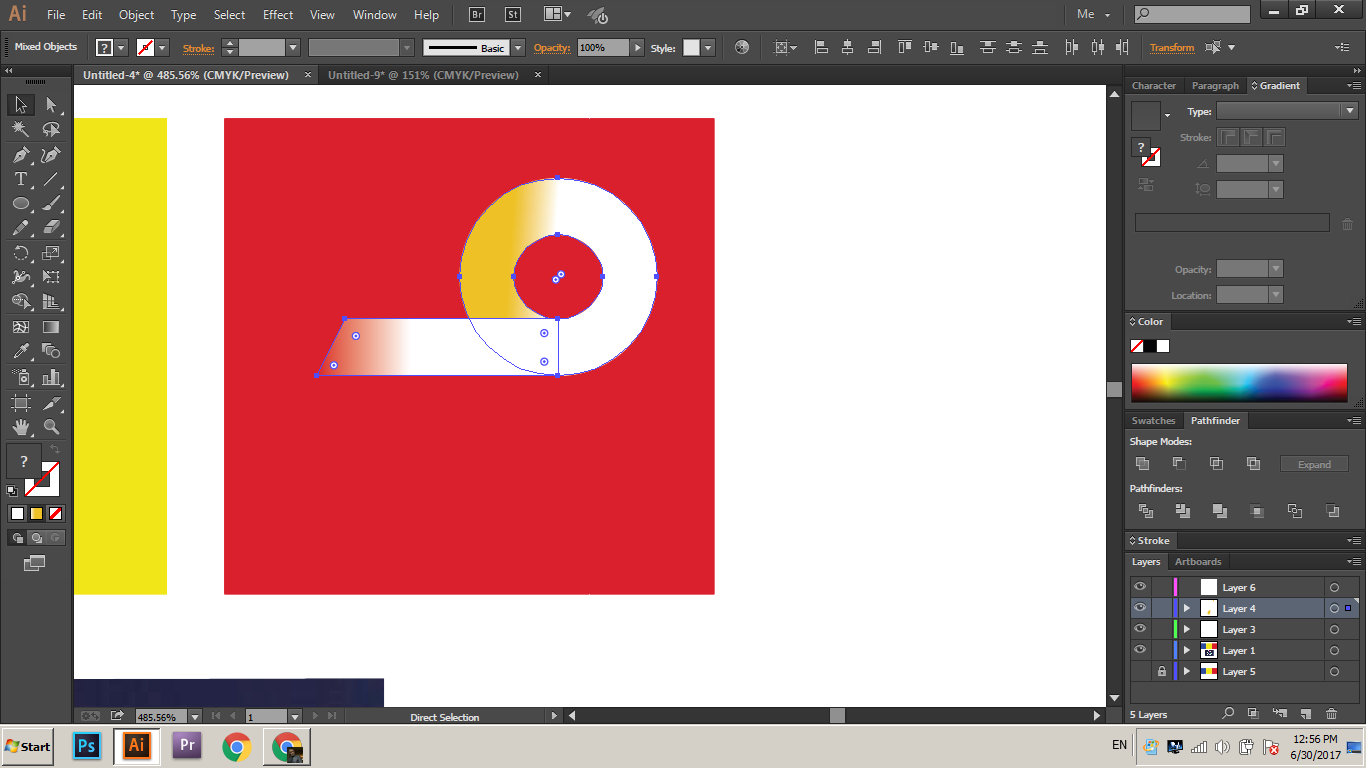
If I merge shape toghether of course the gradient disappears so I can't do that in order to have this:
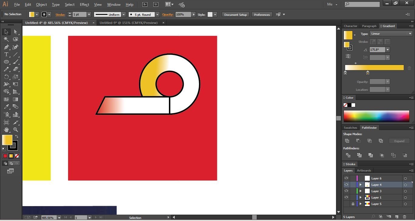
How do I achieve this but the stroke going around the whole object not like the one above. I want the stroke to simply be around the object like it's one object not two
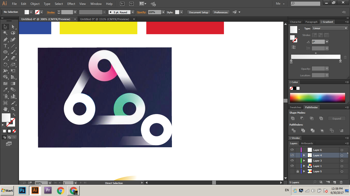
also if i merge the objects the gradients messes up and I get some weird looking objects with different colors.
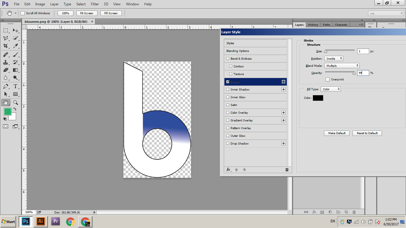
How can I eventually achieve this:
Thanks a lot
 1 Correct answer
If all you want is a black outline I'd:
- Group the two elements.
- Add a new "Stroke" in the "Appearance" dialog.
- Drag the Stroke under the "Content".
This method is "live", allowing you to freely move the elements around, without redoing the stroke.
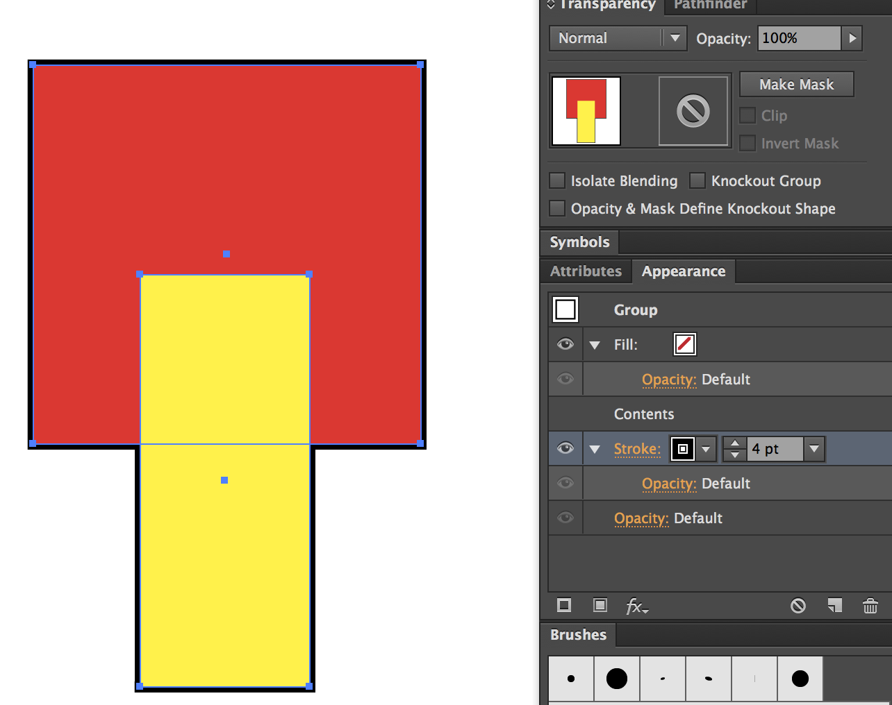
If you want the stroke to appear to follow the straight element (in front of the circle) you could just delete the right side of your front shape.
Explore related tutorials & articles
Copy link to clipboard
Copied
I would make a copy of the two objects with the stroke and no fill. Then merge them and place them directly above the two original objects. It's an illusion but it will give the appearance you're looking for.
Copy link to clipboard
Copied
That worked, thanks
Copy link to clipboard
Copied
If all you want is a black outline I'd:
- Group the two elements.
- Add a new "Stroke" in the "Appearance" dialog.
- Drag the Stroke under the "Content".
This method is "live", allowing you to freely move the elements around, without redoing the stroke.

If you want the stroke to appear to follow the straight element (in front of the circle) you could just delete the right side of your front shape.
Copy link to clipboard
Copied
yes this is what i was looking for, thank you
Copy link to clipboard
Copied
What happens if you group them and use the Appearance panel to put the stome on the group (not the paths)? In the Appearance panel you can drag the stroke to reorder it and put it at the bottom of the stacking order.
This is your best option.
Copy link to clipboard
Copied
Victor,
It depends on whether you wish to have the stroke acting like a normal centred stroke (Align Stroke to Center) on top of the fill where the centre of the stroke coincides with the outline of the fill as in the suggestion by Bill in the first post, or with the stroke acting like a stroke aligned to the outside and only showing outside the outline of the fill as in the suggestions by Ray and Jane in posts #2&3 (if you have Align Stroke to Center rather to Outside you will need to use a stroke weight that is twice the apparent stroke weight because the inner half is hidden).


