

- Home
- Illustrator
- Discussions
- Re: Supplier asked to find 100% pantone code inste...
- Re: Supplier asked to find 100% pantone code inste...

Copy link to clipboard
Copied
I'm using Pantone 170C on a product packaging. One of the part i set it to 50% of the Pantone i use.
But the supplier mentioned they want me to find the actual pantone code i want with 100% setting. How can i achieve this? I tried to find does this mean by using overprint? But overprint also need to adjust the tint of the pantone color right?


 1 Correct answer

One way to do this with the help of the Illustrator ability to find the closest Pantone equivalent to certain CMYK values
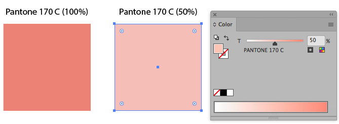
1. Create two rectangles and apply the respective Pantone color, in this case PMS 170 C
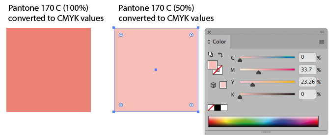
2. Then duplicate de rectangles and convert to their CMYK values
3. Select the 50% CMYK rectangle and go to Edit / Edit colors / Recolor with preset / 1 color job, in the resulting window choose Library and then Pantone Solid Coated

4. In the resulting window choose Tint, now Illustrator tell
...Explore related tutorials & articles
 7
Replies
7
7
Replies
7

Copy link to clipboard
Copied
You need a Pantone guide on paper in order to define/find your color corresponding to 50% of Pant 170C.
Overprint etc. has nothing to do with this case.
Good luck,
Joely
Lucerne/Switzerland

Copy link to clipboard
Copied
esgrace413 schrieb
I tried to find does this mean by using overprint? But overprint also need to adjust the tint of the pantone color right?
Take out your swatches book and look for a lighter version of the other color.
I don't know what you are referring to with the overprint. Is there some overprinting in the artwork?

Copy link to clipboard
Copied
I think you should choose another Pantone color which lighter than Pantone 170 C for this 50% part. Choose your %50 color object and apply a new Pantone color in 100%.
Copy link to clipboard
Copied
One way to do this with the help of the Illustrator ability to find the closest Pantone equivalent to certain CMYK values
1. Create two rectangles and apply the respective Pantone color, in this case PMS 170 C

2. Then duplicate de rectangles and convert to their CMYK values

3. Select the 50% CMYK rectangle and go to Edit / Edit colors / Recolor with preset / 1 color job, in the resulting window choose Library and then Pantone Solid Coated

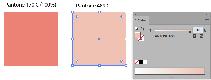
4. In the resulting window choose Tint, now Illustrator tells you that Pantone 489C is the closest aproximate pantone to 50% of Pantone 170 C.

5. Done, now you can use Pantone 489C to paint your elements that was 50% Pantone 170 before
Copy link to clipboard
Copied
thanks.
Beside may i ask, do you know what is the reason i can't adjust the tint of the pantone color? Has anyone expert on printing part? I'm new with this pantone printing and packaging printing.
Copy link to clipboard
Copied
using 100% Pantone color always gives the better result. this is the reason and there is also a little bit risky to use the tint of Pantone color because it can change as per the supplier's technical conditions.

Copy link to clipboard
Copied
There is a very good reason to use a 100% spot color instead of a screened 50% one, you will get a nice flat ink layer instead of a ink layer made from tiny dots.
But I think the method that was marked as the Correct Answer is not the right way to select that color.
In normal Preview mode the Pantone color is displayed as if it was converted to CMYK, resulting often in a duller color preview.
Overprint Preview gives a better representation of the Pantone colors, because it is using the Lab values.
The Recolor Artwork method as described above will help when you want to find a Pantone color that comes close to a certain CMYK mix color.
But when you want to find another Pantone color, based on a percentage of a Pantone color, it will use the (duller) CMYK preview equivalent to find the closest match.
To find the color you need to use the Lab values, but unfortunately Illustrator does not do that.
But Photoshop can, so there is a workaround.
Select an object filled with the 50% Pantone color and copy it.
Go to Photoshop and make a New file based on the Clipboard size and choose Lab Color as the document Color Mode.
Paste As: Pixels.
Sample the color with the Eyedropper and double click the Foreground Color Picker in the Tool bar.
Choose Color Libraries and select the Pantone Color library you want.
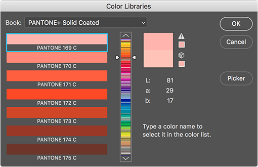
Photoshop will find the closest match based on the Lab values, in this case, Pantone 169 C
Below you will see the difference between a color selected from the CMYK values and from the Lab values in normal Preview and Overprint Preview mode. You will see that Pantone 169 C that Photoshop found is the better match.
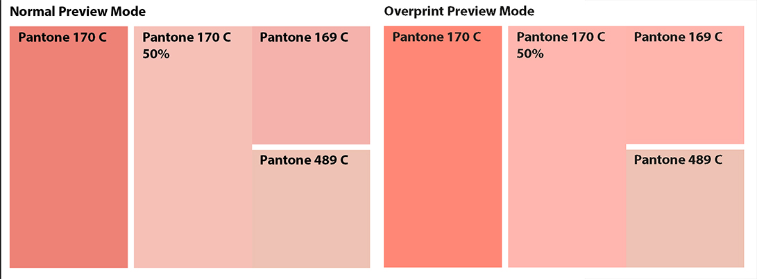
Always look at your Pantone color in Overprint Preview mode.
And always compare the color you found to the one in the printed Pantone color guide is in my opinion the best advice.

Get ready! An upgraded Adobe Community experience is coming in January.
Learn more
 AdChoices