Copy link to clipboard
Copied
Hi there forum guys and gals,
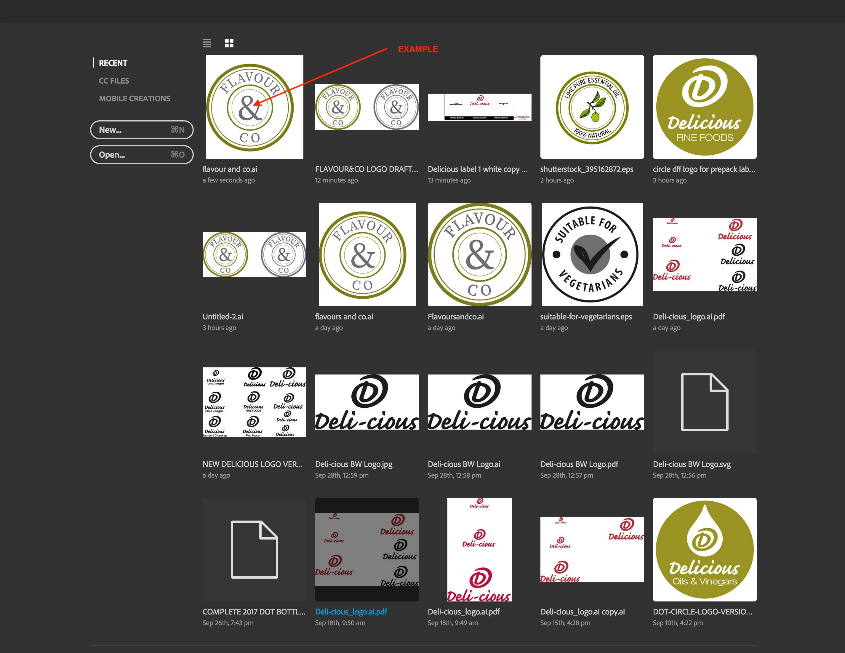
Can anyone tell me why when I view some of my files in the Recent Files thumbnail layout in Illustrator CC 2017 that either the artboard is cropped on the left, or the artwork is justified to the left leaving a larger white gap to the right?
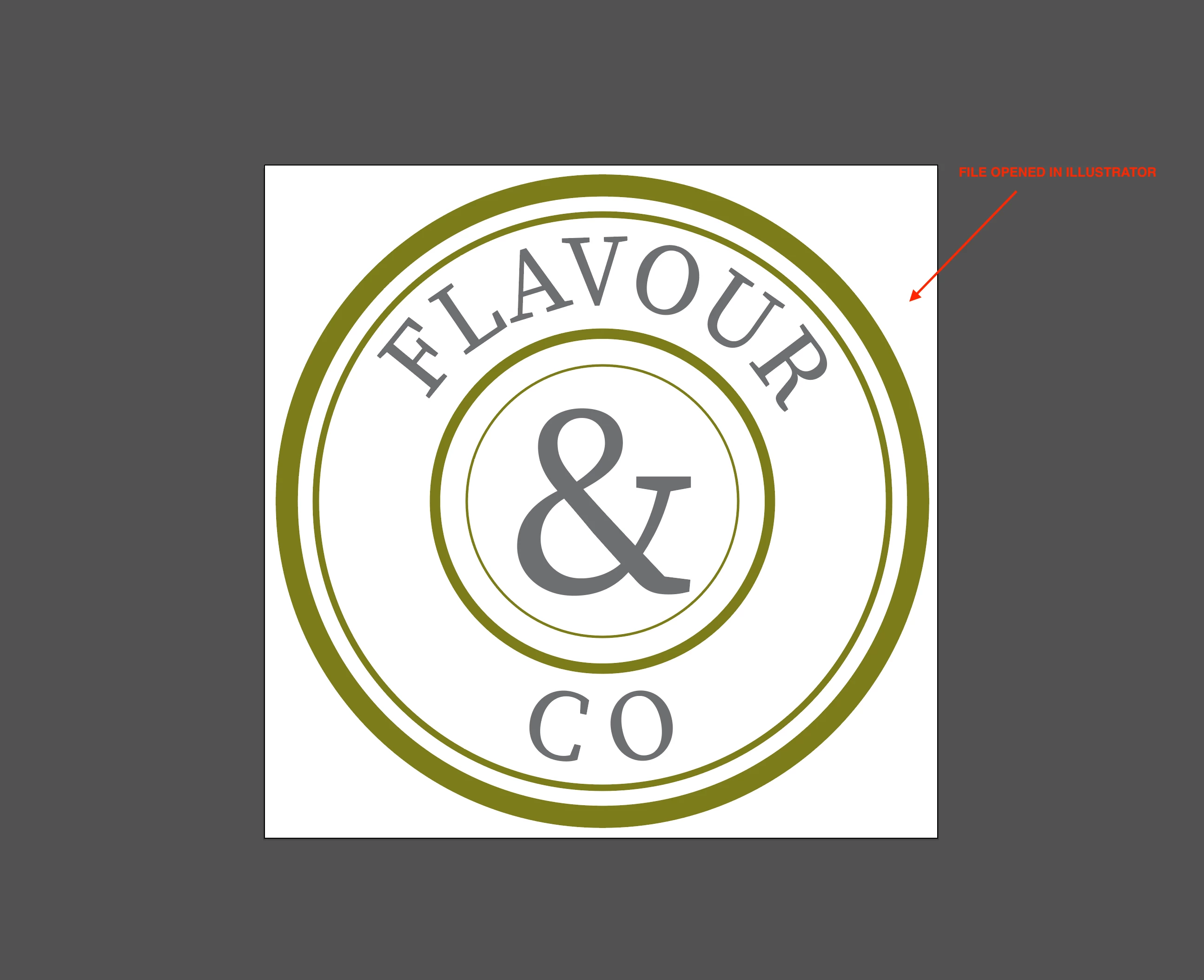
If you open the file, you can see that it is perfectly centred on a square artboard, but when resaved the thumbnail shows different.
Recent Files screenshot
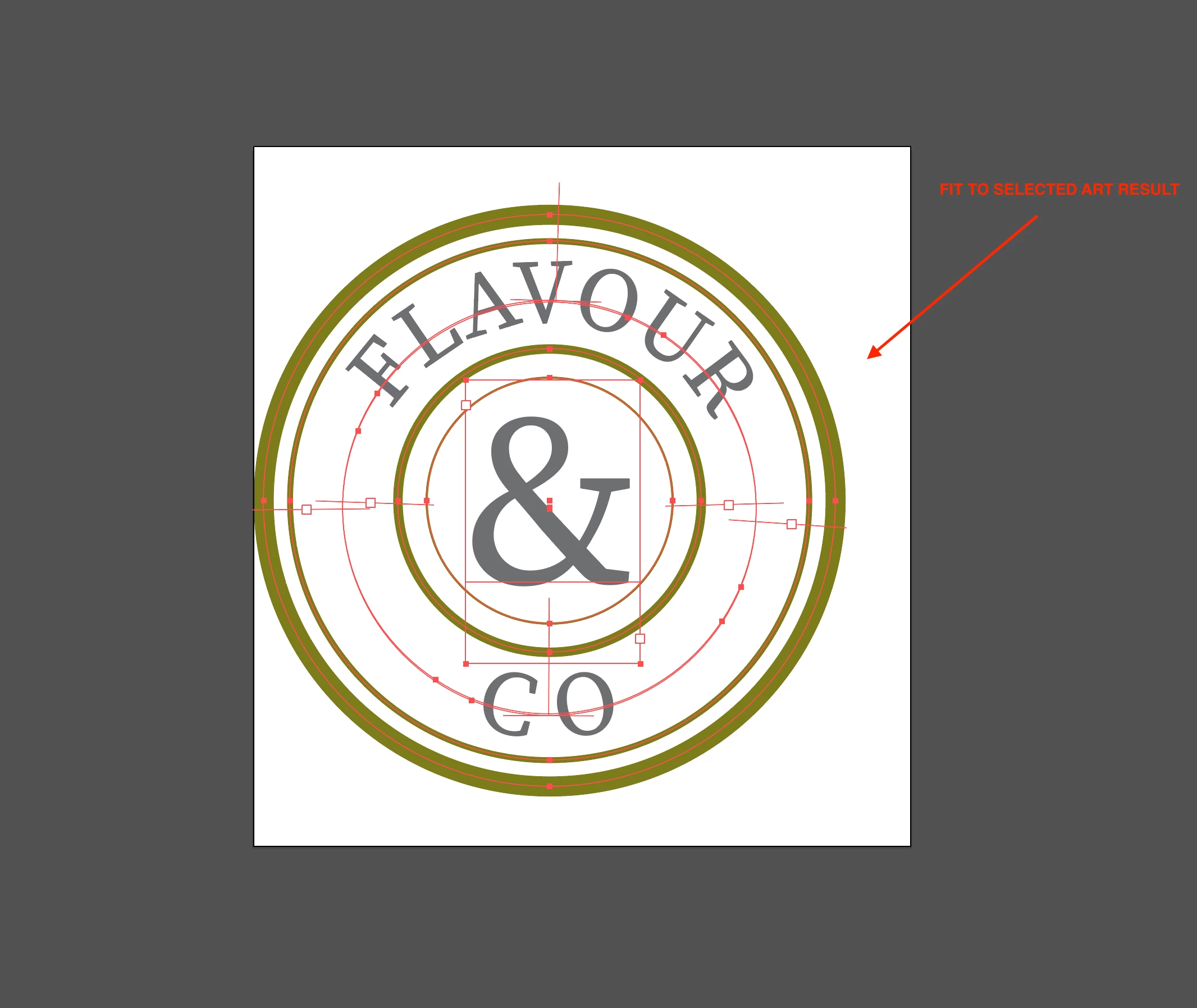
Fit to Selected Art result
File opened in Illustrator
The text objects "Flavour" and "Co" have been rotated. Rotate them back and you get the preview you want. In order to move the text along the path, use the path text brackets as described in here
How to create type on a path in Illustrator
But actually why should you care about a preview - is it really worth it?
Copy link to clipboard
Copied
[moved from Adobe Creative Cloud to Illustrator]
Copy link to clipboard
Copied
Obviously Illustrator uses the bounding box frame from the embedded PDF.
Copy link to clipboard
Copied
Sorry? There was no "embedded PDF", this was created in Illustrator from scratch. I am not sure what you are referring to? My apologies if I appear too much of a newbie here, but I am sure there was no embedded PDF used, so can't see how a bounding box can be in use?
Copy link to clipboard
Copied
Illustrator files have a PDF embedded if you save them with "PDF compatiblity".
Please read here about PDF boxes
forgot the link: The PDF page boxes: MediaBox, CropBox, BleedBox, TrimBox, ArtBox
Copy link to clipboard
Copied
Hi Monika
Thanks for your input, and I am aware of selecting "create PDF compatible file" when saving the artwork as an .ai file. This is something I regularly do.
But I fail to see how selecting this option in the dialogue box has anything to do with my initial question about the reason that my circular artwork appearing to be left justified in the "Recent Files" thumbnails for Illustrator and also when you select all on the artboard and then try to "fit to selected art" it only fits to the left side of that circle but leaves space at the top, the right and the bottom. (as shown on my screenshots"
I can save a copy of this Illustrator file artwork and deselect the option of "create PDF compatible File" and the results are exactly the same when viewing the thumbnail in Recent Files.
So I would say this has no bearing on the reason as to why it is happening.
Copy link to clipboard
Copied
Illustrator seems to use the art box for displaying the recent files. No matter how your artboard is set up. It looks like Illustrator just doesn't care about your artboard.
Copy link to clipboard
Copied
I would agree if this was consistent across all designs, but it isnt.
Also, I have 2 files one with a PDF compatible saved and one without and they both show the offside view in recent thumbnails. So how can an ai file without a pdf compatible file inclusion be referencing an art box?
Also, interestingly, if I convert the text to outlines, then the problem disappears and the thumbnail shows centred artwork as one would expect. So I surmise that it is more to do with text and not art boxes.
Copy link to clipboard
Copied
Is there any chance there's a stray point that Illustrator is taking into consideration in addition to your visible artwork when centering your thumbnail?
Copy link to clipboard
Copied
I thought that but in selecting all on active art board, nothing extra showed up. Neither did outline view show anything extra.
Copy link to clipboard
Copied
If you highlight your text on the path and select all the text on each path, are any highlighted segments hanging off that side of the circle? I suspect it may be a paragraph/character element defining space around the type on path area.
Copy link to clipboard
Copied
Hi Mark
I could see nothing.
Would it help to look at the file for yourself and see if I am missing something?
https://www.dropbox.com/s/2poaadxe8jus0ya/flavour%20and%20co.ai?dl=0
Copy link to clipboard
Copied
The text objects "Flavour" and "Co" have been rotated. Rotate them back and you get the preview you want. In order to move the text along the path, use the path text brackets as described in here
How to create type on a path in Illustrator
But actually why should you care about a preview - is it really worth it?
Copy link to clipboard
Copied
Hi Monika
Thanks for explaining that it was due to rotation, although I still don't get why rotating within the same circular path would result in a space being created on 3 sides outside the widest circle.
I read through the instruction via the link you mention and it actually doesn't refer to text on a circular path does it?
All I did was type on that circular path and then rotate that path. Can't see how that would result in a space creation.
Anyway, as you say, why should I care about a preview. It was only really worth it from the point of view that my actual artwork was centred visually and I thought the thumbnail should show a representation of that. So the question was posted to see if it was me, or a bug in the thumbnail generation of Illustrator.
Thanks for your response.
Copy link to clipboard
Copied
When you rotate the text object, the bounding box gets rotated. WHy that causes the different preview? Don't ask me.
As for the text bracktes: they are also present on circular text paths.
Copy link to clipboard
Copied
I get it now! Use the marker to rotate the text as opposed to rotating the object box. Tried with 2 versions having set the rotation of the boxes back to 0° and then moved the marker to the centre point. Saved out the file and lo and behold a centred thumbnail!
Thank you Monika
Copy link to clipboard
Copied
You're welcome.
Thank you for the interesting problem.
Copy link to clipboard
Copied
Glad you guys figured it out. That's what I was eluding to when I said check the text on the path. Looks like another good question resolved.
Copy link to clipboard
Copied
Sorry Mark, I didn’t understand your exact meanin. But thank you also for your valuable input In helping me get the situation solved.