

- Home
- Illustrator
- Discussions
- How to create a smooth curve line graph in illustr...
- How to create a smooth curve line graph in illustr...
How to create a smooth curve line graph in illustrator?

Copy link to clipboard
Copied
Hello, I am trying to create a smooth sine wave style graph based on some tide data for my local area, I am not sure which tool in illustrator is best for this? Would it be the line graph tool?
I have tried to use the line graph tool but I get a straight lines in a zigzag shape rather than the smooth wave I'm looking for (think radio or sound wave appearance).
I am also having trouble with the x axis labelling, it needs to show date and exact time if possible. I have labelled the data in excel as both the date and time, and I'm importing the data into illustrator from excel.
I need to find a solution appropriate to 12 x 30 days, 3 to 4 times each day, with each time having a different height on the y axis. So approximately 1300 different pieces of data.
the y axis is height and the x axis is the date and time of day.
I would be so immensely grateful for any help! Thank you.


Explore related tutorials & articles
 6
Replies
6
6
Replies
6

Copy link to clipboard
Copied
To my knowledge, Illustrator does not have a way to make a smooth sine wave on a line graph, or for that matter on any type of graph. You could draw the curved line with the Pen, or you could ungroup the graph (which causes it to loose a link to the data), join the lines and reshape them, or maybe someone in the scripting forum has a script to do this.
As far as the axis labels, it would help to see an example, but here are some tips. Illustrator does not support Excel formulas or calculations in cells so that data would have to be resolved before bringing the data into Illustrator. If you have letters and numbers in a single cell you need opening and closing quote marks around the information in the cell. If you have numbers with commas in a cell, the commas need to be removed -- in Excel you can specify that the cell is a Category: Number and take the check mark off of Use Separator.

Copy link to clipboard
Copied
Barbara is an advanced user, and her answer is correct. The Graph tool in Illustrator has not been updated in over 20 years. Your choices are
- to work with the graph as a group so that you can update the content and make changes with the graphing tools or
- to ungroup the graph and break the link to the graph and make the changes in Illustrator.
If you want a wavy line, you'll have to go with Barbara's idea to ungroup the graph (maybe more than once) and create the wavy line yourself.
You might make a copy of the graph before you break it.
And you might ask on the Illustrator Scripting forum to see if anyone has written a script or you can hire to write a script that will make your work go faster.

Copy link to clipboard
Copied
There's a nice little plugin made by Stephen Vincent called "Kimbo" that does sine waves and a whole lot more. It's not expensive and well worth the look. I've used it and it works great. here's a link: KIMBO - ILLUSTRATOR PLUGIN
That said, I'm sure that there's a way to do sine waves in Illustrator. Maybe someone more advanced will help you out.
Copy link to clipboard
Copied
Thank you all very much for your help. I wonder perhaps if my answer lies in a scripting solution, I will take a look on that forum too, thank you. Unfortunately I know nothing about scripting myself.
I'm going to try a different software as manually plotting a graph of 1200-1400 data points is inefficient and seems unnecessary, but also I am hoping to make a few of these for different locations, so multiple graphs would be extremely inefficient. And using the graph tool isn't appropriate as I am unable to get a consistent curve when I manually manipulate the points on the zigzag line graph. I wonder how other tide charts are made, simple graphs in excel probably. Which makes sense but I want to make them look attractive (but also still accurate) in something like Illustrator. I really feel like I'm looking for quite a simple thing so I am surprised illustrator can't do it!
Thank you again so much for your answers and assistance.

Copy link to clipboard
Copied
i wonder if there is some scriptable element to the curvature tool that could do this, since creating smooth curves between points is what it does.
Copy link to clipboard
Copied
I don't know if this would be practical for you, but this is a workaround.
You've created the graph.
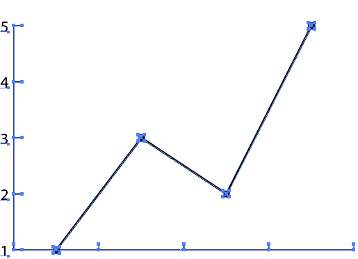
Select just the lines with the Direct Selection tool and cut them.
Then choose Edit > Paste in Place.
While the lines are still selected, choose Object > Path > Join.
Select the graph with the Selection tool and Object > Lock Selection. That gets it out of the way for the next steps.
With the Direct Selection tool, select the first two points.
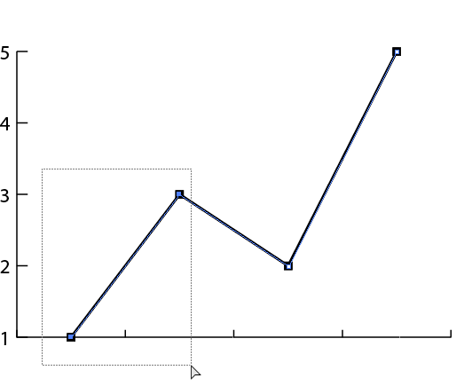
In the Properties panel, convert to curve.

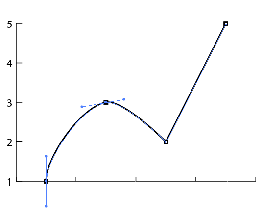
Select the next two points with the Direct Selection tool
.
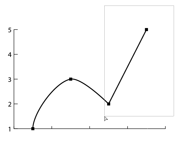
In Properties, convert to curve.
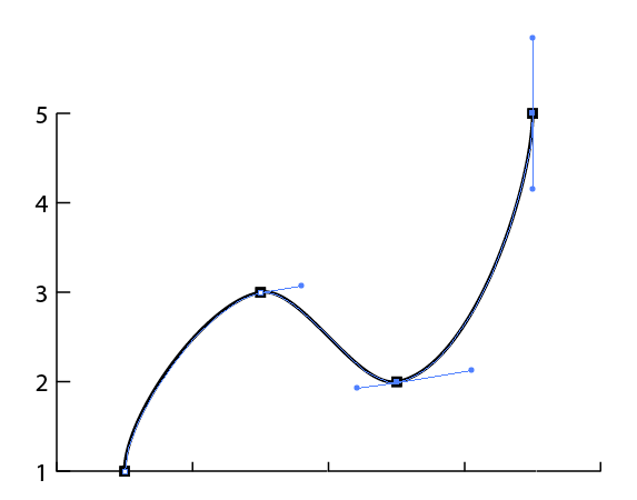
When done, you can unlock the graph.
Note that this does not break the link to the data in the graph, but if you need to change the data, you'll need to re-curve the line.

Find more inspiration, events, and resources on the new Adobe Community
Explore Now
 AdChoices