Copy link to clipboard
Copied
I often wonder why parts of some folder titles are hidden by means of … even there is so much space on both sides.
How do I get LR CC Library to use all the space for the folder tree and without hiding parts of the titles when there is plenty of space?
Regards Henrik Rasmussen
Copy link to clipboard
Copied
Sorry, I think the panel width is fixed when dragged to the maximum possible. I used to be able to drag further on my Mac by holding down the Option (Alt) key while dragging but that doesn’t work for me on W10.
Copy link to clipboard
Copied
Without knowing what folders you have above the "Lande" folder, this may be of help-
Scroll to the very topmost folder and hide it in the folder panel.
Copy link to clipboard
Copied
But he's not looking at folders, he's looking at Collections. There is no Hide This Parent for collections.
The only things that I can think of that will help is to make the panel as wide as possible (looks like this has already been done), and then to hover the mouse over each collection name to see the full name.
Copy link to clipboard
Copied
I should -'Open mine eyes'
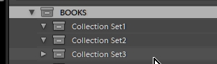
Yes, there is no "Hide Parent" in collections panel, but it is possible to have too many 'nested' sets which moves contained collections further to the right.
Perhaps the OP could drag&drop sets into one level of hierarchy which would narrow the panel view.
Copy link to clipboard
Copied
It seams to me, that there is room for UI improvement...
Copy link to clipboard
Copied
Sorry for the late reply.
It is natural that nesting course more space to the left, but this does not explain the hidden text in the right which is substituted with "...". There should be plenty of room to show more of the text, rather than hiding it.
And sorry for causing confusion by called it folders instead of collection sets. I should communicate better 🙂
Find more inspiration, events, and resources on the new Adobe Community
Explore Now