

- Home
- Lightroom Classic
- Discussions
- Is it possible to edit a photo with this much ligh...
- Is it possible to edit a photo with this much ligh...
Is it possible to edit a photo with this much light/dark range?

Copy link to clipboard
Copied
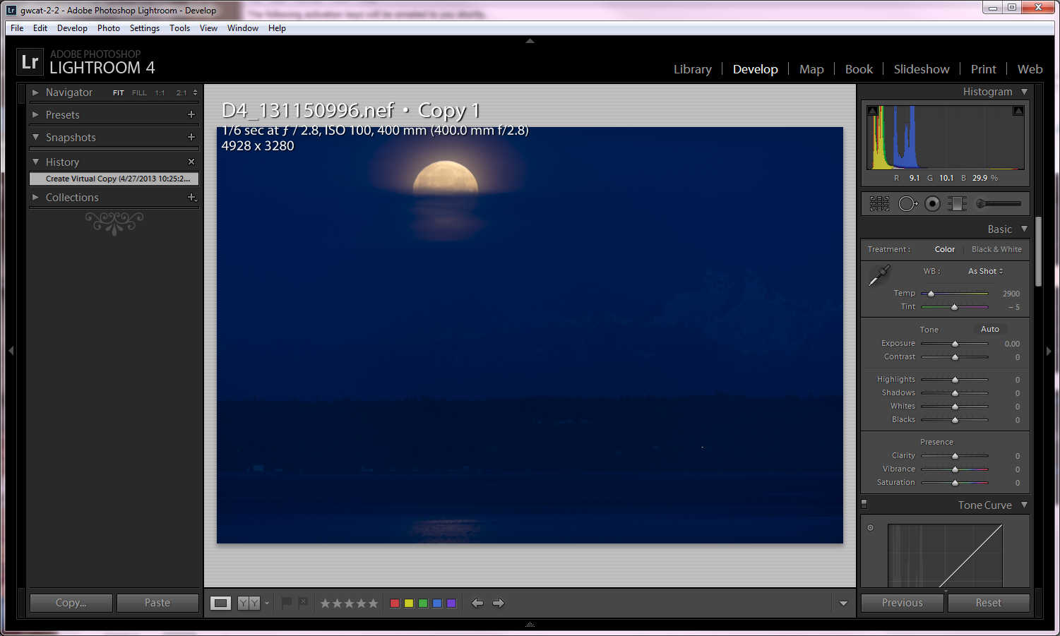
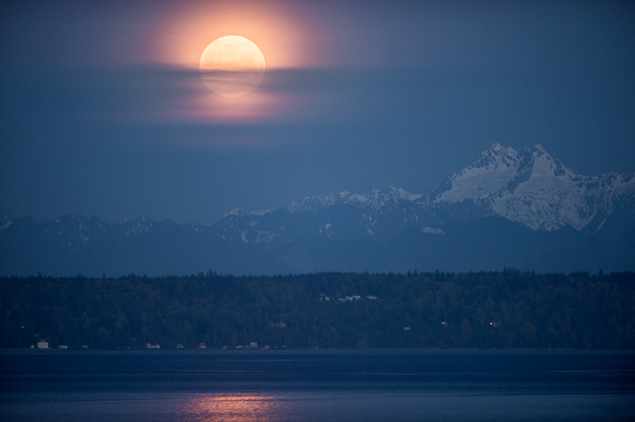
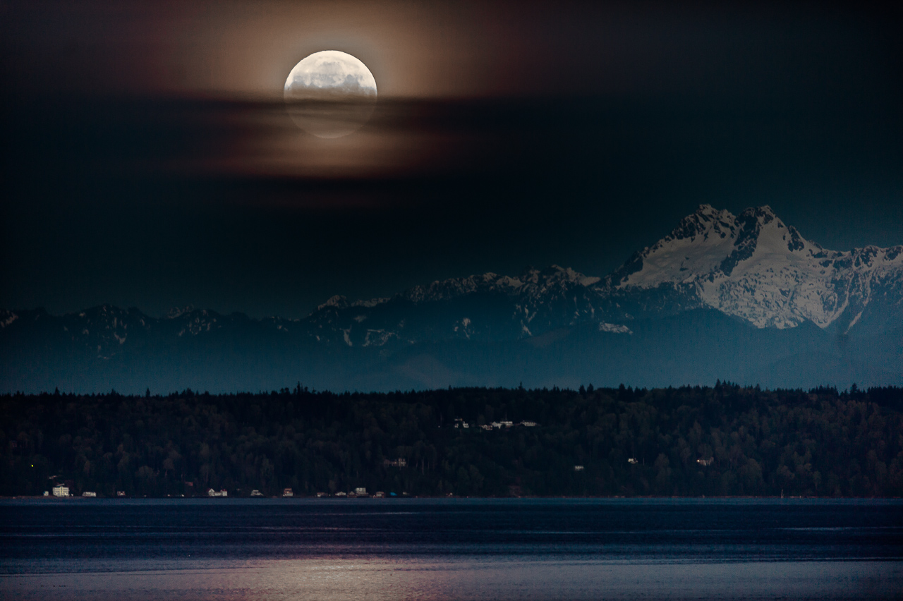
This is a "how to" question. See attached photo of the moon setting at first light "as-shot". The goal was to keep the moon from overexposing with the idea that the camera was capable of recording sufficient landscape information in the shadows. I have this scene bracketed quite a ways but the settings here seem to work best.
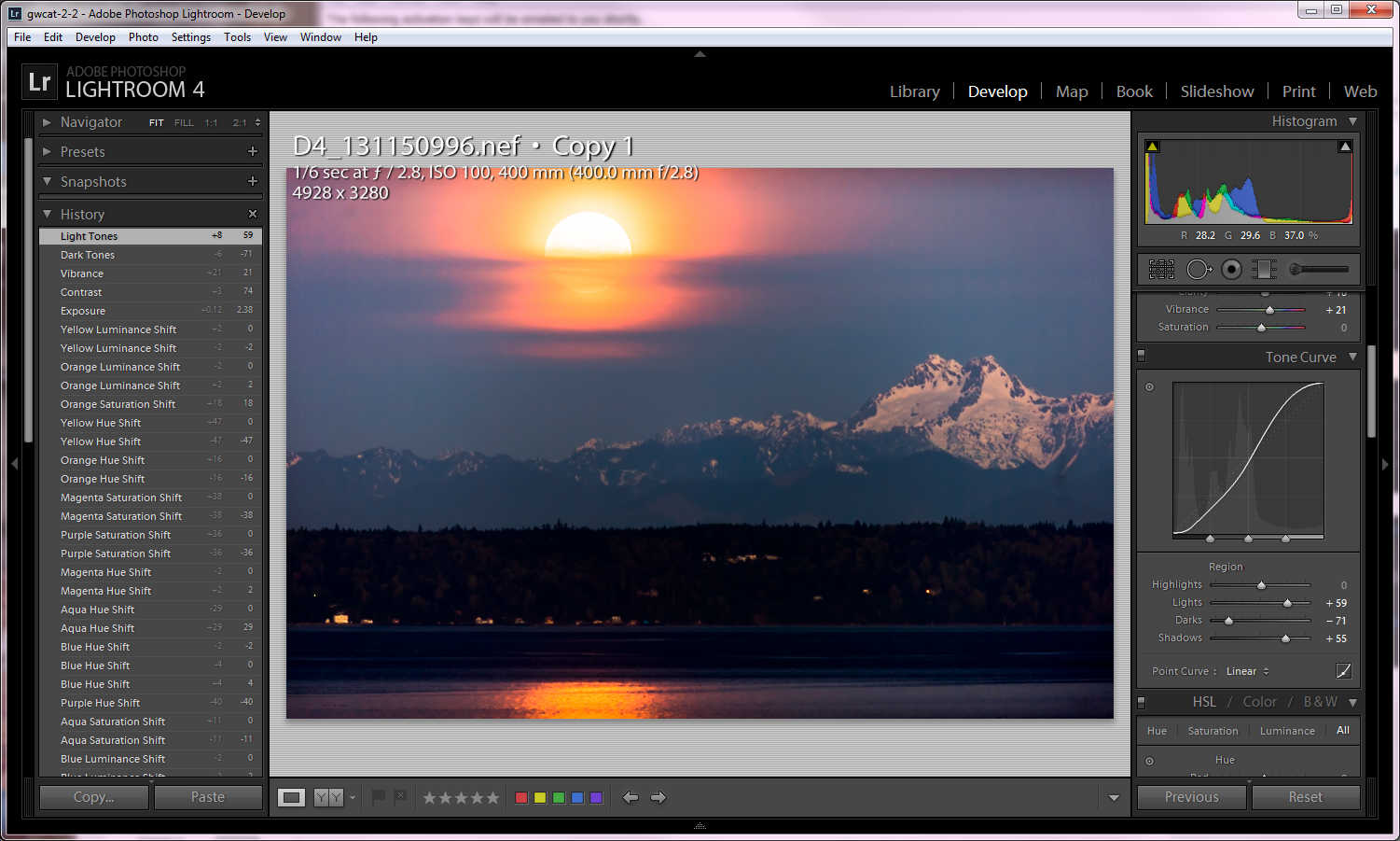
Here it is with the mountain brought out of the shadows and temperature adjusted. The mountain has good depth, but what it takes to do this, messes up the moon (as you can see).
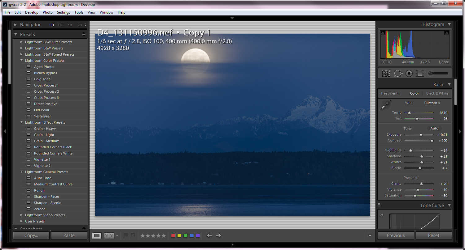
After messing around with the controls I noticed the bleach bypass preset will actually preserve most detail, but at the expense of most color. The orange reflection on the snow gives extraordinary depth to the mountain (especially for predawn). The instant I try to add more color, the moon turns bad.
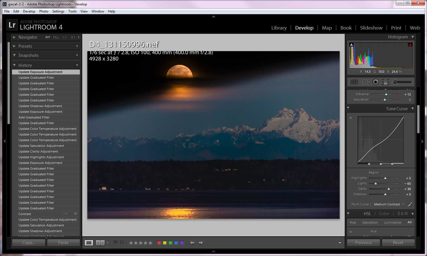
For illustrative purpose, this is the closest I can get both subjects on the same photo using LR, graduated filters and some controls cranked. I run out of control trying to recover the black around the moon, and lowering its saturation. Obviously this is unacceptable except that it shows that since detail at both extremes got recorded to the same raw file, it should be theoretically possible to make it look like I want. Or not? That's the question.
What appears to destroy the moon the most is correcting the temperature to get the orange snow reflection. Another way of looking at it: since my eyes had no trouble seeing this scene live, and the camera was able to record this detail, there should be a way to render it. I don't take a lot of landscapes so I don't know. Any ideas? or am I out of luck?
Thank you in advance for any input.


 78
Replies
78
78
Replies
78

Copy link to clipboard
Copied
@ elie-d. While this rendition may be a bit more dramatic, the lighting on the snow on the mountains is not realistic since the only lighting for the scene is the moon which is way behind the mountains. The side of the mountain that we can see is in the shadow of the lighting. I have not posted a picture because what I have come up with is pretty much the same as "c.frans w", and "twenty-one". Also I will check the next full moon in my location in Trinidad and Tobago 10 deg north of the equator but I do not think I see quite the deep orange color but somewhat more muted than a sunset would be.
Ok my try.
Copy link to clipboard
Copied
I went ahead and took another whack too - you can see it here:
(context-click and choose "Open Link in New...")
Basic Settings:
------------------
Other Settings:
------------------
Curves
Locals
HSL
What I like about it:
* More neutral color.
* Orangier moon.
* Accomplishes more so the goal I set out to accomplish (governed by my take on George's vision for this photo), esp. more tonal detail in mountain.
What I don't like about it:
* I went ahead and changed color balance of mountain w.r.t. sky, and that along with the greater mountain clarification give way to a "what's wrong with this picture" thang in my mind (i.e. where did the atmosphere go, or put another way - where is the mountain w.r.t. the atmosphere). For example in most other's versions, and my first version, the mountain has same general color and haziness as the sky, making it "clear" (pardon the pun) that the mountain is under the same atmosphere as the moon, which ties the two together energetically, and looks more natural, in my opinion.
* The gray sky is a little, well, gray... not bad I guess, just not much color...
Other notes:
- first time around, I used channel curves for getting rid of the color cast, which was mostly overkill - 9X% can be remedied simply by cranking up the temperature.
Feel free to comment, if you've a mind to...
PS - Anybody know why the computed temperature is sooooo off? (way too cool).
UPDATE: I peeped pixels and noticed this photo was not so sharp, and had a surprising amount of noise. To combat, I added a fair dose of high-radius sharpening (which makes for "high radius" detail noise), and some noise reduction (more than normal), then added a relatively fine grain to restore a finer texture. Looked great at 1:1, but unfortunately grain size is not tied to output resolution, so the grain was completely lost upon output for web, and the result looked over-clean/over-smooth on the web, thus the change was backed out, to avoid having to maintain virtual copies with different grain size for different output resolutions.
Rob
Message was UPDATED by: Rob Cole
Copy link to clipboard
Copied
I had told myself I would not offer feedback to anybody who hadn't asked for it, since my social skills are limited, and my tact: less than perfect - often I (unintentionally) offend or aggravate or provoke defensiveness... when providing feedback. But I can't seem to help myself...
elie-d wrote:
This is two exports, one at +5 Exposure, HDR blended and the 32 bit tiff edited in LR5 with a couple Radial filter applications, 1 Grad filter on bottom area and some brush work on the sky.

I really like the moon in this one, and the general sense of drama. Obviously you were aiming for artistic effect not naturalness.
To me, if you'd finished the painting of the sky to have a more seamless transition between near moon, away from moon, and into vignette, and cleaned up some of the color and tonal artifacts near the center of the mountain and at the seam with the dark forest area, this photo would be awesome.
Just my opinion, please take it for what it's worth, or forget about it. I know this wasn't intended to be a finished photo for contest submission... - as I said: the moon is awesome and the mountain clear and dramatic, but the photo looks very much unfinished to me, as perhaps should be expected.
Rob

Copy link to clipboard
Copied
Thanks Rob. I know that my version was over the top and just a fast and incomplete job. The problem originally expressed by the OP was that he was having difficulty bringing up the mountain without overexposing the moon and my intention was merely to sketch out a possible solution through a combination of working in 32 bit and local adjustments. The addition of 32 bit support in LR4 is a real boon, adding range and flexibility even to the local tools, and a technique I want to explore a lot more.
Copy link to clipboard
Copied
This is a most refreshing thread, very constructive and informative. Thanks guys.

Copy link to clipboard
Copied
Here's my shot...LR5 and some "stuff".
I've left the File Info intact..
Copy link to clipboard
Copied
Thank you all for your renditions! They are all better than what I've been able to come up with  It's become apparent that in order to get the most out of this shot, it will have to be done at least partially in Photoshop (I have CS6). For that, I will need to do some research into some of the techniques that have been mentioned. This photo is not my usual subject matter. I use mostly LR for my usual subjects, which are dogs and some sports, and they tend to be action shots. They don't often require this level of editing, or this kind of editing. So in other words, I need to do some reading. When I come up with a result, I'll post it here.
Copy link to clipboard
Copied
Thanks Jeff.
What I like about it:
* Mountain has good tone/definition.
* Looks fairly natural, but has some color...
* Reflection in water seems to have been enhanced (extended).
* Simplification by elimination of houses and driving the forest to black very much works for featuring moon / mountain / reflection.
Interesting to me: If the houses are there, I need to see the forest more too. If the houses are eliminated, I don't.
What I don't like about it:
* Moon is missing detail.
* Gradient of glow surrounding moon does not look smooth to me (transition from bright glow near moon, to dim sky further away from moon, is relatively abrupt). Same is true of most other versions posted too...
PS - I would like to see you do another version which does not include a round trip to Photoshop (i.e. Lightroom only).
Rob
Copy link to clipboard
Copied
DdeGannes wrote:
This is a most refreshing thread, very constructive and informative. Thanks guys.
Yeah, there's usually a lot of head-butting in this forum, but every now in then we succeed in working together 

 .
.
You're welcome, for my part - and thank you too!
Rob
Copy link to clipboard
Copied
Thanks for acknowledging the post Rob.
Copy link to clipboard
Copied
This thread is a testament to LR's ability to "make a silk purse out of a pig's ear," without resorting to PS. There is no one "correct" way to process this image, but everyone here has done a great job creating interesting and usable images from this color shifted and contrast starved raw image file. LR5 takes this a step further with the Radial Filter. I tried correcting the sky area using the Graduated Filter tool, but found it impossible to get a smooth transition. Using LR5 beta with the same settings from LR4 I discovered the Radial Filter provides a much smoother and more transparent "feathering." I had to make the Radial Filter very large to achieve the desired transition, but it works quite well. Here's a full-screen mode view showing the Radial Filter.
Here's the final results:
To me the image looks almost like an oil painting, but I'm sure it will help achieve whatever look you desire.
Cheers,
Todd
Copy link to clipboard
Copied
Radial filter is convenient, but worth considering whether the paint brush is a better tool for the job. Consider using a big brush and turn flow up to 100 so effect is fully applied in one stroke (or minimum number of strokes) without the brushing uneven-ness which comes from going over an area repeatedly at reduced flow *** see note below.
The bottom line: unless an evenly feathered elipse-shaped mask is precisely what you want, you can get superior results using the brush, if you have the requisite brushing skill, granted - maybe not as convenient...
PS - I used a (smaller) radial filter over the moon (and surrounding glow (but not over the darker sourrounding sky)) in my 2nd whack, just for convenience (and for fun, since it's new).
Tip: if you are unsure just how you want the paint, use a radial filter at first, move it around, change it's size and shape (and feathering), until you get something about right, or in any case you learn something, then if not exactly right, delete it and apply paint with brush instead, armed with additional knowledge experience of what you want..
*** Note: Unlike some "airbrush-like" tools in some editors, 'Flow' in Lr does NOT control amount of paint per unit time, it controls amount of paint per stroke, so "mid-stroke hesitation" etc. will not affect result.
UPDATE: Upon review, I stand corrected: I used three radial filters over the moon. - probably should have just used paint brush.
Cheers,
Rob
Message was UPDATED by: Rob Cole
Copy link to clipboard
Copied
Rob Cole wrote:
In my opinion, unless you *want* an evenly feathered elipse-shaped mask, you can get superior results using the brush (depending on brushing skill).
I agree for image areas that follow a complex contour the adjustment brush is a better tool. For this specific image one (1) Radial Filter works better than the Adjustment Brush. I did try both the Adjustment brush and Graduated filter and I have plenty of experience using both tools.
I'm sure if you played around with the brush settings long enough, stroked it enough, and endeavored long enough you could come close to the same effect as the Radial filter. I say "close" because the Radial brush "feathering works differently than the adjustment brush. The Radial filter feathering "zone" is less pronounced and allows feathering over a much larger area achievable with the adjustment brush.
Try making the Radial filter much larger to extend feathering and rotate it to fit the contour as in my posted screen shot. I used Invert Mask, Feather = 100, Exposure = -1.36, and Contrast = 24. Feel free to use whatever Radial Filter settings you like.
Like I said, there is no one "correct" way to adjust this image or any other image file. Choose your own tools and use whatever works for you. The Radial Filter is new to LR5 beta and there's no guarantee it will work the same in the LR5 final release....but I sure hope so!
Copy link to clipboard
Copied
Good point - different feathering charactersitics of the radial filter.
trshaner wrote:
Radial Filter is new to LR5 beta and there's no guarantee it will work the same in the LR5 final release....but I sure hope so!
Eric Chan said the feathering will be "increasable" in Lr5-final, but backward compatible with the beta.
R
Copy link to clipboard
Copied
Rob Cole wrote:
Eric Chan said the feathering will be "increasable" in Lr5-final, but backward compatible with the beta.
R
That's good to hear as it will give the Radial Filter even more flexibility for this type of correction. Here's a Canon CR2 raw file shot of a white ceiling (~50% Gray) with an Adjustment Brush and Radial Filter applied. It clearly demonstrates the difference in feathering.
I couldn't achieve the same gradient using the Adjustment Brush with any combination of settings. This one's the closest, but quite different:
Adjustment Brush Radial Filter
Exp. +4EV, Size 50, Feather 50, Exp. +4, Feather 100, Invert Mask
Flow & Density 100
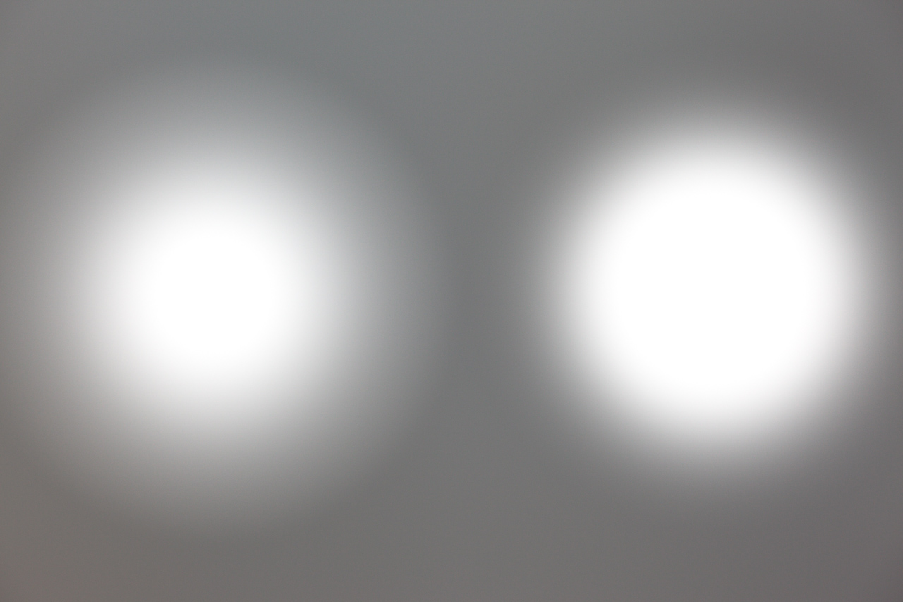
The other difference about the Radial Filter is that you can change its Location, Shape, Size, and Feather after the application. This makes it easier and faster to apply than the Adjustment Brush. But there's a place for both tools!
Copy link to clipboard
Copied
Thanks Todd .
And, if you want a true and non-circular elipse, it would be a challenge to create it with a brush.
So, I don't knock the radial filter, just: - right tool for the job and all. (I hate to see people using the radial filter when a brush would be better, and vice versa).
~R.
Copy link to clipboard
Copied
I agree.
Having made this discovery I'd love to see Adobe add another control to the Adjustment Brush, Radial Filter and perhaps Graduated Filter to allow fine tuning the gradient region. It looks like the Adjustment Brush and Graduated Filter use a near linear gradient and the Radial Filter something closer to an exponential gradient. I sometimes find the feathering capability of the Graduated Filter and Adjustment Brush make it difficult to hide the transition zone.
Being able to fine-tune the gradient transition may help to "blend" and hide the transition area. I'll be interested to see how the Radial Filter feathering works in LR5 final release. At least we know the current near exponential gradient will be reatined.
Great stuff!
Copy link to clipboard
Copied
trshaner wrote:
I'd love to see Adobe add another control to the Adjustment Brush, Radial Filter and perhaps Graduated Filter to allow fine tuning the gradient region.
Me too.
NX2 has a handle in the feather zone which you can use to alter the fall-off: steep then gradual, or gradual then steep... (both linear and radial gradients), but I'm thinking more like a tone curve (i.e. set the exact fall-off "formula" graphically, e.g. gradual at first, then steep for a while, then gradual again...).
Cheers,
Rob
Copy link to clipboard
Copied
trshaner wrote:
This thread is a testament to LR's ability to "make a silk purse out of a pig's ear," without resorting to PS. There is no one "correct" way to process this image, but everyone here has done a great job creating interesting and usable images from this color shifted and contrast starved raw image file. LR5 takes this a step further with the Radial Filter. I tried correcting the sky area using the Graduated Filter tool, but found it impossible to get a smooth transition. Using LR5 beta with the same settings from LR4 I discovered the Radial Filter provides a much smoother and more transparent "feathering." I had to make the Radial Filter very large to achieve the desired transition, but it works quite well. Here's a full-screen mode view showing the Radial Filter.
Here's the final results:
To me the image looks almost like an oil painting, but I'm sure it will help achieve whatever look you desire.
Cheers,
Todd


This is cool ..this is close to what I was envisioning. The goal is a very soft, but surface-detailed moon (i.e. understated, almost faint), and mountains that are vivid enough to have depth. This is the closest yet. The lighter haze under the mountain is natural (fog), btw. I guess I need to download the beta. Thanks!
Copy link to clipboard
Copied
Here's a DNG with my LR5 beta adjustments. I'm sure you can get it closer to what you're envisioning.
https://www.yousendit.com/download/UVJoZGluTWNHa05WeHNUQw
Make sure to use copies of your original image files saved to a separate folder for "testing" LR 5 beta.
The long 400mm telephoto perspective is really what makes this beautiful landscape shot unique. My only other suggestion is to look at ways to increase the overall image sharpness in future shots. Anyone who has shot with a 300mm or longer lens knows it can be challenging to get good focus and prevent vibration from degrading the image sharpness at slow shutter speeds. With this heavy-weight lens use a strudy tripod, live-view mode with manual focusing, and a remote shutter release or self timer for hands-off shutter release. Fog and general atmospheric conditions get amplified with long telephotos so this may be unavoidable, but it does give the image a unique look.
LR5 works magic with even the worst images–I'm stoked and looking forward to the final release!
Copy link to clipboard
Copied
trshaner wrote:
Here's a DNG with my LR5 beta adjustments. I'm sure you can get it closer to what you're envisioning.
Thanks! There's no way I can get the clouds AND mountian like the above with the current version. Haven't had much time to work on this as I'm still catching up after a 15 hour power outage Monday. It was the hottest May 6 on record in Seattle and all the A/C units destroyed the local substation. (I like shooting that mountain, mostly because it's there )
Copy link to clipboard
Copied
George in Seattle wrote:
The goal is a very soft, but surface-detailed moon (i.e. understated, almost faint), and mountains that are vivid enough to have depth.
How about this? (done exclusively in Lightroom, of course...)
Rob's 3rd Whack (Softer Moon) (hint: context-click and choose "Open Link in New...")
Closer?
~R.
Copy link to clipboard
Copied
Rob Cole wrote:
George in Seattle wrote:
The goal is a very soft, but surface-detailed moon (i.e. understated, almost faint), and mountains that are vivid enough to have depth.
How about this? (done exclusively in Lightroom, of course...)
Rob's 3rd Whack (Softer Moon) (hint: context-click and choose "Open Link in New...")
Closer?
~R.
OMG! 3rd times a charm! That is really close to real life, but its also a good balance of real-life and emphasis. I had something like that in mind when I originally pulled it up, and would have been happy getting remotely close to that. After a several hours and many restarts, I gave up. I take it this was done in the beta?

Copy link to clipboard
Copied
If I may be blunt, Robs and Jeffs' versions are the only ones so far who managed to make it look natural and credible - even if it isn't.
In my book, edits shouldn't be visible. There are many other interesting interpretations here, but to me they don't make it because burns and dodges and graduated filters are too obvious.
No disrespect to the others, this was a tough one. I'm not too happy with my own contribution either.
Copy link to clipboard
Copied
George in Seattle wrote:
OMG! 3rd times a charm!
4th time even better? (or am I straying from the path...)
Reminder: context-click and choose "Open Link in New..."
It's a little brighter overall, but with an even dimmer/fainter moon.
http://www.robcole.com/LrForumSupport/D4_131150996.xmp.zip
Y'all know what to do with the xmp zip? (see snapshot titled 4th whack...)
~R.

Find more inspiration, events, and resources on the new Adobe Community
Explore Now
 AdChoices