

- Home
- Lightroom Classic
- Discussions
- LR4 auto tone continues to be a disaster?
- LR4 auto tone continues to be a disaster?
LR4 auto tone continues to be a disaster?

Copy link to clipboard
Copied
How is it that Photoshop's auto tone can produce such pleasing results, yet Lightroom's auto tone can be so wildly off the mark? This is not a recent LR4 thing, it's been a problem ever since Lightroom was released 6 years ago and Photoshop's auto tone has worked well as far back as I can remember. It just baffles me that this feature of LR still hasn't been fixed in this latest release. Lightroom's auto tone feature, as it stands, is essentially useless and I see many people posting similar experiences. It's erratic too... sometimes setting exposure wildly too high, other times wildly too low. It seems it's biggest problem is in setting exposure. All I ask for is an auto tone that behaves like Photoshop because I don't have time to manually tweak all of my photos.
Any insights on why this behaviour might be?
Does anyone have any suggestions? I saw a few people suggesting manually tweaking the text of the preset (e.g. turn off auto exposure).
I trust I'm not alone in this frustration?
Does anyone have experience with Aperture?
I realize there can never be a magic "fix any photo" button, but it would be so helpful if Lightroom could at least give me a good starting point. As it stands, I have to manually adjust every photo, which is fine for my favourite shots, but way too time consuming to perform on the rest (either I do that or I edit in Photoshop, which kind of defeats the purpose of having Lightroom in the first place).
cheers


 117
Replies
117
117
Replies
117

Copy link to clipboard
Copied
Chris,
vidlife wrote:
Now ..... if only...... the auto would be .... well, auto.
Chris
You must learn to be proficient in PV2012, regardless of what improvements Adobe makes to auto-tone. It will never be able to read your mind. It goofs exposure a bit more than it should, but it doesn't take long to click the exposure +1/3 or -1 button in quick dev. I think you've got Lr3's auto-tone on too high a pedestal, and Lr4's down too low.
vidlife wrote:
Is the Lightroom team working to fix this? anybody know?
Chris
I know there was some improvement made between Lr4.1RC2 and Lr4.1 final - have you tried it in Lr4.1 final?
Rob

Copy link to clipboard
Copied
vidlife wrote:
but, see the above for all the steps and theories and experience needed to use ..... AUTO
The fact is, you do not need those meanderings. Work roughly from the top down, and use your eyes.
Copy link to clipboard
Copied
Here's another option - percent auto-toning.
You edit as best you can without auto-toning, then you click to move your photo(s) a fraction of the way toward the auto-tone settings. If you like what you see, click again...
Cookmarks (photo adjustment links -> basics -> auto tone)
Rob
Copy link to clipboard
Copied
How to edit a photo in Lr4, the quickest way:
================================
1. Click Auto.
2. Adjust Exposure (left or right).
3. Adjust Blacks (left).
-----------------------------------------------------------------------
Explanation:
* Often, exposure is off.
* Sometimes, more black clipping is desirable.
-----------------------------------------------------------------------
Fine tuning requires PV2012 editing skills and some time.
-----------------------------------------------------------------------
Note: If this "procedure" doesn't cut it, please do tell. No improvement will come unless Adobe knows what to do. More specifically, do any settings other than exposure (and blacks) seem to be off much, in your opinion?
In my opinion, Lr4 auto-tone does what it's intended to do pretty good, e.g. compared to Lr3, except for a larger variance in exposure (in Lr3, brightness and/or exposure was off a lot too, just less of a swing, right?) and I think it's too shy with the -blacks sometimes too.
Bottom line: Lr4 auto-tone is a very useful tool, once you accept that you need the most basic of editing skills to go with it: exposure adjustment (and blacks).
I know some folks want "Auto" to be 100% automatic - and I agree, some improvements are in order, but @now, it is what it is, and I hate to see folks throwing out the baby with the bath water...
PS - I think ssprengel pretty much nailed where the tendency toward underexposure comes from, but what about the overexposure?
Cheers,
Rob

Copy link to clipboard
Copied
Rob Cole wrote:
How to edit a photo in Lr4, the quickest way:
================================
1. Click Auto.
2. Adjust Exposure (left or right).
3. Adjust Blacks (left).
Or even just steps 1 and 2.
I find auto rarely gives an optimum exposure; it often alters exposure much more than I think is right. However, auto plus exposure adjustment is often a good starting point.
Copy link to clipboard
Copied
CSS Simon wrote:
Or even just steps 1 and 2.
I find auto rarely gives an optimum exposure; it often alters exposure much more than I think is right. However, auto plus exposure adjustment is often a good starting point.
Indeed. Adjust blacks leftward, or in some cases: right-ward (after auto-toning) only if it suits you (and the image) - exposure is the biggie... With just these 2 (or 3) things, it's not only a good starting point, but may be a good finishing point too  .
.

Copy link to clipboard
Copied
3) Set +Shadows to the same value as Highlights (i.e. -40 and +40).
It seems you are trying to devise some formula to processing the digital image. There cannot be a formula for processing an exposure… each scene is different.
What each scene processed in LR4 (PV2012) needs is:
1) a “Black point” and a “White point” and
2) processing from the top down to take full advantage of PV2012.
To get around the random and distracting “Auto-Exposure” try this approach…
- Start with an “Auto-Black point” and an “Auto-White point” without an “Auto-Exposure”:
a) hold the “Shift” key & “Double Click” the word “Whites” and then the word “Blacks” to the left of their sliders.
(This will set the “Black / White points” as if you selected “Auto” without effecting the “Exposure” slider)
b) move the “Exposure” slider to adjust for global brightness, then
c) move the “Contrast” slider to adjust for global contrast.
2. Set your “Highlights” and “Shadows” sliders for the scene.
…This approach takes full benefit of PV2012 “top-down” processing.
As for setting “Shadows” and “Highlights” the same – this is again formulaic and I think problematical. There is an important interplay of the “Highlights/Whites” slider pairs and the “Shadow/Blacks” slider pairs. Take a look at George Jardine’s free video for an excellent explanation. (click here, leave your email address and George will send you a link to his video.)
After watching George’s video, you most likely will want to readjust you “Blacks” and Whites” sliders to “shape” your shadows and highlights for each scene.
Bob
Copy link to clipboard
Copied
Thanks for the great tips Bob  .
.
The main reason to keep +shadows value same as -highlights, at first, is to facilitate finding the most appropriate exposure value, and to factor out the large variations in tone ranges assigned to shadows and highlights for different photos.
For example, sometimes -highlights will darken almost the entire image - not only "true" highlights, but also midtones and upper shadows, and shadows slider affects a very narrow range of lower shadow tones. So if one was trying to bring down the highlights with it before finding an optimal exposure, they might end up with exposure set too high, and then have a hard time toning the shadows... Wonky settings (that often include asymmetric highlight/shadows values) that allow perfect toning in 2, but not all 3 regions are a direct result of inappropriate exposure setting, and are a trap that many newcomers to Lr4 fall into - I did, about a million times, in the beginning. Now: not so much, and when I do, I catch it sooner. Likewise, sometimes shadows slider reaches across the midtones, and highlights slider affects only a narrow band...
Once you know what you are doing, or in any case have exposure set right, then you can skew those h/s sliders to kingdom come. Until then, I recommend not.
I mean, if the shoe don't fit, then don't wear it. - I'm sure different people have found different ways of doing things in Lr4 that work for them.
In any case, this thread is primarily about auto-tone, and if you notice -highlights is always equal to +shadows value when you click it (or they are both 0). Not a bad thing for a 1-button auto-tone function to do, me-thinks.
Imagine you clicked auto-tone, adjusted exposure (and maybe blacks), and now have a nicely adjusted photo, except the highlights are too bright. Here are two options both of which will remedy with almost exactly the same result:
1. -highlights (the more obvious choice)
2. -exposure -highlights (with less amount) +shadows (same amount as highlights).
Which one is best?
Usually #2. Why? Because PV2012 usually likes for exposure to do as much of the heavy lifting as possible, with highlights & shadows being used with smaller values.
I absolutely do not recommend this being any sort of hard and fast rule for all people all the time... - the purpose of the recommendation is to help people learn PV2012. Once you learn it, you don't need no rules..
Personally, I often leave global settings at symmetric values, then use locals to fine tune, or skew highlights and/or shadows sliders using relative presets designed to accomplish specific purposes. YMMV.
Cheers,
Rob

Copy link to clipboard
Copied
BobDiN wrote:
What each scene processed in LR4 (PV2012) needs is:
1) a “Black point” and a “White point” and
2) processing from the top down to take full advantage of PV2012.
To get around the random and distracting “Auto-Exposure” try this approach…
- Start with an “Auto-Black point” and an “Auto-White point” without an “Auto-Exposure”:
a) hold the “Shift” key & “Double Click” the word “Whites” and then the word “Blacks” to the left of their sliders.(This will set the “Black / White points” as if you selected “Auto” without effecting the “Exposure” slider)
b) move the “Exposure” slider to adjust for global brightness, then
c) move the “Contrast” slider to adjust for global contrast.
2. Set your “Highlights” and “Shadows” sliders for the scene.
…This approach takes full benefit of PV2012 “top-down” processing.
You seem to be trying to use the old 'Levels' approach - setting the white point and black point and then using the middle gamma point to set the overall brightness. That is NOT how LR4 is designed to work. With PV2012, you should first set the exposure slider to get the midtones correct; it does not matter at this point if that blows out the whites or blacks. Then you set the highlights and shadow sliders, and only after that should you use the whites and blacks sliders to tweak the exact whitepoint and blackpoint you desire. That is how PV2012 is designed to be used, and the effect of each of those sliders depends on the previous sliders having been set properly - you can't just turn it on its head as you seem to be doing and still get the best results.
Autotone will rarely give as good results as doing it manually in the correct order. Autotone cannot possible know what sort of effect you want or like. I often use Autotone to get a rough and ready image to view, but I then undo it and do it manually when I get the time.
Bob Frost
Copy link to clipboard
Copied
bob frost wrote:
...you can't just turn it on its head and still get the best results.
Not so sure about that...
I mean, you *can* make use of a white-point/black-point concept, as long as you realize:
* exposure and whites and highlights will determine the white point.
* blacks should not be set before exposure (and it doesn't work like a normal black level slider, so don't try to make it).
One problem is: if you like black, and dark shadows, but you try to get them using contrast (before adusting blacks), you end up with too much contrast, so you end up having to strain to recover highlight detail, and fill the darks without it looking over-processed... Or, you end up running shadows into the negative, then you end up with flat shadows, and maybe even flat midtones, which is fine if that's what you want, but not if it ain't.
Likewise, if you like bright highlights, and try to adjust them before you get to the whites slider, you may end up cranking contrast up too high, or run highlights into the positive, after you've gone far enough with exposure I mean, and then not be able to get pleasing results across the entire image, or just have overly compressed highlights.
Granted, if you have enough experience that you know blacks will be coming, and whites will be coming, and take those things into consideration when adjusting the sliders above them, then top-down can work too.
But this is a procedure which does NOT work for me:
1. adjust exposure until the image looks as good as you can make it look, as if this were the last slider you would be allowed to adjust, then
2. adjust contrast until the image looks as good as you can make it look, as if this were the last slider you would be allowed to adjust, then
3. adjust highlights & shadows until the image looks as good as you can make it look, as if these were the last sliders you would be allowed to adjust, then
4. adjust whites & blacks.
regarding #1 - I think the point has been made that an appropriate value of exposure may make the image look like hell initially, due to overblown highlights, yet still too dim shadows... or just impossible to tell whether it's right or wrong without filling out the histogram with contrast/whites/blacks.
regarding #2 - I think this is where a lot of folks go astray. you may want more contrast than will look good until highlights & shadows get adjusted. Or you may want less contrast than will look good until blacks & whites get adjusted.
regarding #3 / #4 - highlights & shadows sliders simply must be adjusted in conjunction with whites & blacks sliders for best results.
Without blacks & whites sliders, PV2012 would suck, in my opinion.
And what makes it so darn tricky to learn is that what you should set things to now is NOT what looks best now, but what *will* look best once you adjust some other thing(s). i.e. it's hard to make incremental improvement, with just single-slider adjustments.
It would be much easier to learn if one could look at the image and say:
* gee it's a lot too "xyz", so I'll reduce "xyz" a lot. ah, much better.
* now it's not quite "abc" enough, so I'll increase "abc" a little. ah, that's better.
and so forth, until the image looks good enough, or you're out of time.
But that's not how PV2012 works.
Once you get the hang of it, and things click, it's heaven - and quick. But until then, it's hell - and takes forever: chasing adjustments around and around like a dog chasing it's tail...
Let's see, where were we? - oh yeah: auto-tone. It *really* needs to be fixed! Why? because it's too much for people to have to take the time to master PV2012 before they can get decent results in a reasonable time frame. If one could choose from a matrix of auto-toned options where at least one of them looks pretty good after first click, but would look even better after only a few minor adjustments, it would be a righteous way for people to get good results with PV2012 out of the box, then get improved results as they improve their technique...
Sorry for going on and on..., but I'm reminiscing about the past when I nearly pulled my hair out trying to get the results I wanted with PV2012.
PV2012 rocks!  , once you learn how to use it, until then: not so much...
Rob
Copy link to clipboard
Copied
BobDiN wrote:
After watching George’s video, you most likely will want to readjust you “Blacks” and Whites” sliders to “shape” your shadows and highlights for each scene.
I haven't watched George's video. But I understand quite well how to use the blacks and whites sliders to shape shadows and highlights:
* -blacks +shadows: increase intra-shadow contrast (or the reverse to do the oppoiste, i.e. reduce shadow stratification / tonal separation).
* +whites -highlights: increase highlight contrast (or the reverse to do the opposite, i.e. compress highlights).
And for the sake of completeness, to increase midtone contrast:
* +contrast -highlights +shadows
You know you've mastered PV2012 when you can quickly define the brightness and intra-region contrast of all 3 zones how you want them.
(or should I say, it's one way to know you've mastered PV2012 - I'm sure lots of people have mastered it who don't even open the histogram or think about this stuff with their left brain, or in any case think about it differently... - to each their own ya know...) - that said:
For advanced users, another way of specifying an editing procedure would be:
* Define midtone level and separation, then toss a coin. If it lands on heads, adjust highlight level and separation next, if it lands on tails, then adjust shadow level and separation next, then do the other.
Note: The above mentioned "procedure" somewhat violates the "top-down" regimen, since it would be:
* exposure & contrast
* highlights & whites
* blacks & shadows
or
* exposure & contrast
* blacks & shadows
* highlights & whites
depending on that coin toss.
but once you've mastered PV2012, you can do what you want, instead of following somebody else's procedure.
I often do this:
* exposure & whites
* blacks & contrast
* highlights & shadows
Fine tune levels and separation in all 3 zones (starting with the center zone), done.
As far as I'm concerned, the only hard & fast rule is: be diligent about considering exposure first before you change anything else, since it's the linch-pin, the keystone, the fulcrum around which all else gets balanced.
So, another editing procedure could be:
* adjust exposure
* adjust something else
* reconsider exposure
* adjust something else
* reconsider exposure
* adjust something else
and so forth.
Sorry for going off topic: this post has nothing to do with auto-toning.
Cheers,
Rob
Copy link to clipboard
Copied
More auto-tone observations:
* I've yet to see contrast outside the range -25 to +25, nor highlights outside the range 0 to -50 nor shadows outside the range 0 to +50 (highlights/shadows values always mirroring one another symmetrically, as previously noted).
* I've seen -blacks & +whites all over the map, and exposure of course.
* I don't recall ever seeing any large +blacks or -whites values - always very small values.
All of this seems fairly reasonable to me - just wondering if my observations are consistent with other users.
Anybody else?
Rob
Copy link to clipboard
Copied
Hi,
Yes I agree with you I haven't seen any excessive values, I did run a test on a bracketed series -2EV, 0EV and +2EV and it actually seemed to do a fairly good job but the exposure values were out by about 0.40. For example the underexposed used +1.55, middle -0.4 and the overexposed -2.6 but the histograms were amazingly similar.
When I adjusted the exposure to +2, 0 and -2 the other Auto Tone settings seemed to be OK.
Almost as if the Auto Tone assumes you "Expose to the right" ... maybe it does?
Don.
Copy link to clipboard
Copied
Just saw a new record (since I've been paying attention) for highest +blacks value: +26.
(but it was appropriate for the photo).
BKKDon wrote:
Almost as if the Auto Tone assumes you "Expose to the right" ... maybe it does?
It had better not (and I doubt it makes that assumption).
R
Copy link to clipboard
Copied
Only joking about the "expose to the right" assumption or am I? 
All in all PV2010 gives a more pleasing initial result but noise was always an issue. PV2012 seems to address the Blacks, Whites and Contrast correctly but Exposure is way off.
I prefer the 2012 process because it handles noise/chroma much better and if you get used to it it is easy
Don
Copy link to clipboard
Copied
BKKDon wrote:
All in all PV2010 gives a more pleasing initial result but noise was always an issue.
Not sure what you mean  .
.
BKKDon wrote:
PV2012 seems to address the Blacks, Whites and Contrast correctly but Exposure is way off.
Noticed there was no mention of highlights & shadows. - my take on them is that the PV2012 auto-toner tends to want shadows to be filled and no highlights too bright... i.e. often does the good thing when it's what you want, but if it's a shot where you want the shadows to be darker and more closed out, you may have to trim the shadows some. Likewise for the highlights... But other than those cases, the auto-toner usually gives pretty similar results to what I would do myself most of the time, although I often pump contrast up a little more and compensate with -highlights +shadows. The auto-toner tends to drop contrast more, and is heavy on the +whites instead, and then goes easier on the highlights/shadows. I think the auto-toner's way tends to have a little less punch, but looks a little more natural.
Cheers,
Rob
Copy link to clipboard
Copied
Yes I would agree with you on the highlights/shadows in PV2012 but essentially I would never use Auto Tone in PV2010 because it mostly tended to wash out the image.
In PV2012 Auto Tone does a good job on blacks/whites and minimizes clipping, auto tone contrast is good but I let the image itself dictate the shadows/highlights (as you said).
I think that if you think in terms of PV2012 the process is far better and the shadow recovery is much better (if you want it) and along with the new Tone Curve it is a far better process.
But, the point here is, those that have been relying on Auto Tone previously (especially PV2010) haven't been able to reproduce it with PV2012 - maybe a plugin like Perfectly Clear would give them the results they want - I was never hooked on Auto Tone as most products (Perfectly Clear included) tended to make images a little washed out as PV2010 did.
Actually I forgot to add that I am probably biased as I am extremely happy with LR4.1, even performance wise, and I also like the PV2012 process.
Don.
Copy link to clipboard
Copied
BKKDon wrote:
...I am probably biased...
We're all biased Don, but I find your candor refreshing .
BKKDon wrote:
I am extremely happy with LR4.1, even performance wise, and I also like the PV2012 process.
Me too . Even the auto-toner has won a place in my heart now...
Cheers,
Rob
Copy link to clipboard
Copied
Is auto-tone any better in Lr4.2RC1?
(I've heard that it is, but I can't tell yet)
Copy link to clipboard
Copied
I guess all I can say is that the "Exposure" Auto Tone is still not good but the great thing about Auto Tone now is that you can trust the Contrast/Highlights/Shadows/Whites/Blacks and then adjust the Exposure to your liking.
Copy link to clipboard
Copied
Ditto.
Exposure calculation seems no better/different to me in Lr4.2RC1.
It's strange how so much of the time the other values for things are reasonable whilst exposure is outlandish... - oh well.
Cheers,
Rob

Copy link to clipboard
Copied
Must depend on what you're shooting. I've just shot a rugby match, and - although I'm by no means an habitual Auto Tone user (it has never worked for my bird photography, regardless of converter) - I used it in the series of images from today, and it has been excellent.
Copy link to clipboard
Copied
Keith_Reeder wrote:
Must depend on what you're shooting. I've just shot a rugby match, and - although I'm by no means an habitual Auto Tone user (it has never worked for my bird photography, regardless of converter) - I used it in the series of images from today, and it has been excellent.
Yeah, sometimes it works just fine, but I just used it on this photo, and: not so fine:
Autotoned: Exposure = 1.52
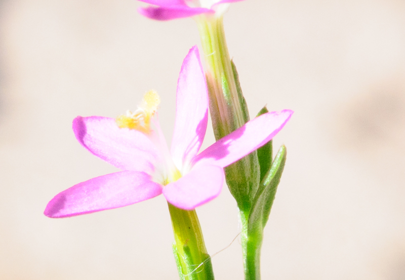
Note: Nothing particularly unusual about this photo, from a photographer perspective - its a snap of a flower in typical outdoor light.
After manual adjustment of exposure to -.1
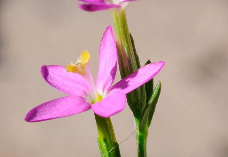
As has been said before, this sort of "way off" exposure doesn't always happen, but it does happen a lot (too much, in my opinion).
UPDATE: In this case, the flower is a crop - some surrounding area was darker and got cropped out. So, the overall exposure computed by auto-toner was not so bad. Still, I think the auto-toner should be able to auto-tone just the cropped region, since from a user perspective, that's the part of the image that is to be used. A scanned photo with the border croppped out, should not have the border be considered for auto-toning. Likewise for a photo of a couple of people standing in the light next to a dark area that gets cropped out, or a couple of people standing in the shade with a bright area nearby that gets cropped out... It wouldn't surprise me if a lot of times when people get a shock over auto-toning exposure result they are looking at a crop and don't realize the implication. I know the implication, but it just happened to me anyway, because I didn't realize I was looking at a crop.
If you agree about this, please add your .02 here:
Rob

Copy link to clipboard
Copied
Have you tried with RC4.2? I never could stand the auto-mutilation with 4 and 4.1 but I could swear Adobe have done something about it on RC4.2 even if it isn't documented in the release notes...much clearer images. It over wrote 4.1 so I cant compare.
Copy link to clipboard
Copied
finesse99 wrote:
Have you tried with RC4.2?
Yes I tried it. - as I said in post #94: seems same to me. - but I have no way to compare 1:1 either.

 AdChoices