Hi guys,
When Apple still offered their in-store one-to-one program, I used to sit with one of their "creatives" to help me with Aperture - Apple's defunct editing program. The one thing I was told, and still follow, was that Apple designs its screens, or monitors, to be used at full luminosity. And that's how I've set my screen up for years, ln particular for editing/printing. In fact, that's what I'm mosy confortable with.
By @raphaels28255986
In the Aperture era about 20 years ago, displays were not as bright as they were today — especially CRT displays, which were relatively dim. If the maximum luminance of those displays was in the 120-140 nits range, editing at that level probably would have produced acceptable prints.
But in the last 20 years, display luminance has constantly risen. Maximum luminance for affordable displays now can be 300–500 nits. Editing at that level will probably create dark prints, so editing for print at maximum luminance on a current display is not recommended.
The last big change has been HDR-capable displays, such as Apple displays with the XDR label. These can exceed 1000 nits, which is fantastic for true HDR viewing and editing (Adobe is working on true HDR previewing in photo apps), but not useful for print editing.
If you’re going to edit for print on a non-HDR display, calibrate/profile it at whatever luminance gets you predictable prints, probably between 90–120 nits.
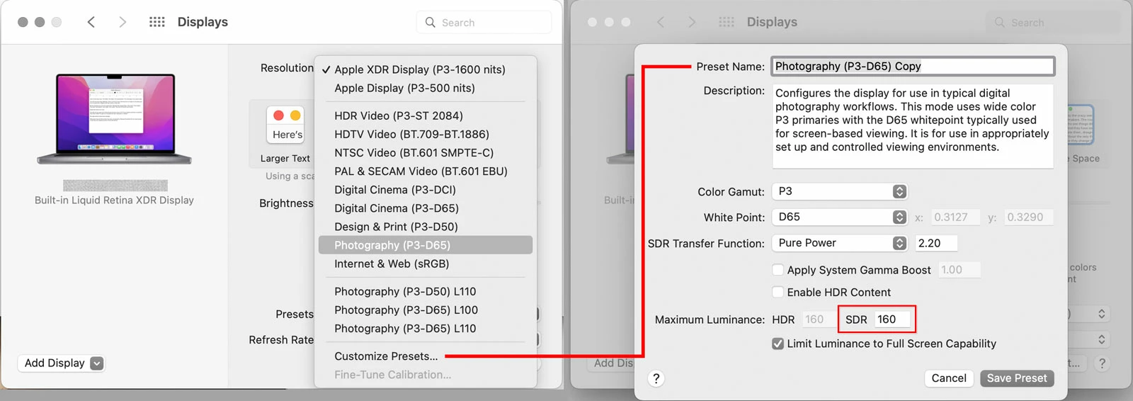
Some of the newest Apple desktop and laptop displays support a new thing called Reference Modes, presets for various types of media creation. If you end up working with one of these displays, you can simply choose the Photography (P3-D65) reference mode selected in the left picture below, which sets the gamut and white point and locks the luminance to 160 nits.
This is ultimately my answer to your question: I believe that the Photography reference mode represents what Apple would now recommend as good display settings for photography.
But I also think that mode’s 160 nits is designed for photos going to social media and websites viewed on screens, and too high for (the now less common medium of) print. So I use a reference mode that I customized: You can see a group of three Photography presets near the bottom of the menu on the left. Those are three customizations I created at different combinations of luminance and white point, because I’m still deciding what works best. But you can see that I tend to work in the 100–110 nits range for print.
I second Richard’s recommendation of Jeff Schewe’s books. When Jeff wrote The Digital Negative and The Digital Print, he had Ansel Adams’ The Negative and The Print in mind and wanted to create similar references for the digital era.
