 Adobe Community
- Home
- Muse (read-only)
- Discussions
- adobe muse and google chrome issues
- adobe muse and google chrome issues

Copy link to clipboard
Copied
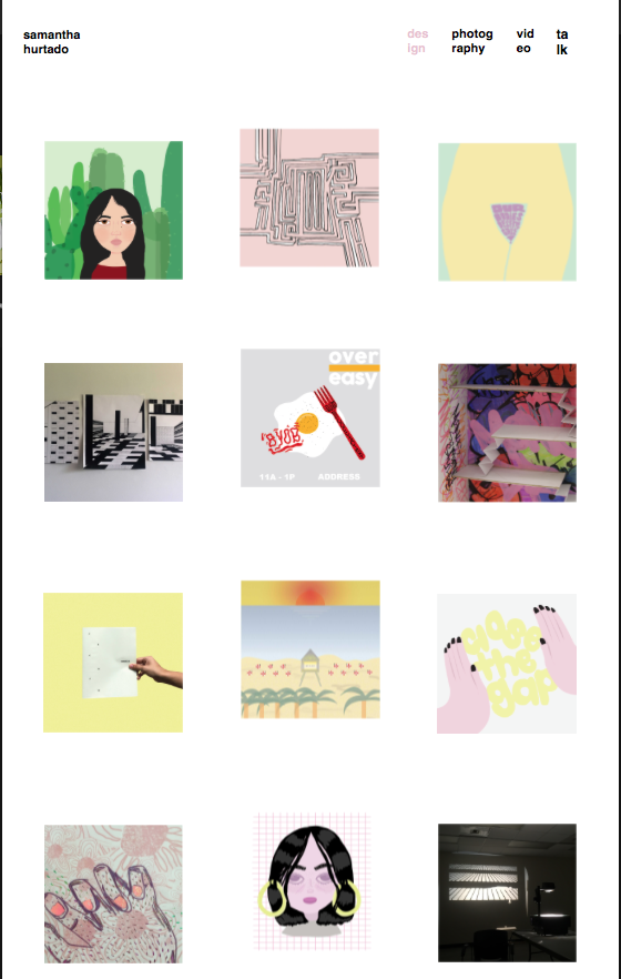
hi. so i published my adobe muse site using business catalyst. when i view the site on the preview option, it shows everything correctly, as it does on muse.
however, when i go to view my site on google chrome, the images are out of order, and the colors are way off (jpegs are RGB and all have all the same settings - but only some show up altered). on safari it all seems to be working fine though.
i have no SVG files. only 1 .OAM animation, jpegs, and text boxes.
you can view the site here: www.samanthahurtado.com


 1 Correct answer

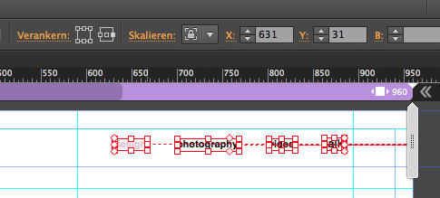
As soon as you set your menu buttons to resize to none and pin them to the container to the right, your misalignment is solved.
You may need a breakpoint at around 500 or so and change the menu appearance.
For mobile it could get a little bigger as well.
Best Regards,
Uwe
 8
Replies
8
8
Replies
8
Copy link to clipboard
Copied
ALSO - on the mobile version there are a lot of things off. it constantly changes, but photos will be out of order and on the wrong page. some things are missing. it is all a mess.
Copy link to clipboard
Copied
For me Safari and Chrome look the same, mobile looks a bit weird, as the first time opening works perfect, getting back from "photography", for example doesn`t let me tab anything.
Could you provide just your "home" page as a .muse via CC or dropbox?
Please only one page so we can have a look how you aligned your buttons:
I also would recommend to think over the menu buttons, if they should be better set to do not react responsive?
Best Regards,
Uwe
Copy link to clipboard
Copied

Copy link to clipboard
Copied
sammah1234 wrote
ALSO - on the mobile version there are a lot of things off. it constantly changes, but photos will be out of order and on the wrong page. some things are missing. it is all a mess.
because you used copy | paste to make your site now most of the svg images are all called paste

also phones don't like large svg files... they won't work because they use up to much power to load
Copy link to clipboard
Copied
how would i change this?
Copy link to clipboard
Copied
As soon as you set your menu buttons to resize to none and pin them to the container to the right, your misalignment is solved.
You may need a breakpoint at around 500 or so and change the menu appearance.
For mobile it could get a little bigger as well.
Best Regards,
Uwe

Copy link to clipboard
Copied
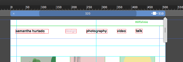
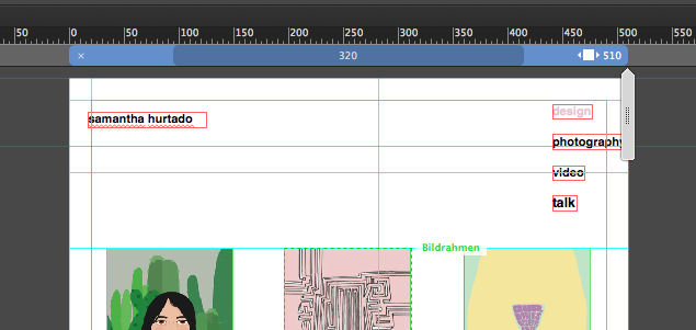
These are pure design issues. The menu, which runs out of shape on smaller widths, forces some images (not all) to move downward.
If you manage to considerably strip down your page considerably (no animations, only one page, if possible, delete the images within their container, but not the container itself), you may share it with us and we will have a closer look.
Please follow these advices: https://forums.adobe.com/docs/DOC-8652
Colors will stay exactly(!) the same, if they are using sRGB color profile, as it should be in the web.
Copy link to clipboard
Copied
 AdChoices