 Adobe Community
- Home
- Muse (read-only)
- Discussions
- Re: Buttons & Contact Form not repsonding to touch
- Re: Buttons & Contact Form not repsonding to touch

Copy link to clipboard
Copied
Currently developing a site using Muse (fully responsive).
All is going well - except when I view my contact and about pages on my mobile (these are the only pages I have finalised as of yet) everything works fine, I'm able to scroll etc. The navigation set within my master page (basic hamburger nav, with sign-in link and search bar just above) all respond to touch and function as they should.
However when testing content of the pages themselves I've found my buttons aren't responding touch, neither is the contact form or 'accordion' composition - no matter how hard I press, no luck whatsoever on my iPhone SE.
Whats confusing me even more is the fact that these features function normally on my iPad - I can't work out where I'm going wrong! I'm going to test it on an alternate device and see if it works on there, any insights in the mean time are greatly appreciated!
You can view both pages here:
Are you able to recreate the issue on your device? Does it work as it should on your end?
Any help people can offer earns my lifelong gratitude!


 1 Correct answer

And you placed your menu on master page? Inside the layer NAVIGATION?
And you are sure, that on your corresponding pages no elements are "by mistake" in this layer (you could detect it with the color of this element, if there is one, elements in this layer would appear with a red border as well)?
I suggest the following for secret purposes: Save your site as a new .muse, like "myfile-secret", delete all content that nobody should see by now, share this file.
It is possible, if you do so, that you f
...
 8
Replies
8
8
Replies
8
Copy link to clipboard
Copied
I could not reach it on my android-fairphone.
I see some smaller issues in layout here:

And realize some issues when reducing the browser window to mobile. Your accordion does not work as intended.
There might be something overlapping your content on smaller screens.
Watch out or send us a one page of this about-site to check.
Uwe
Copy link to clipboard
Copied
Yeah at this stage I haven't full refined the layout of the header-nav across all breakpoints - so thats why you're seeing the issues posted above.
When you say you could not reach it on your android - what couldn't you reach? the links provided above are directly to the two pages in question so you shouldn't need to use the hamburger menu - this also hasn't been finalised as of yet.
From what I can see theres not content overlapping - I will double check
Copy link to clipboard
Copied
But some elements might be (I say not, must be, before I see the .muse) laying on top of the buttons on mobile.
Because, even on desktop, shrieked to mobile version, I cannot click the buttons from the accordion.
My Android cannot find the address and sends me a "not being found, do you want to search?" in the www-address-field.
So at this point I ask, if you mind to send us a .muse so we can check. If one of us wins, ice-cold-beer from your town is accepted  .
.
Uwe

Copy link to clipboard
Copied
Well, I see that it can't be even accessed through a desktop browser.
Just resize your browser to phone size and you can see it behaving like a phone version site.
I have also noticed that apart from contact forms, I wasn't even unable to select the text till where your menu accordion reaches.
To mee, it most probably looks like layering issue.
Regards,
Ankush
Copy link to clipboard
Copied
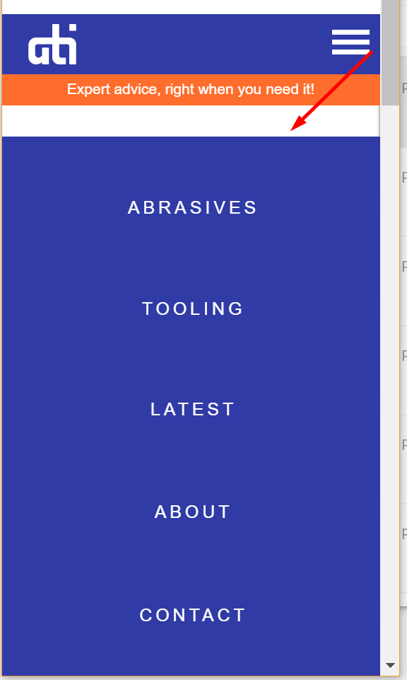
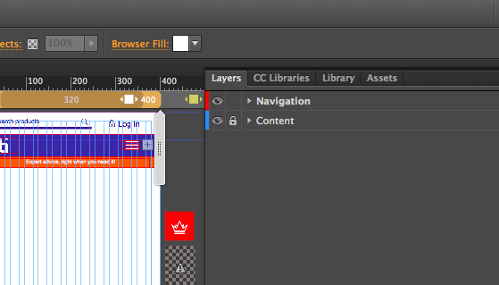
I cannot see how it could be a layering issue though - I currently have two layers : "Navigation" and "Content", with navigation stacked on top so it's always visible 'on top'. See image 1.
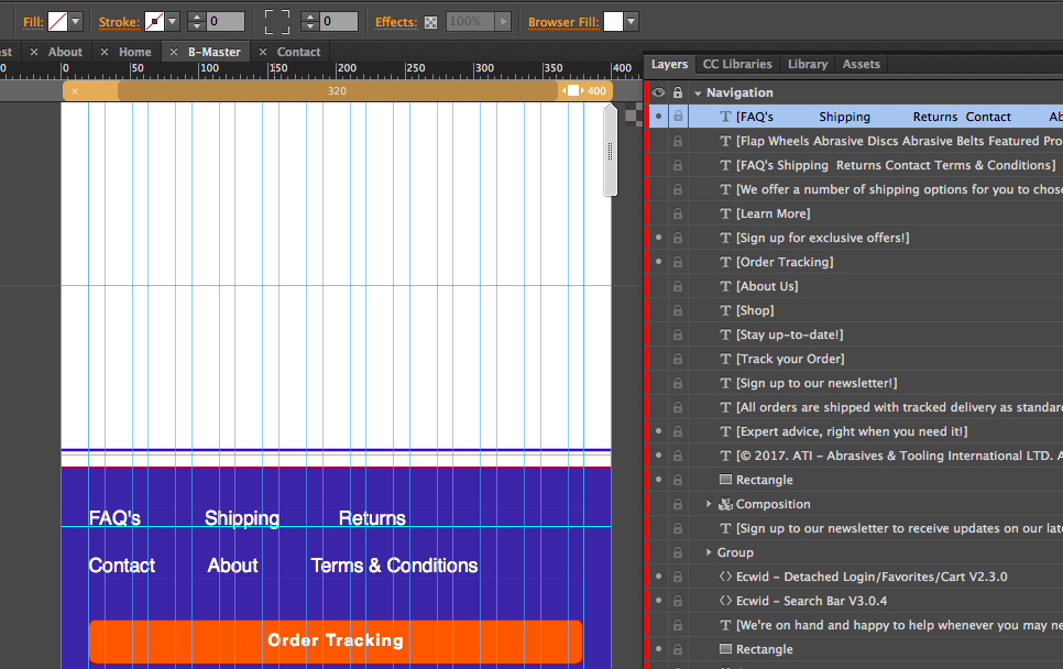
In the "navigation" layer, the footer nav that we're referring to (white text just above the orange bar/button in image 2) is sat at the very top of the layer, so it's currently on top of everything and the issue still persists. See image 2.
Copy link to clipboard
Copied
And you placed your menu on master page? Inside the layer NAVIGATION?
And you are sure, that on your corresponding pages no elements are "by mistake" in this layer (you could detect it with the color of this element, if there is one, elements in this layer would appear with a red border as well)?
I suggest the following for secret purposes: Save your site as a new .muse, like "myfile-secret", delete all content that nobody should see by now, share this file.
It is possible, if you do so, that you find the mistake by yourself – before you share this file you check again your menu-issue, of course.
Regards
Uwe
Copy link to clipboard
Copied
Thanks for the help!
I created a new site all together and began to rebuild the pages, in doing so I have found that the issue lies in the hambr navigation widget I was using in my smallest breakpoin.
strange because the element was layered beneath the text navigation situated in my footer
anyway problem solved - now to build a new hamburger nav!
Copy link to clipboard
Copied
I like it medium
 AdChoices