 Adobe Community

Copy link to clipboard
Copied
Hi all, I could not find this answer with the search so here I go.
I want to put a hover button on a front page, on that page there is a rectangle with a image in it. I want to put the button on that image and that works, but when I preview it in browser it looks good.......until I shrink the browser window to see how the website scales.....then the image scales beautifully but the button goes all over the place.
So my question is, can I fix the location of the button on the image?
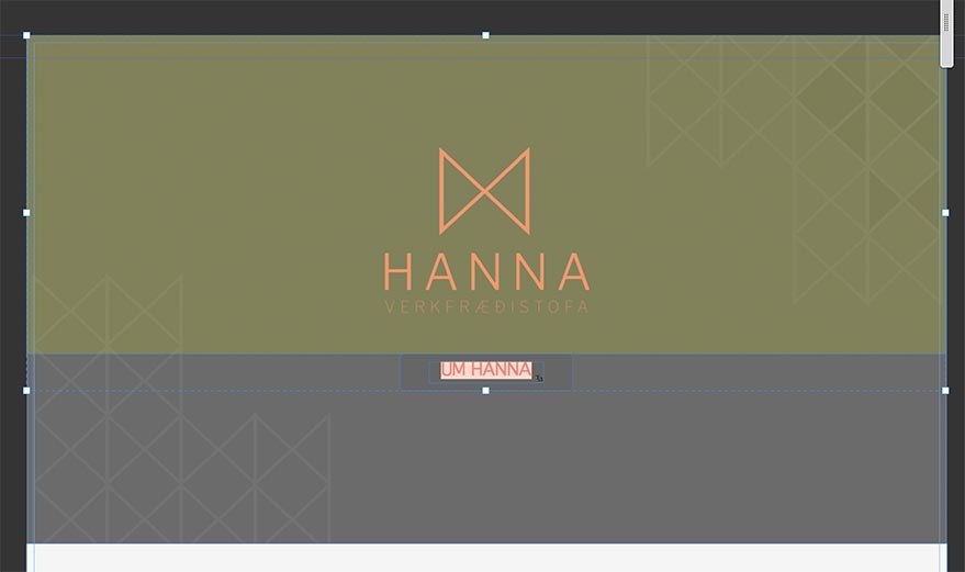
Here is the photo with button looking good

Here I have made the browser window smaller.... button is on its own trip to hell


 1 Correct answer

You won’t believe it at first glance, but Muse does exactly, what it is told to do:
You have a „greyish" image, which – because it’s an image – scales proportionally in width and height.
The text button („UM HANNA“) on top of this image stays in place, where it is supposed to stay.
What makes you think, this button should move synchronously to the image, which is placed behind it? It is the fact, that you know your layout and your intentions. Muse doesn’t. How should it? Muse is nothing but an appl
... 14
Replies
14
14
Replies
14

Copy link to clipboard
Copied
Shows us a .muse wit just these elements and nothing else on one simple page.
Share it via dropbox or via your CC folder.
Seems to be different resizing and/or pinning options.
Best Regards,
Uwe
Copy link to clipboard
Copied
Sorry for late answer, was traveling abroad.
here it the link Adobe Creative Cloud

Copy link to clipboard
Copied
Hey Snuddi,
If you see closely, the state button is at own place, however, it is the background image which is set as responsive, and gets resized and smaller in height as well as width while you scrub the window.
The solution for this can be to set the background as nonresponsive, or add multiple breakpoints and adjust the position of the object accordingly.
Regards,
Ankush
Copy link to clipboard
Copied
You won’t believe it at first glance, but Muse does exactly, what it is told to do:
You have a „greyish" image, which – because it’s an image – scales proportionally in width and height.
The text button („UM HANNA“) on top of this image stays in place, where it is supposed to stay.
What makes you think, this button should move synchronously to the image, which is placed behind it? It is the fact, that you know your layout and your intentions. Muse doesn’t. How should it? Muse is nothing but an application, and you have to tell it, what it has to do.
You have to find a way to tell Muse, what you are intending – and there is a way:
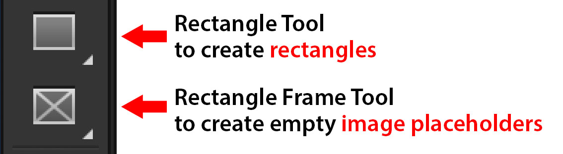
- Place an invisible, empty image frame ( i call it a „guiding frame“) onto the image. This frame should have the same width as the image below, shouldn’t overlap the text button and its scaling behaviour should be the same as the scaling behaviour of the image (therefore we don’t use a rectangle, but an empty image frame in this case. This frame is called "rectangle frame tool“ in the „Tools“ panel):
- Group this invisible image frame with the text button.
- Now, Muse should know, what you, what you are expecting to happen: The text button should now shift synchronously with the image behind, according to the „guiding frame“. Here a screenshot, where I have colourised the „guiding frame“ to make it more clear:
Two small hints at the end:
- As you can see, your text button („UM HANNA“) uses the system fonts "Calibri Light". This may be intentional. But normally you should avoid using system fonts, because they have to be converted to an image during output. Why? Read my answer #4 here: https://forums.adobe.com/thread/2357163
- In addition, this button consists of two elements: a rectangle and a text frame within. It would be better, to use a simple text frame, which can be styled effortlessly like the rectangle, containing the text.
Copy link to clipboard
Copied
Ohh thank you Gunter, your soulution was spot on, and even better with some sarcasm that is absolutely nessasecry 
Yes I know about the Calibri, but that is one of my sisters demands.
I will experience with the button, see what works and looks best.
Again, thank you a million.
Copy link to clipboard
Copied
Fine!
I think, you understood, that I never intended to be „sarcastic".
It is quite normal, that we expect Muse to handle elements in a certain way, because, due to our „obvious“ intentions, we don’t take into account, that there are other perspectives to look at it too:
If we place a text box vertically centred onto an image, we may do this in the expectation, that this text box remains in this centred position, when we resize the browser window. But why? Couldn’t it be „expected behaviour“ as well, that the text stays at its absolute (or relative) position to the page (not to the image), and while the image scales down, when resizing the browser window, the text is intended to keep its position?
Both assumptions are not right or wrong, both assumptions are possible. Muse has to guess, what we are intending in this case. If this guess is wrong, we have try telling Muse more precisely, what we want. And in many cases this can be done by using the technique, I described in my post 4.
Stay aMused!
Copy link to clipboard
Copied
Yes I completly understand your point, but as a newbiee my thinking was not like this.
Now my site is as I want it, except on the front page there is huge white space under the site...... in MUSE it is not 
Copy link to clipboard
Copied
Same procedure as above: Share a small sample .muse file with us!
Copy link to clipboard
Copied
Here is link to catalyst site http://hannaverk301.businesscatalyst.com
And here the must file
Copy link to clipboard
Copied
- Be aware, that the length of a Muse page is dynamical. That means, it grows, it the place is needed.
Your minimal(!!) page lengths are way(!) to high! The „Home“ page has a minimal(!!) length of 3043 px! That means, even if this length isn’t needed, it will not become shorter dynamically.
To fix this: Go to „Plan“ mode, right click every page and set the minimal page length to 500 px. If a page needs more length, it will be adapted automatically according to the content of the page. - If this is done, you will have still a small white border at the bottom of your pages. To eliminate this, go to your master page and set the the padding to „0“:

Then reduce the footer height, by dragging the „Footer indicator“ above the other indicators: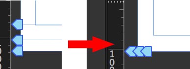
Check these settings for every page.
Now all should work as you want it to work.

Copy link to clipboard
Copied
Gunter,
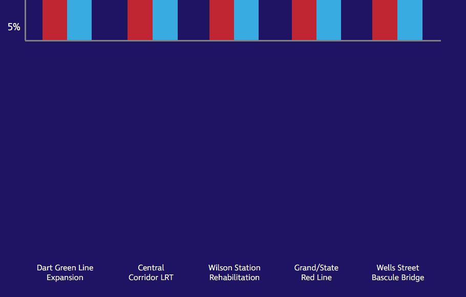
Here is the problem I am having. The text along the bottom of the screenshot should site right under the red and blue stripes. In program it looks great, when I preview it, I have nothing. I can't share the linke becasue the content can't be shared yet. Sorry. Its the contruction biz.
Copy link to clipboard
Copied
Of course you can share! It is a matter of seconds to delete all pages but one, replace text by „dfasd sdcfas“ and deleting other content. Note: You can delete images within their image frames, slides within a slide show.
By the way: Could it be that:
- The text unintentionally is defined as „Footer“, or if it really is meant as footer text, that
- your page is simply too long (–> "Page Properties/Minimal Height“)
- the option „Sticky Footer“ (–> "Page Properties/Sticky Footer“) is checked?
Copy link to clipboard
Copied
Gunter, here is the website. I still have plenty of work to do on the site. But can't get this little thing figured out. My site is set to 500 minimum height and has a sticky footer.
Thanks for the help.
Always a learning process.
Copy link to clipboard
Copied
I see. No footer issue in this situation.
This diagram is quite heavy stuff, I suppose, if created directly within Muse.
Could you please do the following:
- Delete all pages except the „Home“ page and its master page.
- Delete all(!) elements, except the ones, which are displayed in this screenshot:
- Check, if the issue is still present.
- Save this small Muse document as a new .muse file.
- Upload it to Dropbox, CC Files or a similar file sharing service and post the download link here. Then we can have a close look.
You may follow these instructions: https://forums.adobe.com/docs/DOC-8652
 AdChoices