 Adobe Community
- Home
- Muse (read-only)
- Discussions
- Re: How to fix text box causing rectangular to ext...
- Re: How to fix text box causing rectangular to ext...

Copy link to clipboard
Copied
Hi everyone,
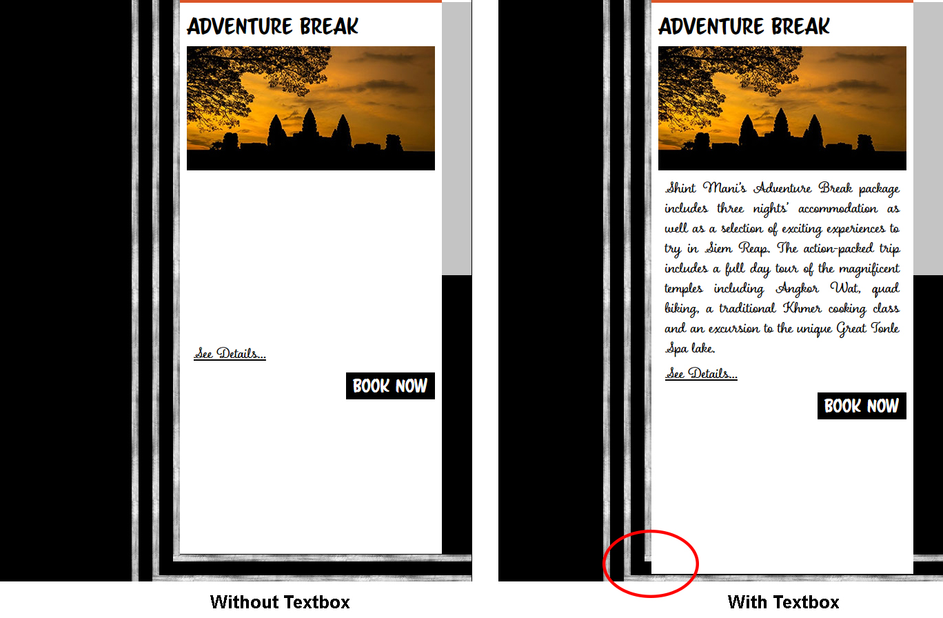
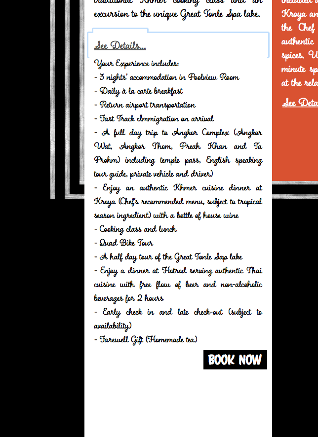
So I arrange a few assets in adobe muse like the right below. Everything looks fine in adobe muse, but once I preview of publish page, the white rectangular just extended by a bit. I was able to identify that it's the texbox that causes this problem. Does anyone know what might cause this reaction? My text box is very standard, I didn't apply any effects to it, or any paragraph settings. Please help me with this issue! Thank you for all your time and attention


 1 Correct answer

The trick: the trigger of the accordion – the name could not be turned around as well, I tricked it with a separate text layer below the accordion and set the trigger to no colour fill at all  .
.
If you want to turn the accordion, you must turn off "Can close all". When finished you must turn this on again.
Uwe
 5
Replies
5
5
Replies
5
Copy link to clipboard
Copied
We (or maybe just I) would need a reduced to your issue .muse via dropbox or CC or similar filesharing.
Copy link to clipboard
Copied
Dear all,
Here is the dropbox link for the file
it is on the Offers page
Here's the businesscatalyst link to see the problem
Copy link to clipboard
Copied
For now I could not reproduce your issue:
I only see your menu to be pinned to the browser (in the uploaded file - not in the file you provided to us - there it seems to be correct)
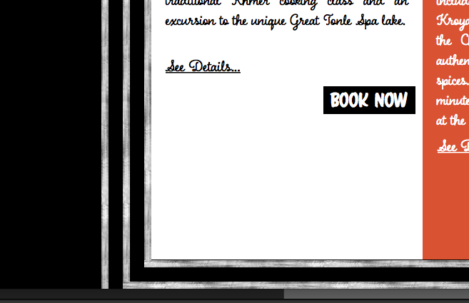
I see your issue with the middle orange text box.
I also realize this:
It is outside of your canvas – try to avoid this as much as possible. Some 3rdparty widgets are outside the canvas sometimes but never real content (don`t even know what it does here?)
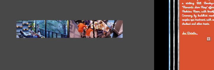
Instead I found your accordion at the bottom:
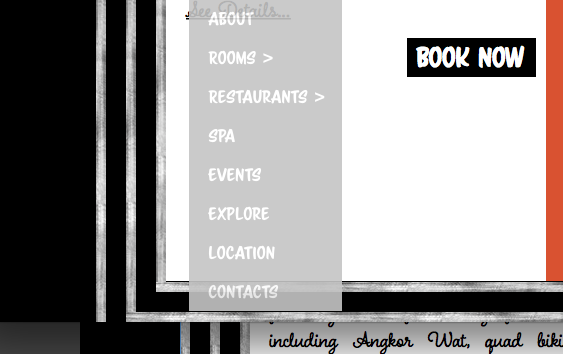
You also have some weird overlapping because of weird order of your elements in the layers palette.
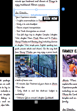
This top middle setting is grouped ( for what reason?) But not the others with the same functionality? Grouping is necessary for responsive stuff, when elements should behave and move together on fluid responsive pages. Your page is a fixed width layout.
If you want to "group" items to order them, put them in layers.
I tried now with the top down themes on this page. Watch this: Offers-german version and feel free to download.
I didn´t get it, why these rectangles behave strange at the bottom of the page. (I need some holiday in Angkor?)
I helped myself and placed this layer "Lines -Frame" (yes, I renamed it and all layers on this page) on top in the layers palette.
So this mistake is invisible now  .
.
Interested in how you proceed, …
Uwe
Copy link to clipboard
Copied
Thank you so much for your help! It seems my disorganisation causes things to behave weirdly, i'll certainly follow this layer organisation style now.
The inverted accordion thing is super cool too, as I didnt want to extend the page further at the bottom! thank you for showing the way to do it!
Copy link to clipboard
Copied
The trick: the trigger of the accordion – the name could not be turned around as well, I tricked it with a separate text layer below the accordion and set the trigger to no colour fill at all  .
.
If you want to turn the accordion, you must turn off "Can close all". When finished you must turn this on again.
Uwe
 AdChoices