 Adobe Community
- Home
- Muse (read-only)
- Discussions
- How To Vertically Position An Object Based On A Pe...
- How To Vertically Position An Object Based On A Pe...

Copy link to clipboard
Copied
Hi guys!
Basically, I want a code that does exactly what this widget does : Vertical Positioning Muse Widget - YouTube
The object must stay on the center and does not have to scroll with the browser.
I tried to use this code, but I did not figure out how to use it:
<div class="colelem" id="u4749" style="float:left; right:5px; top:50%; margin-top:-135px; position:fixed">
Does anyone has a code ready for that?
Thank you.


 1 Correct answer
<style>
#u000 {
position: absolute; /* or fixed */
top: 50vh;
left: 50%;
margin-top: -00px;
margin-left: -00px;
}
</style>
Where:
- #u000 = The ID of your object.
- margin-top = Half the height of your object with a negative value.
- margin-left = Half the width of your object with a negative value.
 8
Replies
8
8
Replies
8

Copy link to clipboard
Copied
Why don`t you use the widget?
Copy link to clipboard
Copied
Hi,
Thanks for your message. Actually, I need pay $109,99 for a year subscription to get only that widget, That does not make sense at all doing that.
Thanks anyway.

Copy link to clipboard
Copied
Hi Luno,
Agreeing to what fotoroeder said, Yes why don't you try the same widget or anything similar to it.
I was browsing through the internet to find a solution for you and got this discussion on MuseThemes forum - Center elements on the page | MuseThemes Forum.
Please see if this helps.
Regards,
Ankush
Copy link to clipboard
Copied
<style>
#u000 {
position: absolute; /* or fixed */
top: 50vh;
left: 50%;
margin-top: -00px;
margin-left: -00px;
}
</style>
Where:
- #u000 = The ID of your object.
- margin-top = Half the height of your object with a negative value.
- margin-left = Half the width of your object with a negative value.
Copy link to clipboard
Copied
Hello,
Well, I tried that and does not works.
Any other idea?
Thank you 
Copy link to clipboard
Copied
*** UPDATE ***
It works. I did not know I had to inspect the element to know its ID. I was using the ' graphic style panel.
But now, I face another problem. It does not works across the breakpoints. I think it is because I changed the logo size.
How can I make that work across the breakpoints?
Thank you.
Copy link to clipboard
Copied
If you use fluid breakpoints, then you do not need a piece of code.
<style>
#u000 {
position: absolute; /* or fixed */
top: 50vh;
left: 50%;
margin-top: -00px;
margin-left: -00px;
}
</style>
Instead, place the object in the center and use pinning on the page.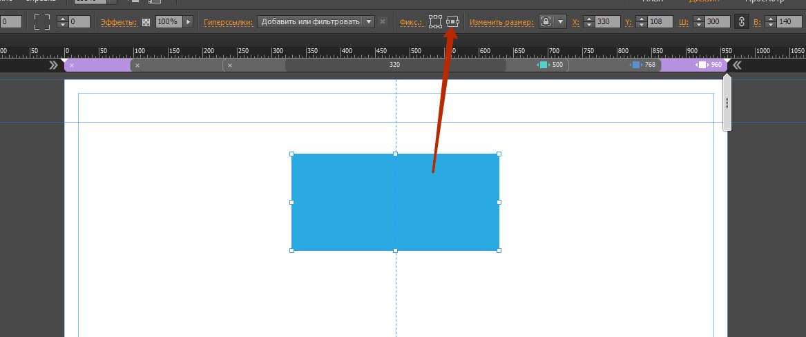
If you do not change the size of the object at different breakpoints, then this code will be enough, and it will work fine.
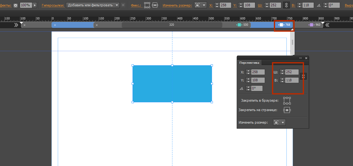
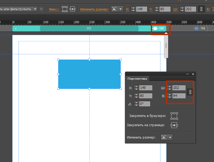
If you need to resize, you must write code for each breakpoint, with different sizes. As you can see, in the screenshot above there are 3 breakpoints - 960; 768; 500. At each breakpoint, I changed the size of the object.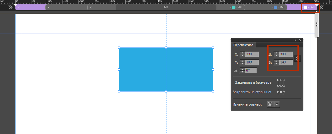
The code will look like this:
<style>
/ * For screens larger than 960x * /
@media all and (min-width: 960px) {
#u94 {
position: absolute;
top: 50vh;
margin-top: -70px;
}
}
/ * For screens less than 960px * /
@media all and (max-width: 960px) {
#u94 {
position: absolute;
top: 50vh;
margin-top: -70px;
}
}
/ * For screens less than 768px * /
@media all and (max-width: 768px) {
#u94 {
position: absolute;
top: 50vh;
margin-top: -56px;
}
}
/ * For screens less than 500px * /
@media all and (max-width: 500px) {
#u94 {
position: absolute;
top: 50vh;
margin-top: -47px;
}
}
</style>
Learn CSS CSS Tutorial 
Copy link to clipboard
Copied
Well, I will have a look.
Thank you very much, I appreciated it.
Have a good one,
Iuno
 AdChoices