 Adobe Community
- Home
- Muse (read-only)
- Discussions
- I don't want to develop a desktop site and a mobil...
- I don't want to develop a desktop site and a mobil...

Copy link to clipboard
Copied
I have been happily developing Muse sites for a few years now. I am certainly not an expert, that's why I have this problem. My sites are coming up with "not mobile or smartphone friendly" by Google search. Therefor I have reproduced some sites in the "phone" mode as well as desktop mode. This has solved the Google search issue. However, this is a pain in the neck  . Some of my sites require constant updates of images and text. This now is twice as much work for me with no extra thanks. Am I doing something wrong or should I move over to WordPress that automatically does this for me.
Thanks
Kel


 1 Correct answer

Yackid wrote
This now is twice as much work for me with no extra thanks.
Kel
so sync the text in the phone layout to the text in the main layout and they both update when you change one
 5
Replies
5
5
Replies
5

Copy link to clipboard
Copied
Hi Kel,
of course it depends on your time you want to spend and it depends on the site structure and on your design.
Why not try to "move your sites from adaptive to responsive websites.
If you follow some rules this should be possible. One of these rules would be to stay with fixed width breakoints as much as possible.
For mobile you would need fluid width breakpoint(s), so from then you would have to change only one time your content.
If you like, share a link of an example website au are thinking of, and we could have closer look, if this is possible without too much hazzle ( what we want to avoid as much as possible).
Best Regards,
Uwe
Copy link to clipboard
Copied
thanks for your quick response, here is an example that Google said was not mobile friendly until I duplicated it as close as possible to the phone option. however you will need to view it in desktop mode.i believe that I followed the correct rules of Muse staying within the breakpoints. Yackandandah Motor Inn
Kel
Copy link to clipboard
Copied
Should be manageable  .
.
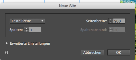
You start with a new site like this (by default I guess):
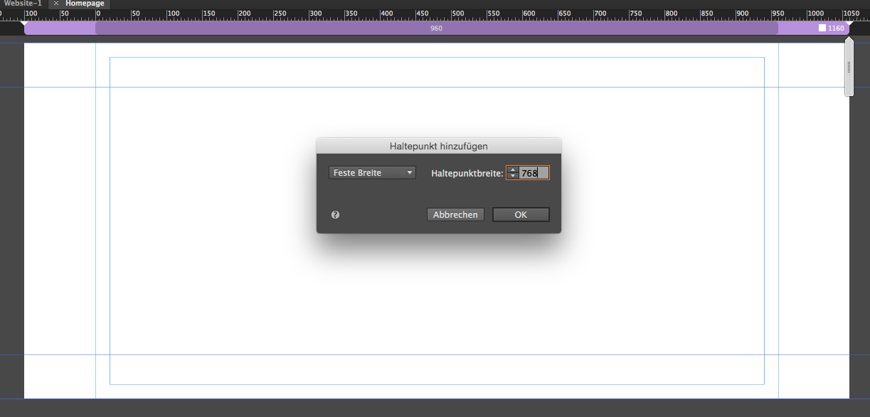
2. add a fixed width breakpoint at 768 (yes your site starts with 1160 although you started with a new site at 960)
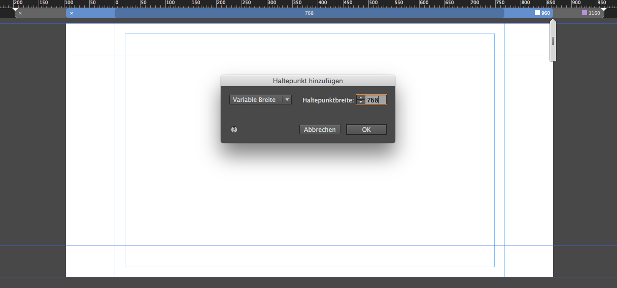
3. add a fluid width breakpoint at 768 (again yes, same px but fluid width)
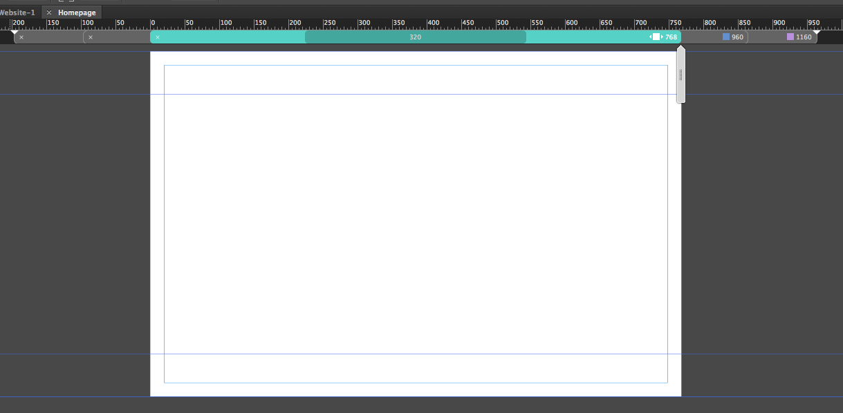
4 set minimumw width by breakpoint properties. So it should like this. finally:
Does this help? For the beginning?
Be aware, that everything important should be in between these thin blue lines.
If you need further assistance, let us know.
Best Regards,
Uwe

Copy link to clipboard
Copied
If your site requires active administration - often changing or adding content, photos, files, then such a site should be done on CMS as a Wordpress. You can not even doubt it. Muse is suitable for small static sites or landings that do not require active administration, or for creating prototype designs. Muse is more a program for designers and in a very small degree for the development of sites.
Copy link to clipboard
Copied
Yackid wrote
This now is twice as much work for me with no extra thanks.
Kel
so sync the text in the phone layout to the text in the main layout and they both update when you change one
 AdChoices