 Adobe Community
- Home
- Muse (read-only)
- Discussions
- Re: Problem with Muse CC / phone. Works fine with ...
- Re: Problem with Muse CC / phone. Works fine with ...

Copy link to clipboard
Copied
Hello,
My problem is that I made desktop version for my homepage www.ajfriman.com that works fine.
I made -> page -> add alternate layout -> phone
Then I made simple scroll version for phone.
Works with my phone but,
It doesn't work with other android phones correctly, Images are small and do not scale accordingly.
I have widget called, QooQee that prevents the horizontal movement.
Width is 380, pictures and text are size responsive width and length and pin to page is fluid.
Can you help me to make the page work with all the smart phones?
Thanks,
AJFriman.
.


 1 Correct answer

Your phone layout shouldn´t be set to be responsive btw. I don`t know devices with 200 btw.
It´s only one width and this should be 320.
Everything should be positioned well into this 320 width and this should pretty much do the job.
Uwe
 9
Replies
9
9
Replies
9
Copy link to clipboard
Copied
Without seeing too much, except the website, I recommend minimum width of 320 instead 0f 320.
This will not solve your issue, though.
You normally do not need a widget to prevent horizontal scroll, if you designed properly.
You don`t need it from qooqee.
Not with this website:
Did I miss something? Works fine? Where?
Best Regards,
Uwe
Copy link to clipboard
Copied
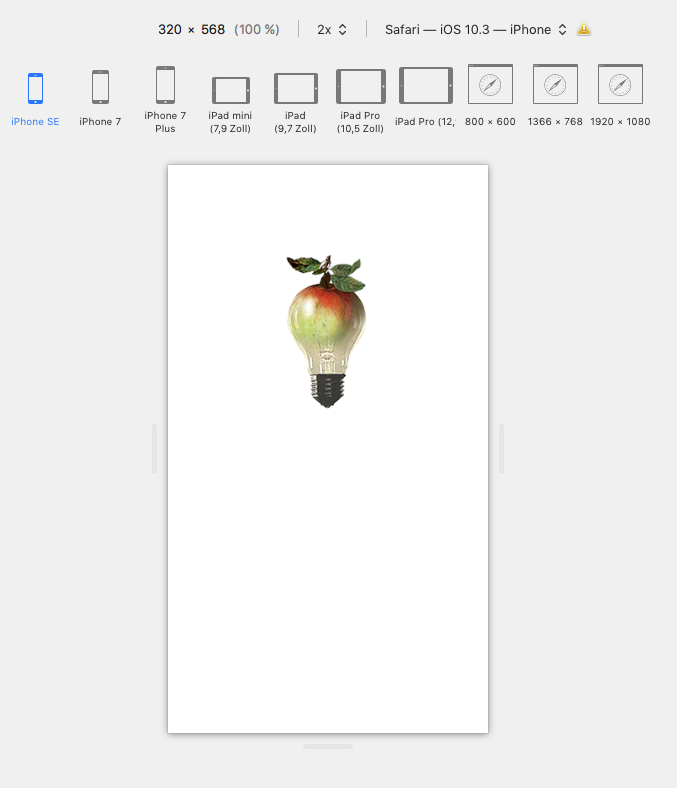
Clicking the apple/pear takes long before images appear.
Your issue is simply a layout issue, till 380 it works fine.
Set your minimum width as recommended in previous post and set up your design that it fits.
Uwe
Copy link to clipboard
Copied
Hello,
Thanks for reply,
Sorry, I meant the the page www.ajfriman.com/art.html
There are the artworks at display and the pictures are small but the the text is correct.
It works fine in my iPhone 6s, safari, chrome and dolphin browsers. I refreshed them and works fine with me, but others who I have asked the page shows pictures small and do not scale to the ends of the screen width.
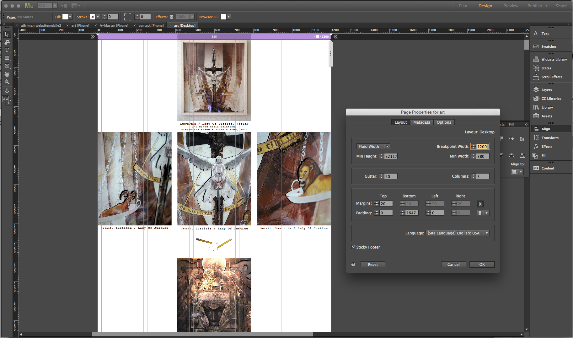
It is almost as if the phone layout shows the pictures 1/3 size. Could it be somehow connected to my desktop layout where I have details of the artworks, three horizontally making it almost the same ratio ?
What do you think?
Thanks,
AF
Copy link to clipboard
Copied
No.
Feel free to follow my suggestions and change your minimum width in your phone layout from default 380 (I do not understand, why Adobe set this to 380 either  ) to 320 and check your layout if it still fits.
If not you have the answer.
You see in my screenshot what happens at 320, right?
Uwe
Copy link to clipboard
Copied

Copy link to clipboard
Copied
Changed it to 320. Don't work. Pictures remain small in smartphones.
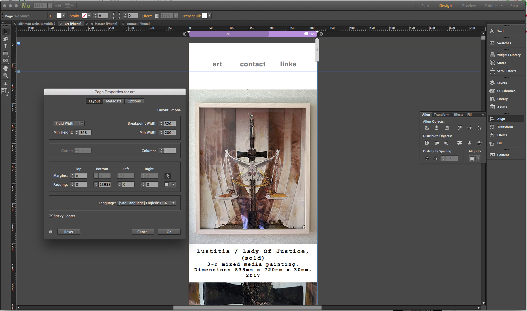
This is the phone layout.
here is the desktop layout.
Copy link to clipboard
Copied
Your desktop layout is centered and your phone layout is left aligned.
Try to center it as well in Site properties.
Uwe
Copy link to clipboard
Copied
Your phone layout shouldn´t be set to be responsive btw. I don`t know devices with 200 btw.
It´s only one width and this should be 320.
Everything should be positioned well into this 320 width and this should pretty much do the job.
Uwe
Copy link to clipboard
Copied
I will change it to 320 and go from there.
I post my success or failure
 AdChoices