 Adobe Community
- Home
- Muse (read-only)
- Discussions
- The Chrome Mobile now cannot load any of My Muse W...
- The Chrome Mobile now cannot load any of My Muse W...

Copy link to clipboard
Copied
The Muse Website that i created suddenly not showing on Chrome Mobile now. It became
an empty white screen which appears on my android (using Chrome) smartphone.
The Muse Website pages cannot load any text, any photo, any javascript which means the entire website cannot be viewed if using Chrome Mobile.
Safari and Windows Mobile are not having problems. They are working just as normal when to view the Muse Website pages.
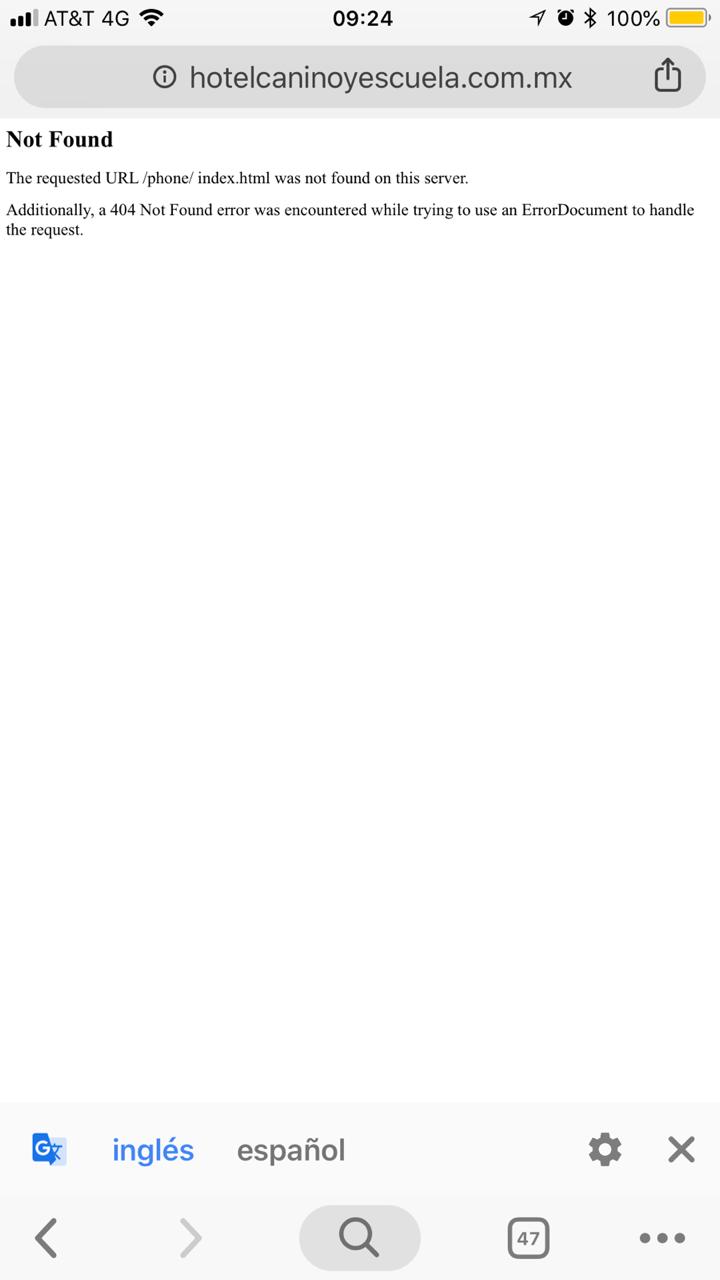
Please note this happened to Muse Website Page only. Later i browse to Muse Mobile Site page is also fine which the link is ended with phone/index.html.
The Chrome Mobile now cannot load any of My Muse Website pages. How to fix it?
Thank you.


 1 Correct answer

SOLVED FIXED WORKS
ADD (copy) This code below, to the master page properties (under Metadata tab) in the HTML for Head Text Area
<script type="text/javascript"><!--
var checkBrowser=navigator.userAgent.toLowerCase();var isAndroid=checkBrowser.indexOf('android')>-1;var isiPhone=checkBrowser.indexOf('iphone')>-1;var isiPod=checkBrowser.indexOf('ipod')>-1;var isiPad=checkBrowser.indexOf('ipad')>-1;var isMobile=checkBrowser.indexOf('mobile')>-1;if(isiPhone||isiPod){document.location="phone/inde
...
 42
Replies
42
42
Replies
42

Copy link to clipboard
Copied
As my muse websites all load fine on chrome it would be nice to get a link to check and see and search somehow kind of deeper about your issue. Did you create responsive or adaptive sites? And so on …
Kind Regards,
Uwe
Copy link to clipboard
Copied
Adobe Muse version 2018.1 Release
2018.1.0.266
Hi Uwe,
The website is made responsive with fluid width has different set points for various screen sizes.
There is no problem to use a laptop and Chrome PC browsing the site. Everything works like normal.
When browse the site with Android phone and Chrome Mobile, the website index.html does not show anything
but completely blank which never happened before. It does not run the javascript like this basic.
<script type="text/javascript">
<!--
if (screen.width <=600) {
window.location="http://mysite.com/phone/index.html";
}
//-->
</script>
So it just stops working. It does want going to website index page. It will not be redirected to the mobile site index page
whatsoever.
But when i type into browser with url address which ends with phone/index.html, Chrome Mobile loads the page and opens like normal.
I have tried site settings on Chrome Mobile, and switched to desktop version. It is still completely blank.
Thank you for taking time to answer my question.
Copy link to clipboard
Copied
As it seems to be the same question here:
Muse Websites Not Displaying on Chrome (Mobile)
I have no idea about, how I could help here. Muse does the code for you. It works on my mobile only when adding that …/phone - it does not work in its expected way. That seems to be a question for those coders out there.
Did you use any 3rd party widgets for some reason?
Sorry, but anyway
Kind Regards,
Uwe

Copy link to clipboard
Copied
Don't know how relevant this is, or how Muse users will get around the problem, (have not seen the code Muse generates, and have no intentions of doing so, because I wish to retain my sanity).
Chrome, and by default MS Edge in future, are now incorporating, (enforcing) more secure page redirect methods to prevent end users being 'hi-jacked' to 'other' sites/or sections of. This is probably to force developers to use server redirects which can be better indexed by search engines.
Sorry, I know the info is not much use to Muse users, but it may help to explain what is happening, (though I have to ask myself, if it is working for tablet devices, why not phones  ).
).

Copy link to clipboard
Copied
Hello fotoroeder!
I am now experiencing similar issue. I have a current MUSE site hosting at GoDaddy that still appears to be functioning. However, when I review the revisions to the site in MUSE all I get is a white screen. Even when I view index.hmtl files that are 6 months old the brower(s) just show white screen. Suggestions? Many thnaks, J Schirmacher
the reference site: bodyinmotion.us
Copy link to clipboard
Copied
EXIST ANYMORE).
EXPORT TO YOUR FILE SYSTEM.
You need to comment out the Business.catalyst reference and just leave the
file version of the link,
ON EVERY PAGE. Look for then comment out the
Business.catalyst reference, like i've done here. Remember, yours may be
different from mine.
This works, But not a good fix, if you change pages often. Good Luck, John

Copy link to clipboard
Copied
jQuery has been upgraded several times since Muse ended in 2018. For best results, export your Muse project to HTML. Change the jQuery library link to the latest minified version from jQuery's official CDN below
As of October 2022, jQuery's latest stable release is 3.6.1:
<script src="https://code.jquery.com/jquery-3.6.1.min.js" integrity="sha256-o88AwQnZB+VDvE9tvIXrMQaPlFFSUTR+nldQm1LuPXQ="crossorigin="anonymous"></script>
Alt-Web Design & Publishing ~ Web : Print : Graphics : Media

Copy link to clipboard
Copied
Help Help I am serious problem because I get white mobile in google chorme android is the only one that is not working because before if they worked super well and now the latest version google chrome android mobile was updated until there was that affection nothing is seen all this is the most serious but very serious in the world because most of them I did a lot of web clients large companies, small and user, now they called me to inform me that they do not see anything in mobile and now that I am going to do with big problem but very big I need who solves me update the javascript code for mobile redirect is urgently urgent urgently please look for adobe engineer muse to solve urgent is massive global please help help who can update the code to redirect mobile in javascript.
Copy link to clipboard
Copied
Simply re-build your site responsively and you won't have these problems.
Alt-Web Design & Publishing ~ Web : Print : Graphics : Media

Copy link to clipboard
Copied
Hi there,
Just had the same problem understand that its best to build your site in a responsive design. However I have built a few sites using the DESKTOP | TABLET | PHONE options (www.stormflame.co.uk).
But found this js code that may help you out go to the following link to redirect your sites to mobile and tablet versions: Redirect to Mobile Website - SUPER Easy Tutorial - BJD.
I just opened the index code (desktop copy) in dreamweaver and replace this part of the code seen near the top of the page:
<script type="text/javascript">
// Redirect to phone/tablet as necessary
......... ("desktop","tablet/index.html","phone/index.html");
with the code mentioned above in the link, along with the js script file thats connected to it.
It seems to work for me so i have a bit of time to re-build this site in a responsive format or choose something else to build it in. Let us know if this works for you?
Copy link to clipboard
Copied
Make sure to test in all browsers and devices. Unless you specifically disable it in your security settings, redirect scripts are ignored by Android Chrome. It probably won't be long before other browsers do the same thing.
Alt-Web Design & Publishing ~ Web : Print : Graphics : Media
Copy link to clipboard
Copied
SOLVED FIXED WORKS
ADD (copy) This code below, to the master page properties (under Metadata tab) in the HTML for Head Text Area
<script type="text/javascript"><!--
var checkBrowser=navigator.userAgent.toLowerCase();var isAndroid=checkBrowser.indexOf('android')>-1;var isiPhone=checkBrowser.indexOf('iphone')>-1;var isiPod=checkBrowser.indexOf('ipod')>-1;var isiPad=checkBrowser.indexOf('ipad')>-1;var isMobile=checkBrowser.indexOf('mobile')>-1;if(isiPhone||isiPod){document.location="phone/index.html";}
if(isiPad){document.location="phone/index.html";}
if(isAndroid&&!isMobile){document.location="phone/index.html";}
if(isAndroid&&isMobile){document.location="phone/index.html";}
if(blackberry||opera||mini||palm||smartphone||iemobile){document.location="phone/index.html";}
if(xoom||playbook||tablet||kindle){document.location="phone/index.html";}</script>
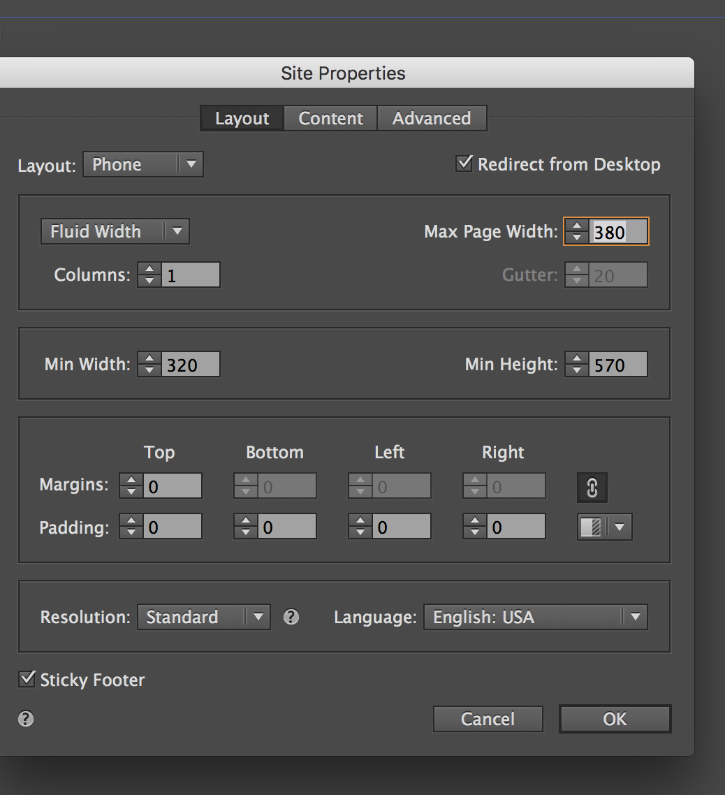
THEN in the Main File goto File menu then Site Properties. under layout tab, use the layout drop down to go to the phone layout, then UNCHECK Redirect From Desktop checkbox. this gets rid of muse's redirect code and uses the javascript (above) on the master page. to do the redirect. WORKS!!! yea........Boooooyyyy....!!!!

Copy link to clipboard
Copied
Thanks!!!
Copy link to clipboard
Copied
Hi John,
Same as amplan1213, the solution in Android works well but in iphone won't, no matter if it's safari or chrome.
Thanks!!
Copy link to clipboard
Copied
SOLVED FIXED WORKS
ADD (copy) This code below, to the master page properties (under Metadata tab) in the HTML for Head Text Area
<script type="text/javascript"><!--
var checkBrowser=navigator.userAgent.toLowerCase();var isAndroid=checkBrowser.indexOf('android')>-1;var isiPhone=checkBrowser.indexOf('iphone')>-1;var isiPod=checkBrowser.indexOf('ipod')>-1;var isiPad=checkBrowser.indexOf('ipad')>-1;var isMobile=checkBrowser.indexOf('mobile')>-1;if(isiPhone||isiPod){document.location="phone/index.html";}
if(isiPad){document.location="phone/index.html";}
if(isAndroid&&!isMobile){document.location="phone/index.html";}
if(isAndroid&&isMobile){document.location="phone/index.html";}
if(blackberry||opera||mini||palm||smartphone||iemobile){document.location="phone/index.htm l";}
if(xoom||playbook||tablet||kindle){document.location="phone/index.html";}</script>
THEN in the Main File goto File menu then Site Properties. under layout tab, use the layout drop down to go to the phone layout, then UNCHECK Redirect From Desktop checkbox. this gets rid of muse's redirect code and uses the javascript (above) on the master page. to do the redirect. WORKS!!!
In this line of code it had a space between the / and index if(isiPhone||isiPod){document.location="phone/ index.html";}
Recopy the code above (It is Now Fixed) and Try Again,
Copy link to clipboard
Copied
ALSO, that other code is just for Muse Desktop/Phone websites, If you are using Muse Desktop/Tablet/Phone websites.
This code below may be helpful. Use it INSTEAD of the other code.
<script type="text/javascript"><!--
var checkBrowser=navigator.userAgent.toLowerCase();var isAndroid=checkBrowser.indexOf('android')>-1;var isiPhone=checkBrowser.indexOf('iphone')>-1;var isiPod=checkBrowser.indexOf('ipod')>-1;var isiPad=checkBrowser.indexOf('ipad')>-1;var isMobile=checkBrowser.indexOf('mobile')>-1;if(isiPhone||isiPod){document.location="phone/index.html";}
if(isiPad){document.location="tablet/index.html";}
if(isAndroid&&!isMobile){document.location="tablet/index.html";}
if(isAndroid&&isMobile){document.location="phone/index.html";}
if(blackberry||opera||mini||palm||smartphone||iemobile){document.location="phone/index.htm l";}
if(xoom||playbook||tablet||kindle){document.location="tablet/index.html";}</script>

Copy link to clipboard
Copied
John, this worked for me! I had to uncheck the redirects on both phone and tablet for this to function properly.
Thanks for the code!

Copy link to clipboard
Copied
Sweet, you're the man! Thanks, John!
Copy link to clipboard
Copied
You know that none of this code is necessary at all, don't you?
And of course you know Muse is under EOL?
Nevertheless Muse still works and as long as you keep 4rd party widgets out it works pretty well in my cases.
Kind Regards,
Uwe
Copy link to clipboard
Copied
Now using John Vandervlugt's provided script as above, and it brings me back the Muse website on Chrome Mobile.
The site shows up again on the Android Phone and redirects to site.com/phone/index.html
Thank you so much for the solution you provide my Muse site. It is sincerely appreciated.
Muse had been an awesome journey.
Just getting started Webflow few days ago.

Copy link to clipboard
Copied
Hi John,
I tried out your solution and I was lucky. It works out fine in all android browsers.Thank you
But then I went to this page with an iphone and ,URL not found‘ appears.
Do you have any idea? I use two mastersites. Maybe this causes issues.
Best regards
Iris
weinreich-design.de
Copy link to clipboard
Copied
it Keeps adding the space to that code when i save it. so i moved that line of code down
<script type="text/javascript"><!--
var checkBrowser=navigator.userAgent.toLowerCase();var isAndroid=checkBrowser.indexOf('android')>-1;var isiPhone=checkBrowser.indexOf('iphone')>-1;var isiPod=checkBrowser.indexOf('ipod')>-1;var isiPad=checkBrowser.indexOf('ipad')>-1;var isMobile=checkBrowser.indexOf('mobile')>-1;
if(isiPhone||isiPod){document.location="phone/index.html";}
if(isiPad){document.location="phone/index.html";}
if(isAndroid&&!isMobile){document.location="phone/index.html";}
if(isAndroid&&isMobile){document.location="phone/index.html";}
if(blackberry||opera||mini||palm||smartphone||iemobile){document.location="phone/index.htm l";}
if(xoom||playbook||tablet||kindle){document.location="phone/index.html";}</script>
Copy link to clipboard
Copied
That time it worked copy the code above, or just remove that space between / and index.
Copy link to clipboard
Copied
<script type="text/javascript"><!--
var checkBrowser=navigator.userAgent.toLowerCase();var isAndroid=checkBrowser.indexOf('android')>-1;var isiPhone=checkBrowser.indexOf('iphone')>-1;var isiPod=checkBrowser.indexOf('ipod')>-1;var isiPad=checkBrowser.indexOf('ipad')>-1;var isMobile=checkBrowser.indexOf('mobile')>-1;
if(isiPhone||isiPod){document.location="phone/index.html";}
if(isiPad){document.location="tablet/index.html";}
if(isAndroid&&!isMobile){document.location="tablet/index.html";}
if(isAndroid&&isMobile){document.location="phone/index.html";}
if(blackberry||opera||mini||palm||smartphone||iemobile){document.location="phone/index.htm l";}
if(xoom||playbook||tablet||kindle){document.location="tablet/index.html";}</script>
i moved that line of code down this should save correctly, so you should be able to just copy this code. If you are using Muse Desktop/Tablet/Phone websites.
-
- 1
- 2
 AdChoices