Copiar link para a área de transferência
Copiado
My text just seems so "plopped on." Even with gradients, dropshadows etc. Like the cover I did Betrayed Heroes. It's got a gradient and it just looks so plopped on.
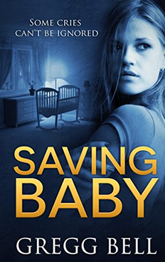
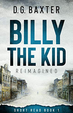
Other covers like Saving Baby (I did not do the cover), The Last Monument, Billy the Kid, they all have such great text that looks so professionally done. How can I make text like that?
Thanks.
Copiar link para a área de transferência
Copiado
There are lots of text/font-type buttons in the graphics panel – see image below. After typing your text simply click on a button to see the effect.
You can also choose from the many options in the Styles panel.
Copiar link para a área de transferência
Copiado
Thanks 99jon and I'm very sorry for the late reply. (I thought no one had answered.) Your reply is very helpful.
Copiar link para a área de transferência
Copiado
Hi thanks for replying. Glad to help. I also have a video demo on using photos to create text which may be of interest.
Encontre mais inspiração, eventos e recursos na nova comunidade da Adobe
Explore agora