Now in Beta: New Premiere Pro Spectrum UI
Copy link to clipboard
Copied
We’re proud to announce a new look for Premiere Pro! In Beta — available today — Premiere Pro is themed and styled using Adobe’s Spectrum design with a new modern look across the entire app.
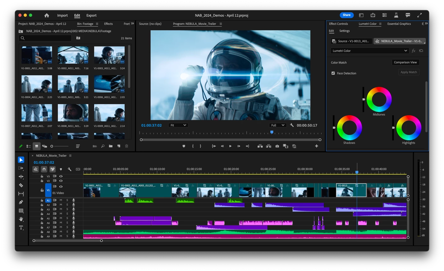
Premiere Pro now includes three different themes: Darkest, Dark and Light.
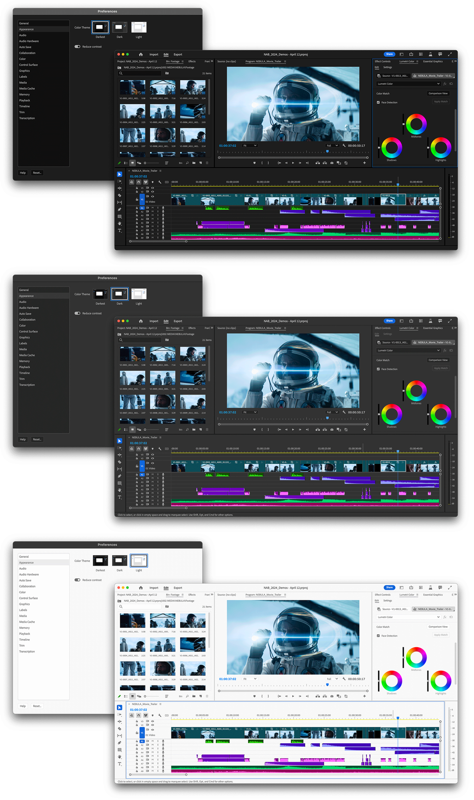
There’s also a new toggle for switching between a high-contrast mode for easier visibility and accessibility or a low-contrast mode for focusing on your content.
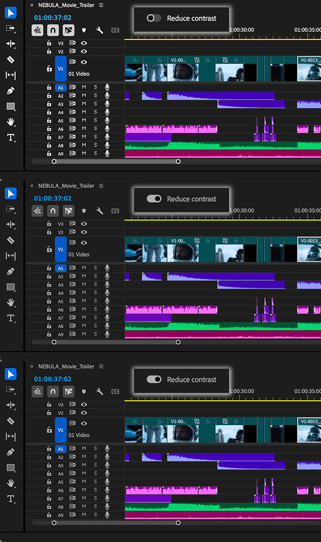
With this design system in place, you’ll see more visual continuity across Adobe applications, better legibility, and easier UI interactions. The Spectrum design system unifies Adobe’s app design behind principles that make it inclusive, scalable, and focused.
Questions to our beta community:
- Is there one theme you prefer over the others?
- Do you switch between themes?
- Is there anything you miss from the previous interface design?
- Is the new design confusing or distracting? If so, in what way?
We want to know what you think. Please join the conversation below.
Copy link to clipboard
Copied
Love, thank you !
The darkest if my fave, easier on the eyes, standing by for the spectrum update on AFX as well
the UI is snappier than before, there are still some areas that are laggy, for instance accessing the "quick" export lags when selecting the presets from the drop down, as if it takes time to redraw, same when clicking the Export button, there are a few of these laggy instances that make the program feel not as "solid" as say (DaVinci Resolve).
BUT, this is a big improvement, the dragging of items on the timeline is snappier, as well as drawing a selection box on the timeline, way snappier than before, these little things speed up the workflow and make the program more enyoable to use (at times I had to wait 5 seconds to open the quick export and another 5 seconds to actually be able to click EXPORT)
Thank you for improving the UI speed !! I hope the rest of the issues can be solved at some point
Copy link to clipboard
Copied
Really nice update, very much snappier timeline, all round from what I can see. GUI movement and resizing seems much improved too.
Wondering if it is possible to have a GUI text font size slider somewhere in the prefs - for clip and sequence names etc, The only other way to change font size seems via display prefs and this changes everything, so for larger text you lose GUI real estate.
Copy link to clipboard
Copied
Nice!
I prefer the middle (Dark) one and reduce contrast off.
Copy link to clipboard
Copied
As always, a darker interface is preferred... and with this release - i can say - I like it. First impressions reveal some visual improvements, with flashier colors on track targets and source patching, among other enhancements. The overall design principles are promising, and the software seems more responsive when working on timelines and other windows. However, there are some important considerations and desirable features to address.
Firstly, a dark menu bar and dark context menus—are these achievable? This is particularly relevant for Windows users,mehh.. Yes, I wished i had a mac, from time to time. Notably, in the Windows 11 Explorer environment, both new and classic right-click menus have been dark when dark mode is active for some time now.
Secondly, regarding aesthetics, the Libraries panel is slightly lighter in color compared to the rest of the interface, which is a minor issue. Another small concern is the inconsistent padding at the bottom of the Project, Media Browser, and History windows, among others. When placed side by side in a workspace, the small differences in height can be visually "itchy", for those who like things properly aligned.
Thirdly, With this release I noticed a hiccup when multicamera editing is active. The smooth responsiveness disappears, and the timeline cursor starts lagging. I understand that in the Beta version, issues are expected as it is still under development. However, this has been a recurring problem in various stable releases over the years, so it would(?) be important to keep an eye on it, so when time comes, editors, who edit multiple cameras, don't have to cry.
Fourthly, it would be great if the Project window didn’t jump around or change size, or if other windows didn’t resize around it when using a custom workspace. (that's the reason i keep Tools window as far away from Project window as possible) Additionally, side-by-side project windows shouldn’t take the “side by side” approach too literally in the same custom scenario. This behavior has persisted across different machines/releases and custom workspaces for years, regardless of whether the workspace is imported or freshly made.
While the new inclusive design, updated color schemes, and reduced clutter on the timeline with redesigned clip badges are all positive changes, dealing with a stray Project window or performance issues when enabling certain features (like duplicate markers or the multicam window) can dampen enthusiasm for the new, well-designed buttons.
That said, some aspects are smoother and nicer, and there is an overall improvement. Sooo... Keep up the good work!
Copy link to clipboard
Copied
A quick sidenote: During my experience with the new Beta design/release, there was a moment where I thought, "I clicked on that, and now it does this?... but it didn’t do that before?... wow." And yes, I double-checked with the stable release. So, yeah. When the Solo switch is engaged, the mute switches on the timeline for tracks that aren’t muted become outlined, allowing you to see what's soft-muted in the timeline. Pretty neat. (Previously, i knew this was a thing only in the Audio Track/Clip Mixer windows.)
Here' s comparison between versions 24.3.0 Stable (Build 59) on the left and 24.5.0 Beta (Build 42) on the right.
Copy link to clipboard
Copied
Darker / Darkest with reduced contrast.
Vibrant is a better choice for the label colours - good that we have some defaults to choose from - but the timeline text on top doesn't always contrast properly (e.g. see yellow label from 'vibrant' selection - text is white rather than black)
Copy link to clipboard
Copied
Hi Trevor! This is great to hear, and yes there is a bug around the text label colors that we are working on. Depending on the color the text label should dynamically change. Thank you for your feedback!
Copy link to clipboard
Copied
While I like the new look, I'm having a few bugs. The clip label colors are all mixed up. This means I lost my labels and now, when I try to change them back, some of the colors are not available (IE brown and yellow are both just brown).
Clip label mixup:
When I try to change the theme, the new option available in appearance, I also don't have the options that are included in this post above:
Any tips how to fix this?
Copy link to clipboard
Copied
@Zachary29825943vx85 I think you just need to move forward to the latest Beta Prime build... Pr24.5xBeta042 or higher. In Pr's about box, what version does it say you are currently using?
If that does not work, please send me a Private Message so I can help you directly.
Copy link to clipboard
Copied
Aha, I have 24.4, but see no option for 24.5. Messaged you!
Copy link to clipboard
Copied
@Zachary29825943vx85 Can you confirm that you are in Premiere Pro (Beta), and if so, which specific version/build you are using?
Copy link to clipboard
Copied
Please make that you can Customize the themes, like new colors for background / button style ecc. I would love to customize my PP UI experience more
Copy link to clipboard
Copied
My kingdom for interactive waveforms: ones that draw as you drag/slide/adjust volume, instead of the 1992 opaque box drawing technique we've put up with for decades. I know audio was the focus of the last release so I was sort of shocked this basic functionality couldn't be ported over from audition etc.
Would also honestly prefer if the crossfades were auto locked (the alt key is needed to make sure you don't add an exponential fade etc).
Everything else seems to be an improvement. Full screen (~ open) bin scrolling is about 90% better. Still a little bit of stuttering but overall but way better than the slideshow seen in previous versions that was a big pain point for me on Windows machines.
Copy link to clipboard
Copied
Waveforms still flicker and redraw a lot when horizontally zooming a timeine as well. Again these are nitpicks but no one wants a timeline slideshow disco.
Copy link to clipboard
Copied
Waveforms reflect volume of you adjust using 'G' gain. Agree that it would be good if they reflected all gain applied. Ideally the master track / submixes would have a virtual waveform that reflected any plugins too.
Copy link to clipboard
Copied
Well... improving how waveforms are drawn and reflect changes could help. I think/agree that first thing to fix(?) or think about would be the flickering issue. Also - waveforms should accurately show what’s happening at a given timestamp, regardless of the timeline zoom level. But..... No fancy features.... look at Audition's "preview editor." It does show exactly all changes.. but with that can be a total slowdown, even with just one mono file. Imagine the impact of constantly redrawing aproximate master mix waveform in Premiere with all those tiktok - let's put 99 sfx blurps and fast swooshes and impacts in, and slam 5 to 10 third party VST3 plugins on all of it - situations.
Copy link to clipboard
Copied
I've already shared most of my feedback within premiere itself so I won't repeat myself here, but another issue I seem to have come across is the playhead moving super jarringly across the timeline during playback. It seems to be worse with the multicam window open but still isn't buttery smooth even without it.
Playback itself is as smooth as expected, media is proxied to prores so no issues there.
Copy link to clipboard
Copied
Also, seems the `Modify Clip` window got a bit wonked out on the new UI. The checkboxes no longer line up
Copy link to clipboard
Copied
also also please add a title back to this window - I have a script that monitors for it and instantly hits enter if it appears but now it's impossible to detect it 😞
Copy link to clipboard
Copied
Great eye, Tom. Thanks so much, this feedback is really appreciated.
Copy link to clipboard
Copied
panning along the timeline is a bit desync'd from the work area bar/top of the playhead in v24.5.0.045. The issue (as well as the juttery playback I mention above) is made worse if the multicam window is open or playback is occuring
Copy link to clipboard
Copied
I prefer Darkest, Reduce contrast.
I don't switch between themes.
I do not miss anything.
The new design is bold, simple and modern.
The only thing that's a little more difficult to see is the small icons in the Output Mapping prefs. The thin white lines get lost and you can't tell that the first icon is a speaker with sound waves emitting.
Copy link to clipboard
Copied
The new UI is great! I found an text alignment bug (image attached). Actually the text is not aligned centrally with the bin icon. Thanks.
Copy link to clipboard
Copied
I only see this now 😭😭