Disable UI Collapsed Margins
Copy link to clipboard
Copied
I use a lot of indenting. Some of the indenting results from different heading levels, some from drop-down text, and some from a combination of ordered and unordered lists, which are sometimes inside a drop-down section, embedded within a drop-down section. RoboHelp's UI has a feature that I think is meant to conserve screen space by adjusting the left margin so that it only shows the left-most text at the current level of indentation. When this occurs, I cannot see any of the list level data (e.g., I cannot tell if I am on #3 in an ordered list because the system hides all the list levels) and the system cuts off some of the paragraphs above and/or below the current section if those paragraphs are not indented as much as the current paragraph level. Because of the levels of indentation I use and the length of some of my help topics, this functionality is often not helpful for me.
Questions:
- Is there a way to disable this functionality? If yes, please let me know how.
- If there is not a way to disable this functionality, is there any easy way to get the system to display the content that is hidden from view on the left side of the page? Currently, the only way I have figured out how to make the content in the left margin visible again, in some cases, is to scroll to the very top of the page (where no indenting occurs) and then to scroll all the way to the left. If I scroll to the left-most part of the current paragraph, the system does not adjust the content visible in the left margin; when I reach the left-most margin, the system wraps up to the next line within the same indent level. Some of my topics, with embedded text that users can hide, are quite long. If I have to scroll to the top of the page to be able to see all the content in the left margin, I lose my current place in the document and have to scroll back down again to find it, sometimes soon ending up back in the same situation of not being able to see the content hidden by the UI in the left margin again.
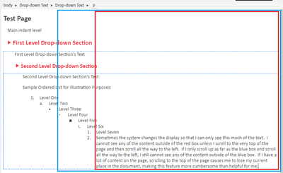
Sample of what I mean (where boxes represent what I can see at two different indentation levels):
Actual (where I cannot see where I am at in an ordered list and can't read the full paragraph above the current indent level.
Working in this environment is not easy. Open to suggestions. Thanks.
Copy link to clipboard
Copied
You haven't said which version of RoboHelp you are using. Please always start a thread with this information. Please go to Help > About and include the full version number.
That said, I don't think this is a version issue and I haven't seen anyone report this for 2019, 2020 or 2022.
I'm not sure I am following so let's check. It seems that when you have content that is wider than the authoring area and scroll to see what is extreme right, you cannot see what is on the left. Correct? If so that is what I would expect.
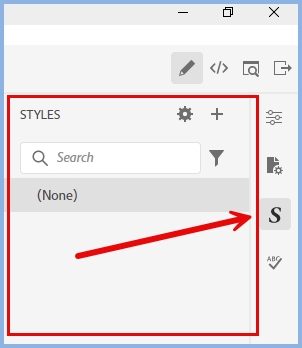
You can increase the width of the authoring area by clicking the icon shown.
On the right hand side you can click the icons to hide the panel shown to further increase it.
Alternatively you can change to magnification to make things fit.
If I have misunderstood, then please explain a bit more.
________________________________________________________
My site www.grainge.org includes many free Authoring and RoboHelp resources that may be of help.
Copy link to clipboard
Copied
Can you try doing the same thing in a fresh, unmodified test project, using the default css? This will help determine if it's some change to your stylesheet that's causing it.
This is what I get when I use a nearly vanilla project in RH2023.
Copy link to clipboard
Copied
Sorry in advance for the width of the images I attached to this reply, but I wanted to let you see that once the system collapses the margins, it doesn't matter if I close the left and right panes, extend the RH UI to span both of my monitors (which provides a wider width than toggling full screen), and/or zoom out (the zoom out only makes the content displayed in the center region of the UI smaller; it doesn't un-collapse the margins).
And the collapsing issue actually influences both top and left directions. When this issue occurs, I cannot scroll any further left until I scroll up. And, after scrolling up to a certain point (not always the top of the topic), the system makes me scroll left before it will let me scroll up again. I may need to scroll up, left, up, left... multiple times to be able to see the top left corner of the document.
I am using RH 2020.8.34. I took the attached screen shots using the default style sheet.
Copy link to clipboard
Copied
It's impossible make any sense of those images.
Can you recreate the issue in a demo project that you can share with me. If you can, then see the Contact page on my site and send the project as instructed there. Do make sure you include a link to this thread and please do not email the project direct.
________________________________________________________
My site www.grainge.org includes many free Authoring and RoboHelp resources that may be of help.
Copy link to clipboard
Copied
Out of time for today. The short version of my last reply: I tried everything you suggested in your first post, Peter, and I included my RH version number. The changes I made to use all available screen space had no impact on the collapsed margins. The result was essentially the same as what you see in the first two images I posted. I did not try an unmodified test project as Amebr suggested, but I did switch to the default style sheet. Switching to the default style sheet also had no impact on the collapsed margins. My next two weeks are pretty busy. I will try to provide additional info after that. Sorry, and thanks.
Copy link to clipboard
Copied
Another thought. Perhaps your text comes from some other system and it has a bunch of inline styling that is preventing wrapping? You can check that by switching to code view.
Get ready! An upgraded Adobe Community experience is coming in January.
Learn more


