

- Home
- RoboHelp
- Discussions
- Indigo HTML5 layout - Index and Glossary slide-out...
- Indigo HTML5 layout - Index and Glossary slide-out...

Copy link to clipboard
Copied
Hi everyone,
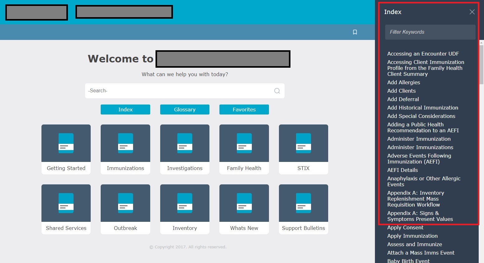
I believe this question may have been addressed once before, but it was not answered definitively - my project manager is insistent on me finding a way to change the default HTML5 responsive Indigo layout behavior. Currently, in the Indigo HTML5 layout, the Index, Glossary and Favorites 'slideout' from the right-hand side of the screen. (please see screenshot below)
Is there any way to change this behavior and have the Index, Glossary etc. slideout from the left hand side? Most websites have this orientation so it's strange that Adobe chose the right hand side of the screen. I've looked all through the RoboHelp editor settings and it doesn't appear to have any option to move the Index and Glossary from the right to the left side of the screen.
Really appreciate any help at all from users that may have found a way to get around this issue!
Thanks very much.
Billy


 1 Correct answer

This is indeed possible. If you choose a right-to-left language, the panes are on the right hand side instead of the left one. So it can be done with CSS magic. Though you'll need to make several changes to make it work for you.
As a shorthand, I created a left-aligned CSS that you can use: Indigo-Left-Handed-Desktop-Panes.zip - Google Drive
This is a rough version and will require refinement is you want to go into production with it. Download the attached CSS and overwrite the existing layout.cs
...
 3
Replies
3
3
Replies
3
Copy link to clipboard
Copied
This is indeed possible. If you choose a right-to-left language, the panes are on the right hand side instead of the left one. So it can be done with CSS magic. Though you'll need to make several changes to make it work for you.
As a shorthand, I created a left-aligned CSS that you can use: Indigo-Left-Handed-Desktop-Panes.zip - Google Drive
This is a rough version and will require refinement is you want to go into production with it. Download the attached CSS and overwrite the existing layout.css in the Indigo layout. Then you're set.
---
Below is for those interested in the finer details, and as a reference for future tinkering.
First, you'll need the SCSS files to make it easy on yourself. You can download them from: RoboHelp screen profiles and layouts
Use an application like Koala (Koala - a gui application for LESS, Sass, Compass and CoffeeScript compilation.) to compile this to a CSS file.
in the CSS, you'll first need to left align the panes. Open the file layout.scss and search for:
@include popup-sidebar($right
replace all occurences with
@include popup-sidebar($left
Note: Unless you want only to change the desktop. Then don't replace all occurences, only the ones for desktop. Doing only desktop is much easier, as the menu buttons on mobile/tablet are also right alignd. For my sample, I've only updated the desktop version. (Note that you need to unmerge the selectors on line 836) Changing only a single device may cause strage flickering when moving between desktop to mobile versions.
Next, change the topic content position to the right, as the panes are currently showing over the topic content.
On line 392, change the right alignment to: #{$left}: $topic-sidebar-width + 1rem;
And, on line 411, change the right alignment to: #{$left}: 0;
With these modifications, the panes are left aligned. You will probably want to update the TOC book icon as it is currently pointing to the right hand side.
Changing the mobile and tablet view as well, will require more work in updating the layout. It can be done if you want to.
Copy link to clipboard
Copied
Hi William,
Wow! Thank you so much for taking the time to compile that revised 'layout.css' for me, you really went above and beyond. I truly appreciate it, I'm going to try your fix and overwrite my current layout and see what happens. I'll let you know what happens!
Many thanks again.
-Billy
Copy link to clipboard
Copied
Update - Worked like a charm! William, you're a legend!! Thank you again for taking the time out of your busy schedule to help this newbie out.
Cheers! 

Find more inspiration, events, and resources on the new Adobe Community
Explore Now
 AdChoices