 Adobe Community
Again ...
Copy link to clipboard
Copied
Copy link to clipboard
Copied
You should know by now that you should give the refusal reason.
First is out of focus, second is overexposed, third is overexposed, is missing contrast and has chromatic aberration, fourth is bricks like the second and missing contrast, fifth is bricks like second and fourth and is overexposed.
Copy link to clipboard
Copied
Well...
those bricks patterns.
Histogram looks good.
I do not see any overexposition.
Especially no.4.
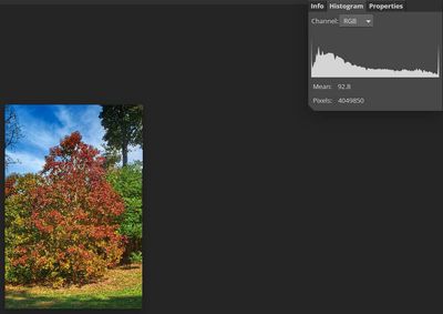
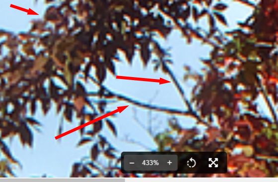
That tree, could you please highlight where do you see that aberration.
Histogram looks good.
So I have doubts about overexposition.
And contrast... if you think thats better, I have no problem to sink shadows into the black.
Copy link to clipboard
Copied
This strongly looks like overexposure. But if you think you know better… At least I think that moderators think as I do… in this case!
Copy link to clipboard
Copied
thank you for not being discouraged by the lack of "reason".
Copy link to clipboard
Copied
Hi @beaver1234,
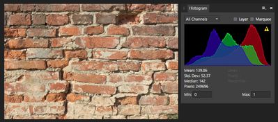
Your brick wall histogram is saying that white is clipping and highlights a bit high.Those two parameters also affect the exposure of the picture. If they are high, the image is overexpose.
The trees' white is also clipping.
Best wishes
JG
Photographer.
Copy link to clipboard
Copied
Thats the same thing, but different software.
Copy link to clipboard
Copied
Hi @beaver1234,
Look, every application that a file is opened in does its own level of adjustments. Even among Adobe family of apps. Every web page does it own adjustments. Every file viewer does its own level of adjustments. Every computer does its own level of adjustments. Adobe wants to know that your file has maximum chance of sales, and people wants to know what they see to work with is pleasing to their eyes. We all do have our instances where we do not agree with the decision made by the moderators but there is not a thing we can do about it. We either try to please them by making all the possible adjustments we can or call it a day and move on - move on to either disregard that or those file(s), or upload it/them elsewhere. I'm sure some other platform will accept it/them. As I said earlier on I like the exposure of the walls. I don't think I am the only fool to like them.
I would like for you to explicitly tell us what's the point you are making here. Since we are not the ones that rejected you file and we can do nothing about it this could never be about us. So speak your mind or we declare this conversation pointless, end it and move on. The contract you agree to say they reserve the right to reject your files. So you see, they don't have to take your photos no matter how great you think they are and you agreed to that.
You're fortunate they are accepting some of yours. They've blocked my upload app from uploading photo files larger than 6MB and reject all other photo files. I message customer service about it. The long and short of the response I get is that my computer/Internet service/ me is/are the problem and nothing is done to resolve it. The same set of files they don't want were subsequently successfully uploaded and accepted elsewhere with no problem. It's just a matter of choice.
Best wishes
JG
Photographer and Nutrition Author
Copy link to clipboard
Copied
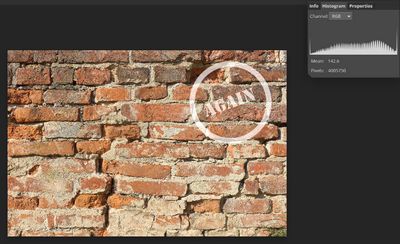
You take the wrong bricks picture. Try with your second picture (first bricks)… As a side note: watermarks disturb the histogram.
Copy link to clipboard
Copied
It's not a guessing game. TELL US THE REJECTION REASONS FOR EACH PICTURE.
Copy link to clipboard
Copied
I'm sorry, it's no disrespect to what you're doing here.
But if the picture is wrong, or flawed in any way, it should be obvious from the picture and not from the description.
Copy link to clipboard
Copied
Well, you clearly know better than all of us, why are you even asking?
Copy link to clipboard
Copied
Clearly, not at all.
I'm more interested in the commentary on the image than the commentary on the vague editorial comment.
On the other hand, you don't have to post anything here at all, it's not the duty of every member of the community.
Copy link to clipboard
Copied
I'm sorry, it's no disrespect to what you're doing here.
But if the picture is wrong, or flawed in any way, it should be obvious from the picture and not from the description.
By @beaver1234
It's not always obvious. That's why we kindly ask the reason that the moderator gave. Normally, we tell you all the reasons we see. You don't need to agree, however, something did disturb the moderator, if the picture got refused.
But as you said, we do not need to comment, and I fear that in some near future exactly that will happen.
Have a nice day.
Copy link to clipboard
Copied
As a volunteer and frequent forum participant, I don't think I'm alone when I say the obfuscation you add to images is unnecessary and provides us with no useful data. For meaningful feedback from us, please refrain from adding overlays.
You haven't told us why your images were rejected. So I guess it is was for technical reasons and possibly others.
As you can see from the BEFORE and AFTER shots below, this brick wall is noticeably overexposed.
BEFORE:
AFTER:
That said, this will probably not make many sales for you as Adobe Stock currently contains over 2 million images of brick walls. Whether or not Adobe are accepting more bricks at this time, nobody here can say. That's an internal decision that's likely based on how much demand there is for bricks, as well as the quality and aesthetic of your images compared to your competition's
https://stock.adobe.com/search?k=brick%20wall
Make adjustments and resubmit if you think it's worth your while. Good luck!
Copy link to clipboard
Copied
Hi @beaver1234 ,
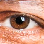
The first image: Too much of the frame is out of focus. The subject is not completely in focus and also displays blue/purple color fringing.
Frankly I like the exposure of the second image. However based on the explanation at Create Better Photos For Adobe Stock With 7 Tips For Success, the brightness resulting in a pale color tone will be counted as overexposure without even consulting with the histogram.
Details of the subject of the 3rd image is lost. There seem not to be enough contrast. Too much highlights to the right and what seem to be blue color fringing on the branches at the left.
The 4th and 5th are the same as the second.
Please zoom in on your images to inspect for issues.
Also please note that you are better helped for resubmission when you say the reason for rejection. If you prefer getting an overall critique that is fine, but we'd prefer if you specifically say so, and also mention that they were submitted for stock. Being uncooperative is not the way to go.
Best wishes
JG
Photographer and Nutrition Author
Copy link to clipboard
Copied
I feel that most of the images are not focused.
Also look at the fringing.
433% is a lot. But, here you can see the fringing and the bad focus.
