 Adobe Community
Commercial value.

Copy link to clipboard
Copied
Hello to whoever is reading it 
So I have this image, rejected as for having no commercial value
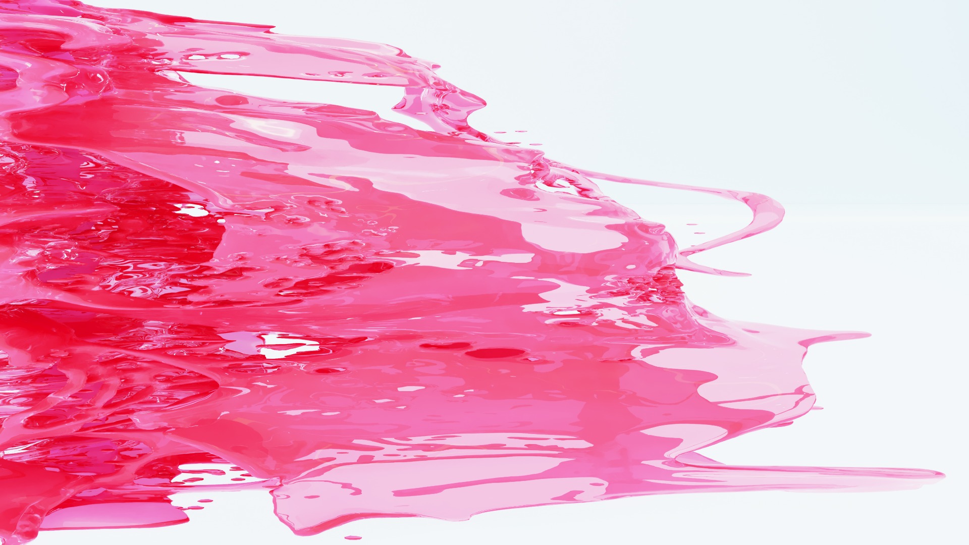
need an advise or direction on :
Is this really has no value?
What can be done to make it have its value, frame the splashes by the sides leaving center empty?
Is the overall concept of splashes'n things became redundant ?
Iam doing a full motion splash animation now, and this is one frame from it, should I proceed?
Thanks.


 2
Replies
2
2
Replies
2

Copy link to clipboard
Copied
Hi,
I am not an expert in movement art. However, I am fairly sure that if Adobe says this has no commercial value for their known clients - that is simply true. Does mean the work is bad or good, just nothing their clients are known to buy. Have fun with this one. Reminds me of my strawberry shake as I am falling over my feet. (joke) JH

Copy link to clipboard
Copied
Hi,
please have a look at the explanation of the reason for the refusal "Aesthetic or commercial appeal" here in the User Guide:
https://helpx.adobe.com/stock/contributor/help/reasons-for-content-rejection.html
I think there are a lot of these pictures in the database and here it is generally hard to get a picture accepted and the quality has to be so very good. I don't think yours is one of them.
What can you do to improve the picture. I think it is always helpful to compare your picture with comparable pictures in the database.
What I notice personally is that the splash doesn't really look like a splash of color and the background color isn't well chosen, not in harmony. I think it would be an improvement if the splash would be more three-dimensional and therefore more clearly recognizable as such, and the background e. g. is designed in white. Adobe loves white/bright backgrounds ; -)
Greets,
v.poth
 AdChoices