

got declined why?

Link in Zwischenablage kopieren
Kopiert


 6
Antworten
6
6
Antworten
6

Link in Zwischenablage kopieren
Kopiert
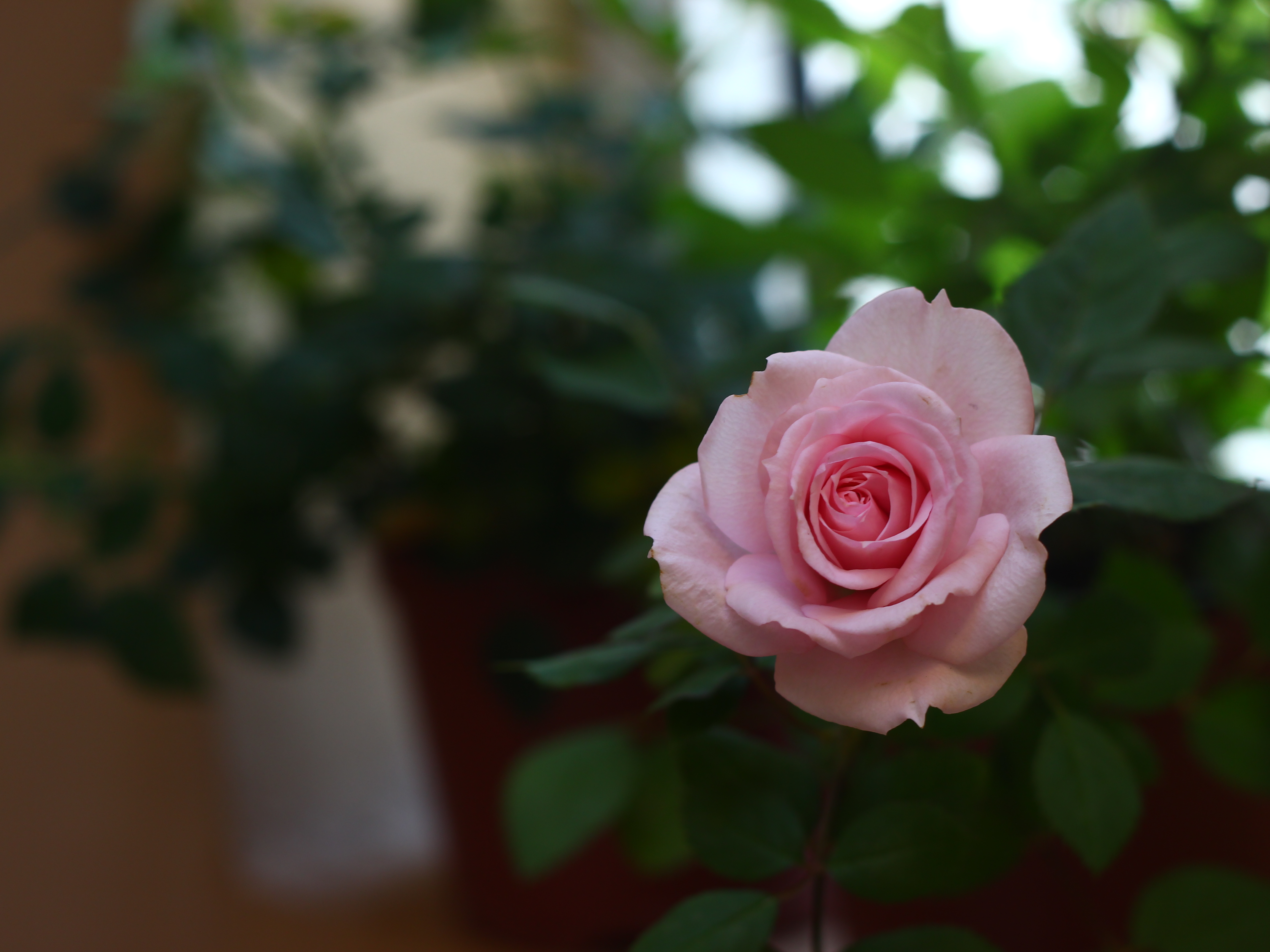
When an image gets declined from Adobe Stock, they give a reason. What did the rejection notice say?
My guess is that it said something like "aesthetic or commercial appeal".
If I worked for Adobe and was screening submissions, I would probably reject yours too. There are three main reasons:
1. The flower looks a bit dull. Bumping up the exposure, contrast, and saturation would really help the flower look better.
2. There are just a metric TON of flower shots on Adobe Stock that have a similar setup (flower against blurred leaves). Unless your floral shot is outstanding or unique in some way, it is highly unlikely to be accepted.
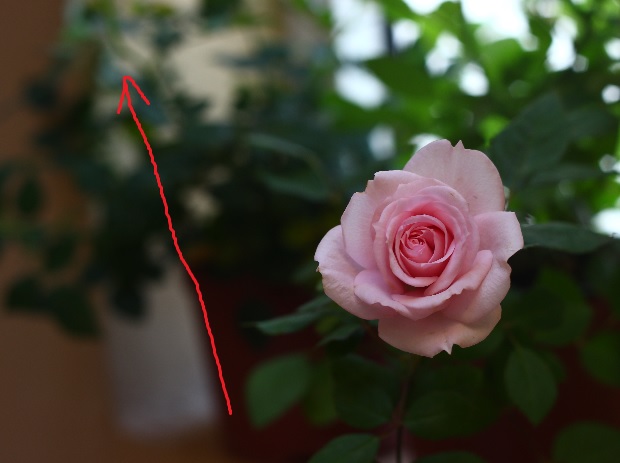
3. The composition is odd. You've got that very distinct white object slanting diagonally away from the flower. This is very distracting. It makes the image feel like it's out of sorts - like a horror movie, but the subject is a tranquil flower. Also, the line pulls the attention away from the flower and up into the top left corner of the photo.
Link in Zwischenablage kopieren
Kopiert
thank you I appreciate your notes but I disagree with you regarding your noting that the stock is full of flower photos because theres still a space for impressive photos no matter how many photos existed in a category.
Link in Zwischenablage kopieren
Kopiert
I think you missed my point.
Of course there is always space for impressive photos. I was trying to gently point out that your photo is not impressive.

Link in Zwischenablage kopieren
Kopiert
haha, ouch. Although I don't think you meant that to be harsh.
If I were Adobe, which I'm not, I'd either want "impressive rose photos" to be something that I can't just go outside and take in my garden (assuming I don't have a white house style/quality rose garden). So with that in mind, I'd want stock images of roses to be a vibrant color with pop, not dull. Although your rose is beautiful in its own right, it's not unique. It also has flaws (just like all of us photographers) which could be corrected (spots on the pedals). The pedals themselves are also slightly wilting and a little brown on the edges, or chipped and chewed on by bugs, rain or hail.
I'm assuming you left room to the left for copy to be added, so Szalam was suggesting that the copy area should be free from distractions.
If you want to continue shooting and submitting rose pictures, try the above and also maybe use OCF to add some unique lighting. Natural light is great for so many things, but it won't help your image stand out since we all have that lighting option available.
Hope this helps.

Link in Zwischenablage kopieren
Kopiert
As another contributor, I'd like to say that I agree with Szalam. The overall composition isn't very interesting.

Link in Zwischenablage kopieren
Kopiert
I agree as well... What I would try is (after following Szalam's instructions for making the flower pop) 'cut' the rose and the leaves that go with the rose, move them down into the corner more, and put everything else out of focus quite a bit more. Perhaps increase the 'canvas' size before blurring, and bill it as a background. After all, it doesn't cost anything but a bit of time to try again.
Weitere Inspirationen, Events und Ressourcen finden Sie in der neuen Adobe Community
Jetzt ansehen
 AdChoices