- Home
- Stock Contributors
- Discussions
- Re: Image Rejected Due to Technical Issue
- Re: Image Rejected Due to Technical Issue
Copy link to clipboard
Copied
Looking for feedback from the experience.


Thank you
 1 Correct answer
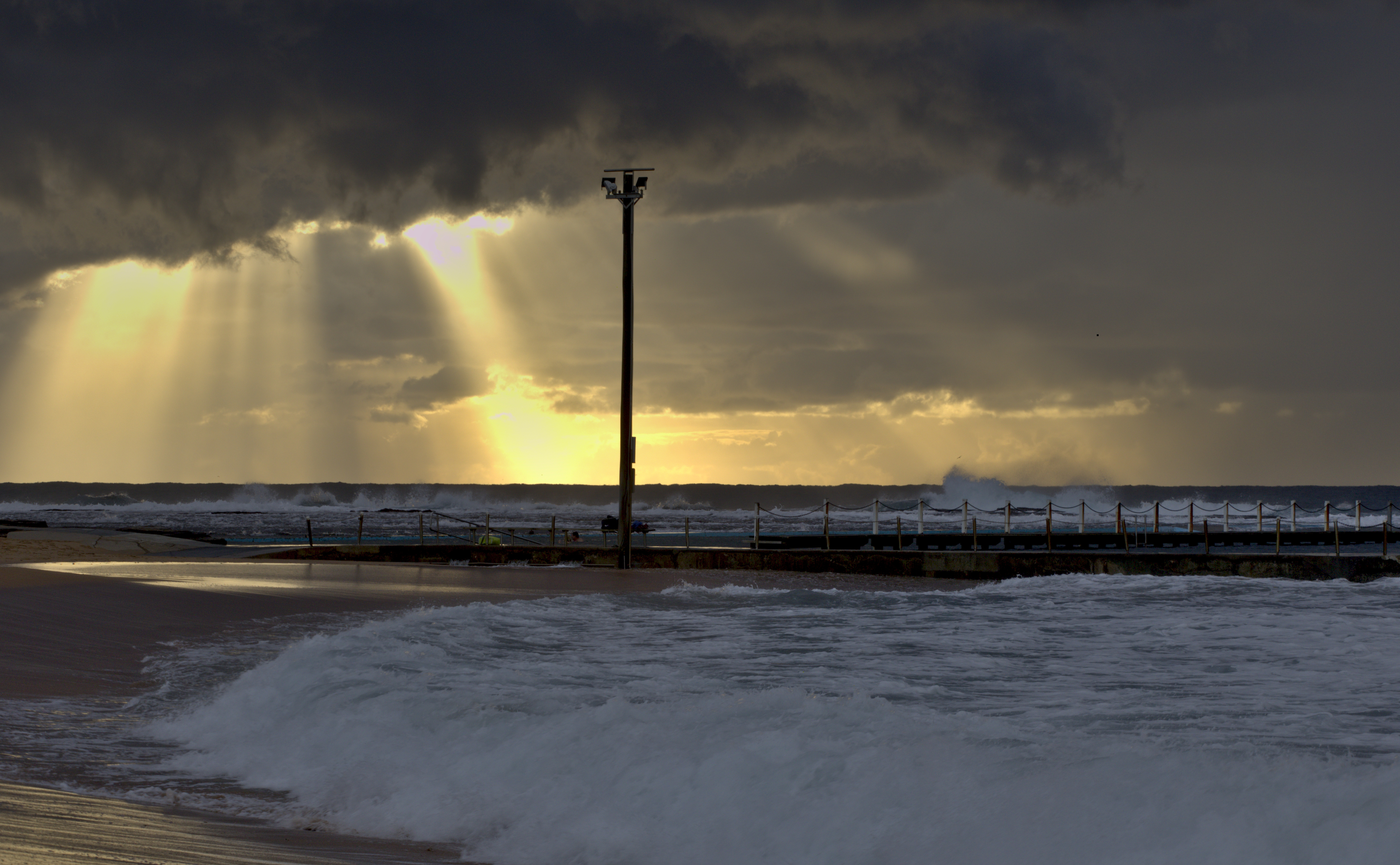
I don't think the blurred people would be considered as chromatic aberration.
I think white balance could be a problem - it is a bit to blue!

This was done using the raw filter in Photoshop - auto mode.
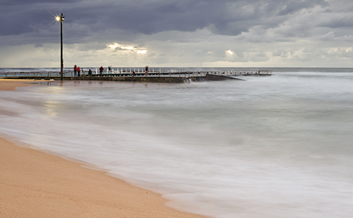
Your second picture - you could adjust the horizon a tad - easy to do.
I think white balance could be adjusted a bit as well - but - you may have other problems with exposure due to the sun's rays being burnt out a bit too much and composition - the lamp kind of divides the photo in two!
Copy link to clipboard
Copied
Hi,
Rejections for technical reasons can be for several reasons. These two photos probably have exposure problems. The whites are too strong and must be muted. Be sure you examine the photos at 100% magnification to find all of the blurry areas. Adobe requires sharp focus and edges. Be sure you review the information for stock contributors. Here is a bit of the information about this from the Adobe information site for contributors. I hope this helps. Regards, JH
See white balance controls in the Color panel
- If a photo has an unwanted color cast, usually caused by the lighting in which the photo was shot, use the white balance controls in the Color panel
- Choose a preset from the drop-down White Balance menu in the Color panel. This sets the Temp and Tint sliders in the panel to preset positions. If you’re working with a raw file you’ll see more choices in this menu than if you’re working with a JPEG.
- Or select the White Balance Selector(the eyedropper icon) and click a spot in the photo that you think should be neutral gray, white, or black.
- To adjust color manually or to fine-tune the results of the other white balance controls, drag the TempTint
Copy link to clipboard
Copied
Hi,
additionally it is to be noted that in the first picture the people on the bridge show a blur of movement, which is no wonder with 5 seconds exposure time. These could also have been interpreted by the selector as chromatic aberration. But it would certainly be another reason for refusal.
In the second picture the horizon is crooked, which actually always leads to a rejection. Furthermore there are some pixel errors visible in the sky which should always be retouched.
Greets,
v.poth
Copy link to clipboard
Copied
I don't think the blurred people would be considered as chromatic aberration.
I think white balance could be a problem - it is a bit to blue!

This was done using the raw filter in Photoshop - auto mode.
Your second picture - you could adjust the horizon a tad - easy to do.
I think white balance could be adjusted a bit as well - but - you may have other problems with exposure due to the sun's rays being burnt out a bit too much and composition - the lamp kind of divides the photo in two!
Copy link to clipboard
Copied
Thank you for everyone feedback. I will make adjustment and submit again.
Copy link to clipboard
Copied
Hi,
it would be very interesting to know if the pictures with the modifications you made were accepted or not. Maybe you post the result of the re-upload here. It would be interesting to know if the tips of the posters have helped here or not.
Greets,
v.poth
Copy link to clipboard
Copied
Good idea, follow up with results might help refine answers. Technical Issue can be so many things at once or one thing. I would like to see an additional sub-list made for the reviewer to be a bit more specific. JH
Copy link to clipboard
Copied
Hi,
it would also be interesting for the posters here who actually judges their pictures and with which background. I think it makes sense to insert a link in the profile to a homepage or to the provider portfolio in order to be able to better classify the competence of the critic for the poster.
Hardly anyone does this here and I think it could only do the credibility of the statements made good and prevent the questioners' constant doubts about the correctness of the assessments.I don't understand why hardly any posters do this.
Greets,
v.poth
