- Home
- Stock Contributors
- Discussions
- Re: Lack of aesthetic or commercial appeal
- Re: Lack of aesthetic or commercial appeal
Copy link to clipboard
Copied
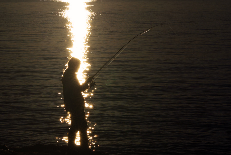
I got recently declined this image with the rejection reason: Lack of aesthetic or commercial appeal.

Honestly, I don't understand this decision. It is (in my eyes of course) a very aesthetic and atmospheric image. It is a kind of a low key image. But all the details are clear and sharp. This image would suit many commercial purposes (again ... in my eyes of course). I am daily working with advertisments and commercials and I would feel like this is a suitable image for e.g. fishing holidays, sea-angling, outdoor, scandinavia, midnight-sun ...
Would be interesting to hear any other opinions or explanations/experiences from other contributors...or even from the Adobe Stock jury.
(the people I showed the Adobe Stock reaction on that image just shook their heads).
I can live with getting images declined. And I usually can understand the reasons why some of my images are getting declined. But in that case I am really in doubt ...
Thanks in advance.
Peter
 1 Correct answer
The sun reflection on the water is burned out and appears more like fireworks and the person seems to be burning. I think there are some technical problems that warrant a rejection. And I don't think that you have expressed any of your intentions for a positive use of fishing holiday, midnight sun in the picture. Search the database for images of the same theme and compare them to yours. Then ask yourself the honest question why a buyer should prefer your picture to the other one....
Besides, fri
...Copy link to clipboard
Copied
Clarity? Hard to look at. Check on similar photos in Adobe Stock. JH
Copy link to clipboard
Copied
Thanks for answering.
I just uploaded a low-res preview here. The original is clear and sharp in every detail.
Mmmhh. Hard to look at could be a reason. But it was meant to catch the natural light situation. ...thats how it is when you look into the sunset.
Now I have checked other contributors who got their images rejected for the same reason. There are many good images rejected (of course...this is subjective). And it looks like I am not alone struggling to find out why.
I am just curious, because even if I try to be objective with this image, I can not really find a strong enough reason to not accept it.
Any other suggestions?
Copy link to clipboard
Copied
The sun reflection on the water is burned out and appears more like fireworks and the person seems to be burning. I think there are some technical problems that warrant a rejection. And I don't think that you have expressed any of your intentions for a positive use of fishing holiday, midnight sun in the picture. Search the database for images of the same theme and compare them to yours. Then ask yourself the honest question why a buyer should prefer your picture to the other one....
Besides, friends are generally not the right and constructive critics of your own images unless they are familiar with the industry...;-)
Greetings,
v. poth
Copy link to clipboard
Copied
Thanks, man! That I can accept as a reason.
Now I looked with "different eyes" on that image and start to understand. I guess it has a lot to do with my expectations (and the resulting frustration), that this image just "had to pass" the jury. Good to get help to change perspective. That was helpfull!
