

- Home
- Stock Contributors
- Discussions
- Re: Rejection in photo submissions
- Re: Rejection in photo submissions
Rejection in photo submissions

Copy link to clipboard
Copied
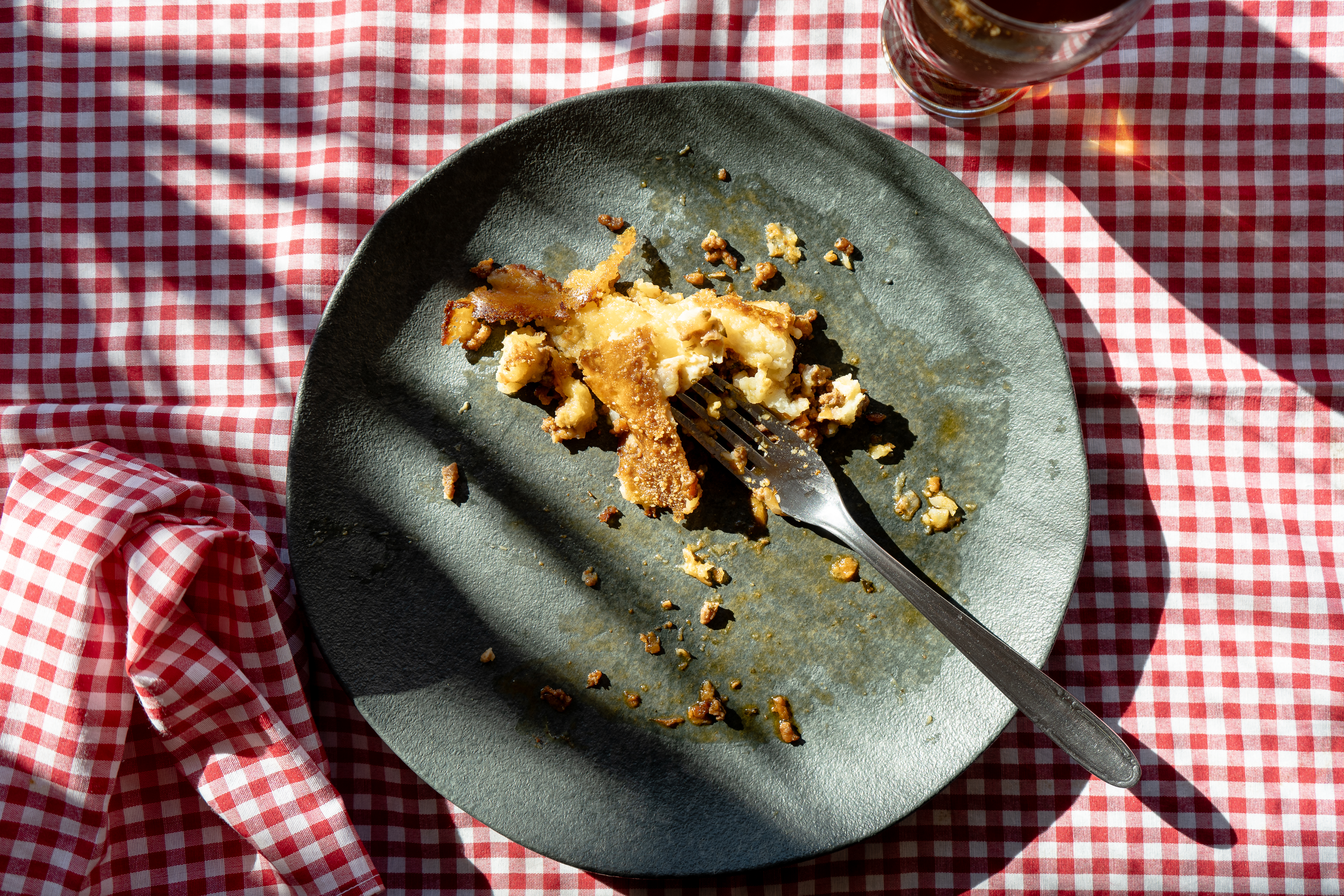
Lately, I’ve noticed that many of the images I submit are being rejected for almost any reason. I can agree with rejections based on quality issues, but those citing "similar content already in the collection" are quite hard to understand.
I submitted a food photo session (Shepherd’s pie) and only three out of thirty-five images were accepted. The rest were mostly rejected — over 80% — with the reason being "similar content." But the images aren’t similar to each other, nor to anything already in the collection. When I created them, I made sure the lighting, angles, materials, and compositions were all different from typical shots.
There are about 4,500 images of Shepherd’s pie in the database, so of course they’re all going to look somewhat similar — it’s the same dish. In fact, some of my rejected images don’t seem to resemble anything currently in the Adobe collection, after I did a thorough check.
Lastly, I’ve noticed that I tend to get more rejections when my images are reviewed on Mondays or Tuesdays, compared to Thursdays or Fridays. Is it just a coincidence, or could it be that the reviewer is different and extremely strict or purist with the criteria on those days? What could this be due to?
The sample files were rejected for the reason of Similar Content. Obviously I have more images to show.


 11
Replies
11
11
Replies
11

Copy link to clipboard
Copied
There are some quality issues involved as well, and moderators can only select one reason for rejection. This one in particular has burned out highlights and underexposure in the shadows. But yes, "too similar" rejections are very common these days, and Adobe recommends submitting only three examples of the same subject in general.

Community Volunteer | I don't make the rules; I just try to explain them.
--------------------------------
Why did Little Miss Muffet step on the spider? Because it got in her whey.

Copy link to clipboard
Copied
IMO, this should have been rejected for aesthetic reasons. The lighting is very poor and the presentation is unappealing. I think your mistake was submitting 35 similar images all at once. Don't do that.
Submit only 2-3 of your very best quality images.

This is what you're competing with. Well lit, nice texture & color variation, good visual interest & an appealing presentation.

Food photography is very challenging to get right. It's not for everyone.
Copy link to clipboard
Copied
Nancy, the photos from this session were intentionally created with a specific look in mind. To achieve a rustic, countryside feel, I first used an earthy color palette — mainly browns and weathered blues. I also chose lighting with strong contrast, coming from one side, to simulate natural sunlight. The light was intentionally harsh and directional. I may have pushed it a bit too far.
I agree it would have made more sense to reject them for aesthetic reasons rather than for similar content. The composition is debatable, but of course, the reviewer has the final say.
I really appreciate the sample image you shared — I actually have many photos in that style. This time, I tried something different specifically to avoid submitting similar content, but clearly, I misjudged the result.
Thank you again for your response.
Copy link to clipboard
Copied
I critique images as a Customer.

Copy link to clipboard
Copied
friends encouraged me because they like my photos and they are beautiful in
my opinion and their colors are bright but the first one was rejected
because it had a repetitive pattern. I took this into consideration and I
followed all the instructions and rules and I uploaded another photo but it
was rejected because its quality was not enough. I felt very frustrated.
Could you and Adobe Stock management please respond to my inquiry and
provide me with all the details and sufficient information about the images
that are suitable for the Adobe website?
Thanks in advance
Copy link to clipboard
Copied
You are not addressing Adobe here but contributors like yourself. Rejection comes with the territory and you will learn over time what the moderators find acceptable and what they do not. Granted, a number of contributors, myself included, are in a quandary over the "too similar" rejections, as they often seem arbitrary if not entirely wrong. But until this issue is addressed, if at all, it's what contributors must necessarily live with should they decide to continue submitting.
Community Volunteer | I don't make the rules; I just try to explain them.
--------------------------------
Why did Little Miss Muffet step on the spider? Because it got in her whey.
Copy link to clipboard
Copied
Stock has very high quality standards. Read your Stock Contributor User Guide.
- https://helpx.adobe.com/stock/contributor/help/reasons-for-content-rejection.html
- https://helpx.adobe.com/stock/contributor/help/quality-and-technical-issues.html
- https://helpx.adobe.com/stock/contributor/user-guide.html/stock/contributor/help/photography-illustr...
- https://helpx.adobe.com/stock/how-to/tips-stock-image-acceptance.html
- Model/Property Releases:
https://helpx.adobe.com/stock/contributor/help/model-release.html
https://helpx.adobe.com/stock/contributor/help/property-release.html

Copy link to clipboard
Copied
If you want specific feedback from the community members in this forum, upload a few of your rejected images.

Copy link to clipboard
Copied
Hernand, as you can see everyone has an opinion on the quality of your photos, as I do.
My advice is that you don't submit all the photos from one series at the same time. For this series the lighting theme is on point, just open up the shadows a little,
I'd use curves to brighten these shots. Wait a couple of weeks and resubmit. 3-4 at a time, and see what happens next. And one more thing, if his is a great forum for contributors... but try to be your best critic, and avoid asking questions like what is wrong with a photo...
Continue playing with your style and have fun in the process, you are definitely on the right track!
Francisco

Copy link to clipboard
Copied
Looking at your photos I too see exposure issues.
In this photo, LightRoom flags shadow and highlight clipping.
Clipping will almost always result in a rejection.

Photography is more than just pressing a button!
========================================

Copy link to clipboard
Copied
Hello,
Sorry, but I personally think your composition could be better. For instance:

The fork is lost against the background! Part of the hand shown does not match the shot.
This is messy!

I also go along with @Nancy OShea . The lighting does not do these shots justice. Shepard's pie is really nice, but alas, it does not look scrumptious in your shots - sorry!
I don't get your 'rustic, countryside feel'. And I wouldn't use harsh light for food.
Find more inspiration, events, and resources on the new Adobe Community
Explore Now
 AdChoices