• Global community
    • Language:
      • Deutsch
      • English
      • Español
      • Français
      • Português
  • 日本語コミュニティ
    Dedicated community for Japanese speakers
  • 한국 커뮤니티
    Dedicated community for Korean speakers
Exit
0

Technical Issues

New Here ,
Nov 14, 2017 Nov 14, 2017

Copy link to clipboard

Copied

These photos were rejected for "Technical Error". I am having trouble to figure out the actual cause. Any help would be appreciated.
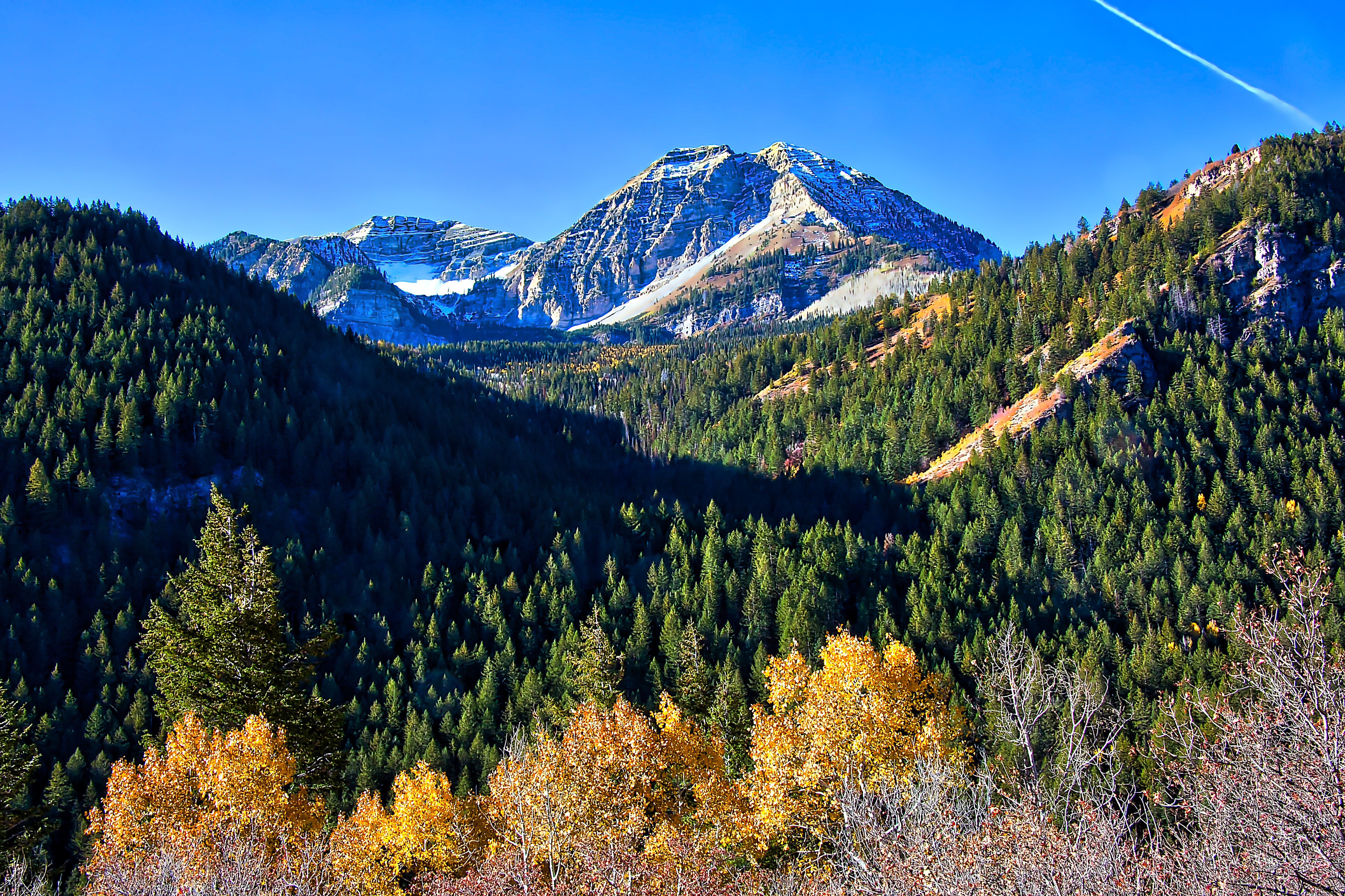
Alpine Loop View-Quick Preset.jpg

TOPICS
Contributor critique

Views

418

Translate

Translate

Report

Report
Community guidelines
Be kind and respectful, give credit to the original source of content, and search for duplicates before posting. Learn more
community guidelines

correct answers 1 Correct answer

LEGEND , Nov 14, 2017 Nov 14, 2017

Your image looks beautiful when it's zoomed out so small. However, open your image and view it at 100%. It looks almost like an oil painting. Looks like some very aggressive noise removal going on here!
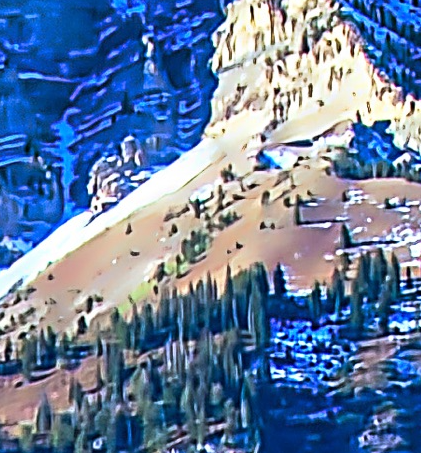
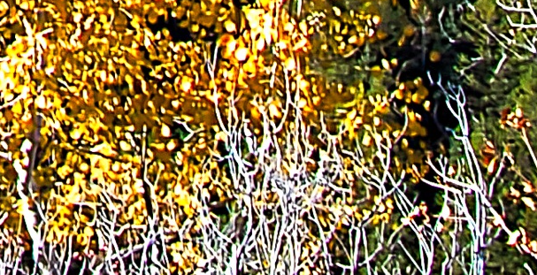
ApplicationFrameHost_2017-11-14_13-48-47.pngApplicationFrameHost_2017-11-14_13-48-11.pngApplicationFrameHost_2017-11-14_13-48-27.png

Also, parts of the image are blown out too bright and some parts are crushed to black.

Also, it's a bit oversaturated and over-sharpened.

Votes

Translate

Translate
Advisor ,
Nov 14, 2017 Nov 14, 2017

Copy link to clipboard

Copied

Very pretty photo. The error might be in the jet contrail right upper area and the contrast in dark and white areas. Looks like a little too much-added color to be natural. Do you read their tutorials - they are worth it. JH

Votes

Translate

Translate

Report

Report
Community guidelines
Be kind and respectful, give credit to the original source of content, and search for duplicates before posting. Learn more
community guidelines
LEGEND ,
Nov 14, 2017 Nov 14, 2017

Copy link to clipboard

Copied

LATEST

Your image looks beautiful when it's zoomed out so small. However, open your image and view it at 100%. It looks almost like an oil painting. Looks like some very aggressive noise removal going on here!
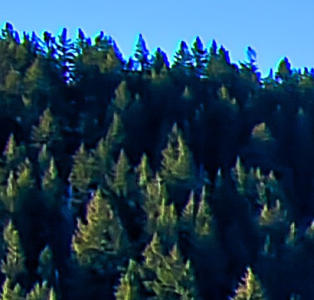
ApplicationFrameHost_2017-11-14_13-48-47.pngApplicationFrameHost_2017-11-14_13-48-11.pngApplicationFrameHost_2017-11-14_13-48-27.png

Also, parts of the image are blown out too bright and some parts are crushed to black.

Also, it's a bit oversaturated and over-sharpened.

Votes

Translate

Translate

Report

Report
Community guidelines
Be kind and respectful, give credit to the original source of content, and search for duplicates before posting. Learn more
community guidelines