- Home
- The Lounge
- Discussions
- Re: Complimentary Font for 'The Jeffersons' Font D...
- Re: Complimentary Font for 'The Jeffersons' Font D...
Complimentary Font for 'The Jeffersons' Font Design
Copy link to clipboard
Copied
Hey all! I am a new design student (just finished my first semester on the way to a BA degree in Graphic Design). I find that I struggle with pairing fonts; it's a black hole I go down & have trouble getting out of!
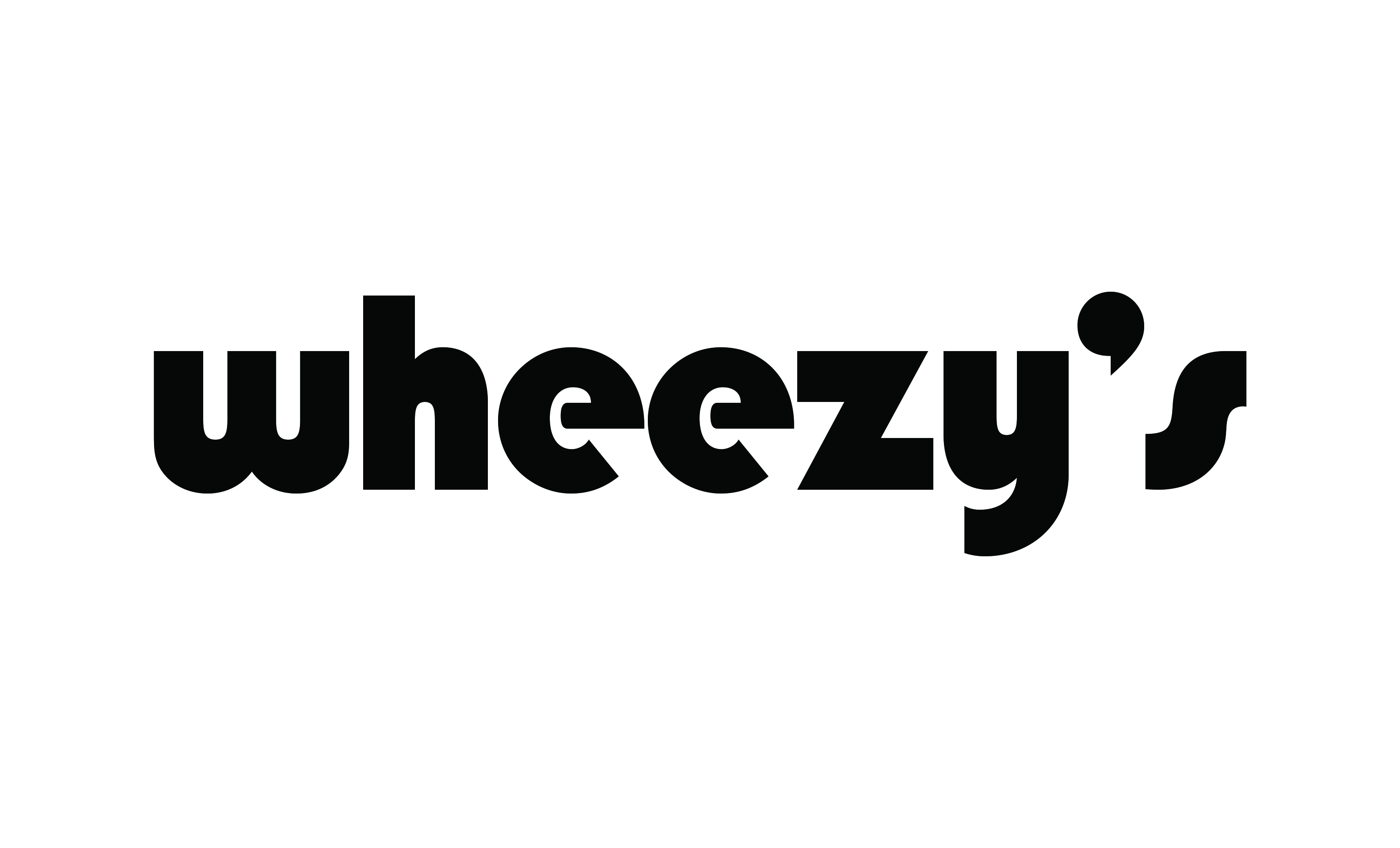
I am looking for a secondary font that might compliment one similar to the one below. (I chose this style of font due to its similarity to 'The Jeffersons' TV show title font. )

After reading another forum post from another user, also looking for font pairing suggestions, I thought it helpful to include more information regarding the use & current design of this project.
My boss asked me to create a logo/design for the name of her boat: 'Wheezy's Way' (inspired by her childhood nickname, 'Wheezy', taken from the classic TV show, The Jeffersons).
The design needs to be fairly simple as it will be printed as a large decal or die-cut, which will then be applied to the back of her boat.
The secondary font I am looking for suggestions on is for the word 'Way'.
I will either be designing the name in all lowercase or with the first letter of each word in caps.
I hope that's enough info to spark some inspiration! 😉 Like I said before, I am SUPER new to the world of design so any specific Adobe font suggestions, or simply suggestions as to what styles &/or features I should focus my search on would be GREATLY appreciated!!
Thank you!!
Copy link to clipboard
Copied
Hi Michelle,
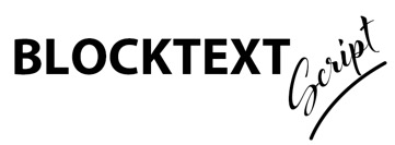
One way to complement large blocky text like yours is to offset it with graceful, fine script, something like the example below. There are many other possibilities, but maybe this will get you started. (I warped the text and added a swoosh line below it to accent the gracefulness of the script).

I hope this gives you some ideas!
Mike
Copy link to clipboard
Copied
I generally start with a font study (exercise) when looking for fonts that work well together. You can use Illustrator or any other application that will give you a large art board to work with. It's common to see a bold face sans serif font contrasted with an elegant script or serif font. If you have used the Font Style wheel in Adobe Spark that also a fun quick way to get ideas and springboard from there.
Here are some things to keep in mind:
1. Opposites attract - Serif/sans serif - Bold/light - Italics/regular
2. Hierarchy - know which words to highlight for prominence
3. Look for font families that have lots of styles within them and use varying weights for accent
4. Do an image search on Font Pairing Ideas for inspiration
5. If you find a font pairing idea that you like and need to identify the font use the 'Match Font' feature in Ps
6. Work in B&W before you introduce colors
Show us some ideas that you've come up with if you'd like more feedback - Have fun!!!
Copy link to clipboard
Copied
cmgap, this was so helpful! Thank you! Before posting the question I had a design similar to the one mentioned by Michael. With his validation & your tips, I have no doubt I will be able to find a match that I love! I was beginning to doubt the use of the 'Jefferson's' font (as I'm not sure how I feel about it in general) but I'm hoping that I can find the perfect match for it that will bring the design together as it appears in my head.
I made notes from all of your tips so that I can reference them in future designs. 😉
I'll post my work as soon as I have something together. I want to take any opportunity I can to learn & better understand the process of designing.
Thank you again!!
Copy link to clipboard
Copied
Adobe Fonts offers font packs (Browse Font Packs | Adobe Fonts ) which are already paired for you. You can also check out the Typography topics on the Adobe Blog for articles on pairing and more (Typography | Adobe Blog ).
Copy link to clipboard
Copied
Thanks guys, for all of your responses!! I feel much more confident moving forward! I am finishing up one other design before tackling this one again but I will most definitely be reposting to get everyone's feedback on my font choices & design!! Thanks again!
