- Home
- Type & Typography
- Discussions
- Re: A nice font for a stylized but proper CV?
- Re: A nice font for a stylized but proper CV?
A nice font for a stylized but proper CV?
Copy link to clipboard
Copied
Hi!
I'm currently between jobs and is looking for a nice font to spice up my CV a bit. I don't wanna go with Helvetica, but at the same time I need something with transparent design.
I have worked with design professionally for four years, but have just recently started to really take an interest in fonts.
Any suggestions would be helpful to get me started!
Thanks in advance.
/ollelindell

Copy link to clipboard
Copied
Just as you might modify the content of your resumé/cv depending on
the job being sought and the company to whom you're submitting it,
your font and overall design choice might also be subject to
modification to fit the circumstances.
I wouldn't use the same font to applying for the position of Chief
Financial Officer of The National Bank of London as I would when
applying to MTV's advertising design and publicity department.
"Stylized" can fit a very broad range!
- H
Copy link to clipboard
Copied
I get your point. I just assumed that it would be apparent that it's for a design job, because of the forum. However I believe that everyone should stylize their CV in some way to display their ambition (not just designers). I also think that the CV should not show too much personality either. So I would like to keep it as general as possible, with a layout, design and style that anyone could love, no matter if it is a Chief Financial Officer or a McDonalds Manager.
This is a very hard thing to do. That is why we see so much extreme art these days, because that's the easier way out. But in the end, what all professional designers should aim for is to create transparent design, something that everyone loves, but no one can really say why.
There's a bit of problems with this too though. Because this is why "everyone" uses fonts like Helvetica. It works for almost everything, and no one can criticise you for using it. So the challenge is too find something that ain't as bland as Helvetica. But something that works almost as well, with just a touch of more personality.
I hope that explains what I'm after more clearly.
Thanks for showing interest!
/ollelindell
Copy link to clipboard
Copied
If it's a design job you're after, I would recommend looking first at the giants in the field of typography. Selecting typefaces can be a very personal choice, but if you narrow your search by going with only the most well-designed typefaces, you'll be off to a good start.
Some of my Type heroes are:
- Hermann Zapf (the godfather of contempory type designers) who has designed typefaces such as Optima, Palatino, Zapfino and Zapf Chancery (to name but a few)
- Robert Slimbach, designer of Adobe Garamond (he's one of Adobe's type designers), Minion, and Poetica
- Jonathan Hoefler, who's type foundry Hoefler & Frere-Jones is well worth taking a look at (home of the slab-serif, Archer)
- Giambattista Bodoni, designer of some very stunning Romantic typefaces (the font Bodoni is based on his work - I wouldn't use it for body copy though)
- Carol Twombly, also at Adobe, she has created some excellent fonts, including Charlemagne, Lithos, Trajan and Adobe Caslon
- John Baskerville, designer of the neo-classical Baskerville in the 1750's - you could do worse than to use this typeface.
After you've selected some typefaces that resonate with you (after all, this is about you) try setting your resume in those typefaces and judge each effort on how easy the text is to read, and whether the text fits the content. If you've made a good type choice, and pay attention to how you set the text, your resume will stand out as elegant without the need for additional styling or cheap effects.
I hope this helps.
Brad
Copy link to clipboard
Copied
That is one solid answer! Thanks a lot for that, I will surely look those up!
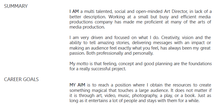
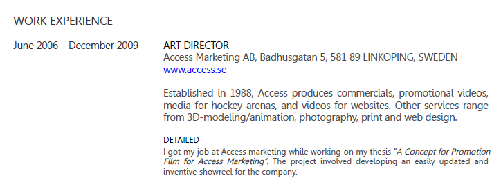
I have, however, already finished my CV now. I went with "Gill Alt One MT" for the headline and a font called "Leelawadee" for the rest. I have little knowledge of fonts...I just know the basics and no history at all. But I know good design when I see it, so I used a program called "The Font Thing" to browse multiple fonts at once, to find a suitable one. But thanks to your post, I can hopefully learn a bit more...
The design ended up like this:


In the screenshots, the font looks thicker than it is because of downscaling anti-aliasing issues, so here's a close up:

/ollelindell
edit: Damn the image quality gets really bad when posted, well, you get the general idea at least.
Message was edited by: Olle Lindell
Copy link to clipboard
Copied
For those who are wondering, Leelawadee is a Microsoft system font, supplied primarily for Thai support. Its Latin letters appear to be slightly modified versions of Segoe, Microsoft's corporate branding and UI typeface. Leelawadee comes in regular and bold, but has no true italics. The changes compared to Segoe mostly have to do with putting "tails" on letters like the lowercase el and eye (l, i) probably to make them feel more like the Thai letterforms.
I think your CV looks okay. My biggest concern now would be grammar rather than design—there are quite a few sentence fragments and a few other problems.
Regards,
T
Copy link to clipboard
Copied
I'm from Sweden and just moved to Sydney three months ago. I haven't studied English since 2004, so I would love for you to point out your main concerns, so that I can hone my skills.
If you're willing you can contact me at olle@waspmail.com
Thanks
/ollelindell
Copy link to clipboard
Copied
Olle,
There are a few kinds of English, with different rules; and there are different ways of expressing oneself.
I believe at least some of the things Thomas refers to are:
First paragraph:
proficient at>in
Second paragraph:
..., has>have always been my great passion (plural like in the next paragraph, unless you use a single term like impact which is then exemplified)
. Both > , both (not as a separate sentence after .)
Third paragraph:
are the foundations for > are the foundation(s) of (singular is better)
Fourth paragraph:
obtain the resources > obtain (or get) the opportunity (suggestion for clarity)
. Just > , just (not as a separate sentence after .)
Copy link to clipboard
Copied
PLEASE don't use Zapfino!!! It's an awful font and any design professional that looks at your CV or resume and see's it, will toss it.
Copy link to clipboard
Copied
Actually, I wasn't suggesting he use Zapfino - just listing some commonly recognized examples of Hermann Zapf's work. And it most certainly is not an awful font - it simply has its place.
Copy link to clipboard
Copied
I understood that. I just couldn't let it not be said that Zapfino is awful.
Find more inspiration, events, and resources on the new Adobe Community
Explore Now
