- Home
- Type & Typography
- Discussions
- Re: Open Sans Font missing / unable to install
- Re: Open Sans Font missing / unable to install
Open Sans Font missing / unable to install
Copy link to clipboard
Copied
Hi!
I have the font 'open sans' installed via Creative Cloud.
But in the Creative Cloud font dashboard, I see there are problems with some of the weights. (light, italic, bold, bold italic)
If I go online to Creative Cloud, I see the entire family is activated.
In XD, the file I'm working on is missing some of the weights (bold, italic, regular, semibold) So no logic there.
In XD also the choice I have in the font menu is only regular, light italic, semibold (italic) and extrabold (italic). So no logic there either.
Can anybody help?
Thanks!
Copy link to clipboard
Copied
I'm also having the same issue — any resolution? Initially Extrabold was also not working but was able to get that working.
Copy link to clipboard
Copied
How did you get ExtraBold working? That's the one that I keep getting a prompt about when I open Premiere or After Effects.
Copy link to clipboard
Copied
I also have same problem. I've deactivated and reactivated, and I can't get all of the font family.
Copy link to clipboard
Copied
I recommend going to Google Fonts and downloading it from there. The package you get from them directly comes with both variable and static (use the static ones.. do not load both), and are v3.0 (Adobe is still serving the v1.0 versions).
Make sure you disable the Adobe fonts versions before you do, as there's a naming difference for the Regular weight.
The outlines are identical to both, but there are extended character sets in the v3.0
Copy link to clipboard
Copied
Thank you. I just had this problem and this worked for me. I can't remember if I had to restart my computer too but it won't hurt. Instances where I had already used the available weights of the font did go a bit weird in places so I did have to change these to the "new" installs of the static fonts. All working well now.
Copy link to clipboard
Copied
Thank you Brad!
Copy link to clipboard
Copied
THE QUICK ANSWER:
Like applications, fonts are continuously updated and have version numbers. Different versions of the same font may typeset text differently.
As Brad mentions, the best recommendation is to ensure that you only have one version of a font installed on your computer: preferably the most recent and comprehensive release.
THE MORE DETAILED ANSWER:
There’s a reason why you may occasionally run into problems with typefaces on Adobe Fonts. If you try to activate fonts that are already installed directly in your operating system – or activated through another service like Google Fonts or Monotype Fonts – you introduce a conflict. Most systems will defer to the fonts installed in the operating system, which explains why you may occasionally see the red-dot warning appear in the Adobe Fonts panel of the Creative Cloud applications.
Open Sans is a widely-used typeface online, and one of the most popular fonts released by Google. It’s therefore likely that you’ll have some or all of the typeface installed natively on your computer. Open Sans may be critical to software that you use, so it’s best to practise extreme caution when removing font files like these from the operating system’s fonts folders.
Font files – much like applications – are continually revised and updated by typeface designers. That means there may be multiple versions of the same typeface in existence. Applications like InDesign are extremely sensitive to this, and that’s why you may occasionally open a file to a dialogue box claiming that some of your document’s fonts are missing.
How does one version of a font differ from another? Sometimes, letterforms are adjusted. Type designers also may add characters to an existing design to add support for more languages.
Updated spacing is typically the most common reason for releasing a new version, because type designers are constantly adjusting how different characters fit together. Changes in spacing also changes how text typesets in a document. That means ten lines of text may now only take up nine lines, which is a significant change to any layout. That’s why InDesign is so particular about font versioning: if you have a complex layout, you wouldn’t want text to reflow without your knowledge.
Another reason for font versioning: new fonts are added to the typeface. Sometimes, that means new weights, widths, or styles. Open Sans is an excellent example: it was originally released with a limited range of weights and italics. Nowadays, the Latin/Greek/Cyrillic version of Open Sans available on Google Fonts’ website has six weights of roman and italic fonts:
https://fonts.google.com/specimen/Open+Sans
I hope that answers your question. If not, please let me know.
Best regards
Andrew
–30–
Copy link to clipboard
Copied
Hi Andrew,
The problem with "Open Sans Condensed" is really a complex one.
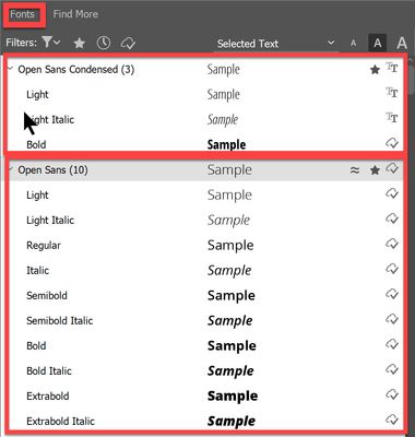
The "Adobe Fonts" site (and the "Adobe Fonts" tab in the Creative Cloud Application) does distinguish between the "Open Sans" types (There are 10 fonts in this family in total) and "Open Sans Condensed" types (There are 3 fonts in this family in total). They all seem to be grouped correctly and all of them are activated.
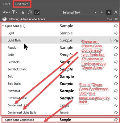
In Indesign, the Fonts selection list also lists these fonts in their correct groups. But when I open the "Find More" tab in the Fonts selection list then I see that two of the "Open Sans Condensed" type fonts are being listed in the "Open Sans" type group.
Whenever Indesign is updated and I go to one of my old manual projects then Indesign loses some or all of the Open Sans Condensed fonts and I have to re-assign them. I've been dealing with this problem for about 7 years now. I switched to Framemaker 2 years ago but sometimes I have to open up one of the old manual files created in Indesign and deal with this issue.
Find more inspiration, events, and resources on the new Adobe Community
Explore Now


