

Turn on suggestions
Auto-suggest helps you quickly narrow down your search results by suggesting possible matches as you type.
Exit
Leslie Moak Murray

Community Expert
Leslie Moak Murray
Community Expert
Activity
Jun 09, 2025
05:57 AM
hee! Thanks, Dave!
... View more
Jun 09, 2025
05:56 AM
Thanks, Trevor! And thanks for this fun SFTW
... View more
Jun 08, 2025
06:25 PM
10 Upvotes
May 26, 2025
07:40 PM
Haha
... View more
May 01, 2025
04:39 AM
I see it now! Beautiful, and it does look like Scotland. The Malwarebytes bug is finally fixed. Thank you for all your help on that.
... View more
Apr 27, 2025
02:13 PM
Well done, Trevor!
... View more
Apr 25, 2025
04:24 PM
Thanks, I should have thought of looking at the forum! -edit- I guess I have to wait till this bug is fixed. It doesn't even let me go to the url from a different tab. Overkill!
... View more
Apr 25, 2025
02:37 PM
No link appears for me. Malwarebytes is blocking it. I get this popup every time I even come into this thread:
... View more
Apr 25, 2025
12:29 PM
I can't view your image!
... View more
Apr 25, 2025
11:26 AM
5 Upvotes
I took this shot of a friend of mine years ago, and now it's an Adobe stock image. The longhorns are too. Taken at a ranch near my house here in Texas.
... View more
Apr 24, 2025
03:47 PM
Haha!
... View more
Apr 23, 2025
06:30 PM
It's not letting me upvote things today!
... View more
Apr 23, 2025
06:29 PM
Temu and Shein are horrible. They steal art too. Anyway "supplementing" is taking jobs away from human models. Every time they do it, that's a booking that would have gone to a human girl of color.
... View more
Apr 23, 2025
01:26 PM
That's pretty funny since Levi's is using AI models of color, saying it's "to increase diversity" as they take bookings away from human models of color. Here's one of their efforts: https://hypebeast.com/2023/3/levi-human-models-ai-generated-supplement
I thank God that my modeling career ended before all this AI stuff started.
... View more
Apr 17, 2025
04:19 PM
Chinese electronics are excluded from the tariffs.
... View more
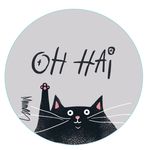
Apr 17, 2025
03:58 PM
I totally get it. From my 2026 cat calendar for Calendars.com:
... View more
Apr 04, 2025
07:43 AM
1 Upvote
Bingo. This is what I've always said. This crap does black people no favors, and I sometimes have to wonder if that was the goal. People won't say this out loud, but there are a LOT of them who will never go to a minority professional like a dentist, doctor, or lawyer because you have no way of knowing if they actually got through medical school or law school on merit or if they were pushed through artificially. Nobody wants a C or D student operating on them. DEI has done lasting damage to them that will take generations to repair. Stop the madness.
... View more
Mar 29, 2025
10:09 PM
Are the bracelets isolated or on a solid white background? Can you upload the picture? You can colorize a drop shadow but if you want them each to be a different color, I need to see the shot. I might be able to do it.
... View more
Mar 28, 2025
09:36 AM
10 Upvotes
Mar 19, 2025
07:21 PM
Ha!
... View more
Mar 17, 2025
11:11 PM
Wow!! Haha I can't get over myself now
... View more
Mar 17, 2025
04:01 PM
hee!
... View more
Mar 17, 2025
12:32 PM
8 Upvotes
Mar 13, 2025
12:44 PM
Wow thanks! I'm glad to have this. I've heard more and more of AI detectors, and it's sorely needed. AI is improving more and more all the time, and I worry about a day when it will fool us all. As it is, it fools way too many people. One look at Facebook will tell you that.
... View more
Mar 11, 2025
08:58 AM
This is how I usually do it too. That "Create Layer" feature is very useful. Another way I do it is:
-Duplicate the layer
-Color Overlay>Black
-Reduce opacity as needed
-Edit>Transform>Distort as needed
... View more
Mar 08, 2025
02:16 PM
Wow, that's great! I have Tubi and watch it all the time
... View more
Mar 05, 2025
05:27 AM
Thanks, Dave, this made my day!
... View more
Mar 05, 2025
05:26 AM
Hee! Thanks, dear Trevor!
... View more
Mar 04, 2025
08:30 PM
hee Thanks! I had to since someone took my moon landing idea! This is a chickadee picture I took from my kitchen window.
... View more
Mar 04, 2025
07:31 PM
13 Upvotes
Copyright © 2025 Adobe. All rights reserved.
 AdChoices