




Illustrator Creative Challenge #3: Design a Retro Neon Sign for a 90s Diner
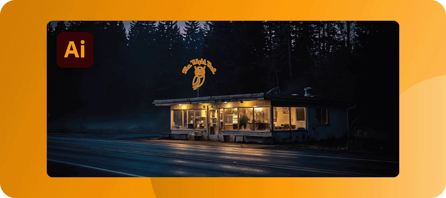
Welcome back to the Illustrator Creative Challenges - our monthly nudge to open Illustrator, try something new, and share it with the community. Last month, we turned beach photos into vector art. This month we're chasing that warm, humming glow of a classic neon sign: the kind that hangs over a roadside diner at the end of a long night.
THE BRIEF:
This isn't just any diner. Here's the fun part - choose a lane (or smash them together):
🐾 The Animal Diner - a 24-hour joint run by, and for, animals. Maybe it's THE NIGHT OWL, open till dawn. Maybe it's a greasy spoon called COYOTE'S, or a flamingo-pink cocktail bar out on the strip. Your creature is the star of the sign.
🛸 The Sci-Fi Diner - a roadside pit stop the way the 90s imagined the future: chrome, rockets, ray-guns, and flying saucers. THE MARS MALT SHOP. LAST STOP BEFORE HYPERSPACE. A neon rocket is optional but heartily encouraged.
Want a raccoon running a diner on the moon? Even better. The brief is a neon diner sign - the world it belongs to is entirely yours.
HERE’S MINE:
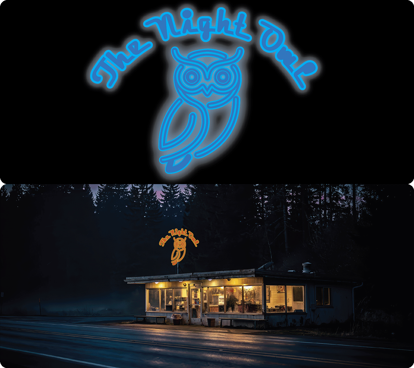
Image Credit: Adobe Stock
I went with THE NIGHT OWL. Here's the workflow:
-
I set the name in NeonStream, then rebuilt the letters as open paths so they'd behave like real neon tubing.
-
The core trick lives in the Appearance panel: I stacked two strokes on every path - a thin, bright, near-white core sitting on top of a thicker, softer colored stroke underneath. That alone makes a line look lit from inside, before any effects.
-
Effect → Stylize → Outer Glow on each element (Mode: Screen, a color close to the tube) through the halo. A little goes a long way.
-
A dark navy-to-black gradient background gave the light something to sit against.
-
I drew the owl with the Pen tool, because real neon is bent from a single length of glass. Keeping it "one unbroken line" or close to it, is what sells the effect.
YOUR TOOLKIT:
Neon is really a lighting effect, and Illustrator has everything you need to make it convincingly:
-
Appearance panel - multiple strokes - the heart of it. Stack a bright thin core over a wider, softer glow color on a single path to build a tube that looks lit from within.
-
Strokes with round caps & joins - set ends and corners to round so your tubes read as bent glass, not cut pipe.
-
Inner & Outer Glow - the actual halo (try Mode: Screen on a dark background). Stack it lightly over the lettering and motifs; a Gaussian Blur applied to the whole sign adds an extra haze.
-
Type & Adobe Fonts - hunt down a bold script or a fat retro face that feels like 1994.
-
Pen & Curvature tools - to draw your animal or rocket as continuous, bendable tubing.
-
Gradients - a dark, uneven background reads far richer than flat black and makes the glow pop.
One pro tip that changes everything: work on a dark background from your very first shape. Neon only looks like neon in the dark.
LIGHT IT UP:
You've built a neon sign, now light it up in the thread. Reply with:
-
Your final neon sign.
-
A line or two on your process - which font, how you built the glow, which universe you chose. Honestly, this is the best part to read, so don't skip it.
Not ready to post a finished sign? Drop your diner's name and the lane you're taking, and we'll be waiting to watch it light up.
WHAT’S NEXT?
We're already cooking up Challenge #4 - think about designing your own graphic and seeing it on a real product with Illustrator's Mockup feature. But that's for later. For now: find us that 2 am glow.
If you found this helpful, hit 👍 Like. Tap ⭐ Subscribe to be first to see the next challenge. And feel free to share it with anyone who'd enjoy joining in.
 AdChoices