
Font overshoots look exaggerated
When I use our custom font in Express, the overshoots (difference between flat and round parts at the top and bottom of letters) appear at an unexpected size, and look exaggerated.
Overshoots are suppressed at smaller sizes, this is controlled in the OTF fonts by the BlueScale value. In our font this value is set to 0.08333 so overshoots should appear at 68 pixels font size, following the formula given in the Type 1 font specification. Yet when I use the font in Express, the overshoots appear already at 64 Pixels font size (second line in the screenshot), and they are 2 pixels high, as you can see in the screenshot, which looks irritating.
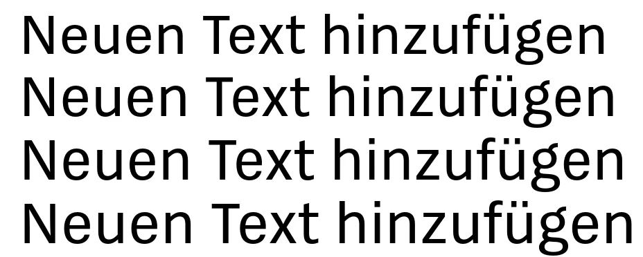
When I set the BlueScale to the standard value, the same phenomenon appears at a smaller size, and the letters look even more distorted:

Why is the display not according to the spec? I don't get this behaviour in other apps like InDesign or Photoshop, and also not with Adobe fonts like Source Sans.
Especially that the overshoot is 2 Pixels at small sizes is very irritating when the image is exported, to the point that users have complained that the font is unreadable. How can I set up the font so this doesn't happen?
