Almost impossible to see what's selected in "Darkest" mode
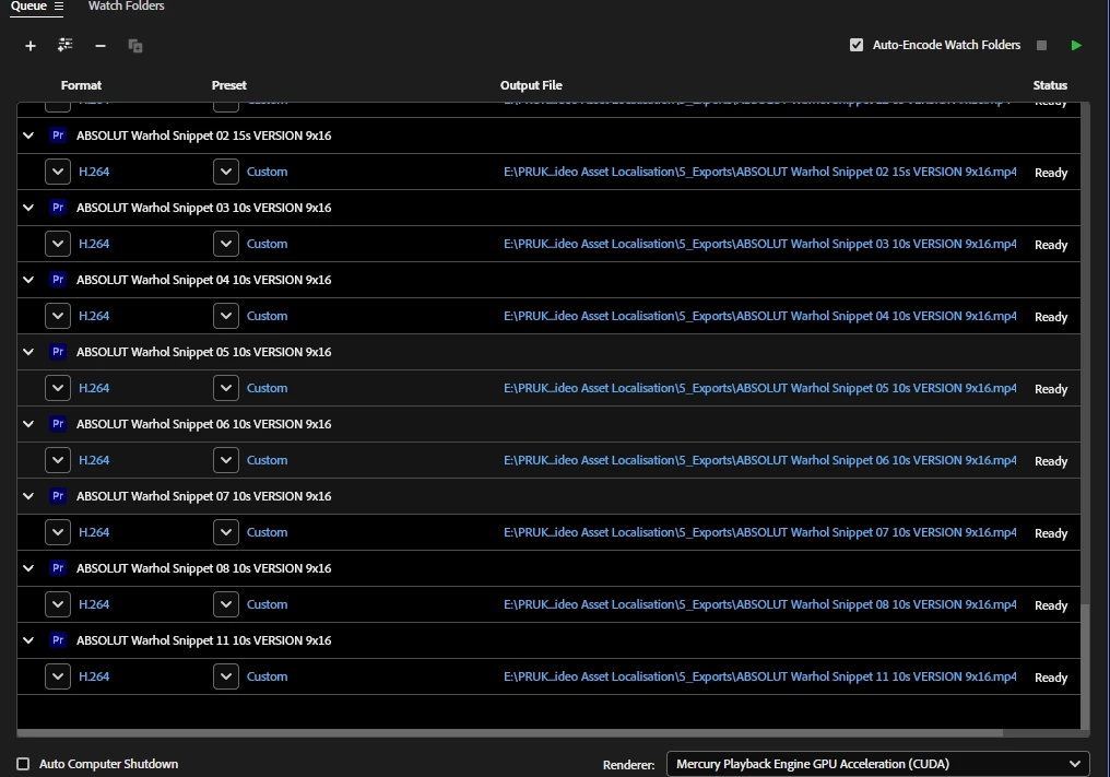
As you can see in this screengrab, when using "Darkest" mode in AME (beta 24.6x52), it's impossible to distinguish selected items from non-selected items:

...believe it or not, four of the rows in that screengrab are actually "selected". Who at Adobe QC didn't notice this?!
Here's a massive close-up, showing the black (unselected) row versus the 8% brightness selected row:

I am definitely not a fan of the "spectrum" way of showing highlighted/selected things throughout the Adobe apps; changing the background from dark grey to imperceptibly-less-dark-grey is just stupid. Use that cyan colour to highlight selected things, please! Or does whoever programs these things have their monitor's contrast turned waaaay up, exactly the opposite of how every graphics professional works?!
Workaround: Don't use "Darkest" mode.
