Icon for vertical and horizontal font scaling is irritating
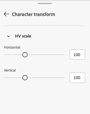
The vertical and horizontal scaling of text is located at the place where the variable axis for variable fonts is located. So every font looks like it were variable. I found this irritating when I first noticed this on a font that I knew is not variable. Maybe there will not be a lot of people who use Illustrator on the web AND on the desktop, but those who do, might find this irritating as well.