Inspiring
June 13, 2024

Spacing of Effects and Keyboard Shortcuts amongst others are too large in 24.6 Beta

  • June 13, 2024
  • 返信数 5.
  • 534 ビュー

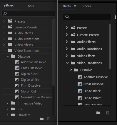
This is a comparison between 24.4 and 24.6. Look how at how few effects I can see on the Effects panel in 24.6 now that the spacing has increased massively.

Additionally, there's so much wasted space in the bezels of the window on all sides. But especially the bottom area with the New Custom Bin and Delete Custom Bin buttons. I have used those buttons basically one time to set up some folders of custom effects and never again. This should not take up that much space for a feature that is so rarely used, and even if it was commonly used, is still extremely easy to click with the old thin bezels.


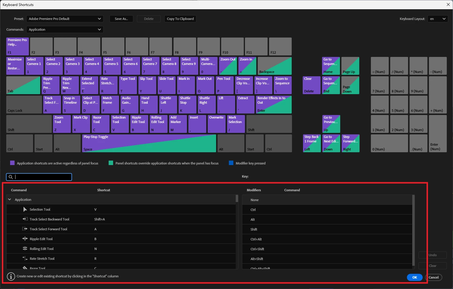
We see this again in the list of keyboard shortcuts all now having this huge spacing which makes it so much harder to find things quickly as you'll have to scroll lots.


I appreciate most of the other windows have similar spacing to how it's always been done, but please revert these back to compact spacing as it's always been. It's especially frustrating for people still using 1080p screens where space is limited.

And heck, give people the option for compact or comfortable spacing as Gmail does for eg, but don't take away precious space without option!


返信数 5

Tom Fewchuk作成者
Inspiring
June 13, 2024

I'm glad you're liking my feedback @R Neil Haugen , and yes more users need to!

That is true that other users are seeing the opposite, but yeah I think Adobe just needs to give people more options to set up their editing experience the way they like. Although they do give a lot of customisation, there could always be more, and be done in such a way that doesn't appear clunky.

R Neil Haugen
Legend
June 13, 2024

Please keep posting your impressions and experience, it would be better if far more users did so.


That said, understand this is one of those issues where other users are seeing it and thinking oh thank HEAVENS I can finally read that stuff! ... yea, we all work and see the UI very differently.


Which is why your suggestion to allow for an option for tight or spaced out panel text is a really good idea!

Everyone's mileage always varies ...
Kevin J. Monahan Jr.
Community Manager
Community Manager
June 13, 2024

Thanks!

Kevin Monahan - Sr. Community and Engagement Strategist – Adobe Pro Video and Audio
Tom Fewchuk作成者
Inspiring
June 13, 2024

Sorry @Kevin-Monahan only realised that forum existed after this. Thanks for doing that, I'll post future ones there.

Have just double posted one, so feel free to delete from the regular Premiere forum.

Kevin J. Monahan Jr.
Community Manager
Community Manager
June 13, 2024

Hi @Tom Fewchuk,

Please post bugs for Beta in the Premiere Pro Beta Bugs forum. I'll move it for you.


Thanks,
Kevin

Kevin Monahan - Sr. Community and Engagement Strategist – Adobe Pro Video and Audio