
Let me pick exactly where to have each feature/ tab. Or at least put the filter tab back at the top
The Lightroom update 10.0 patch notes say “customizable UI” but that is a blatant lie. You’re telling me I can’t pick and choose where individual tabs go? I’ve been able to customize the Illustrator and Photoshop UIs on a feature level for YEARS, why is it not like that on Lightroom? Why can’t I just click and drag the filter tab to the top and have it snap in place?
The decision to move filters to the left sidebar was terrible. We essentially went from the ability to have three separate toolbars (left, top, right) to only two (left and right only). How does reducing the usable space and combining features improve UI customizability as opposed to limiting it?
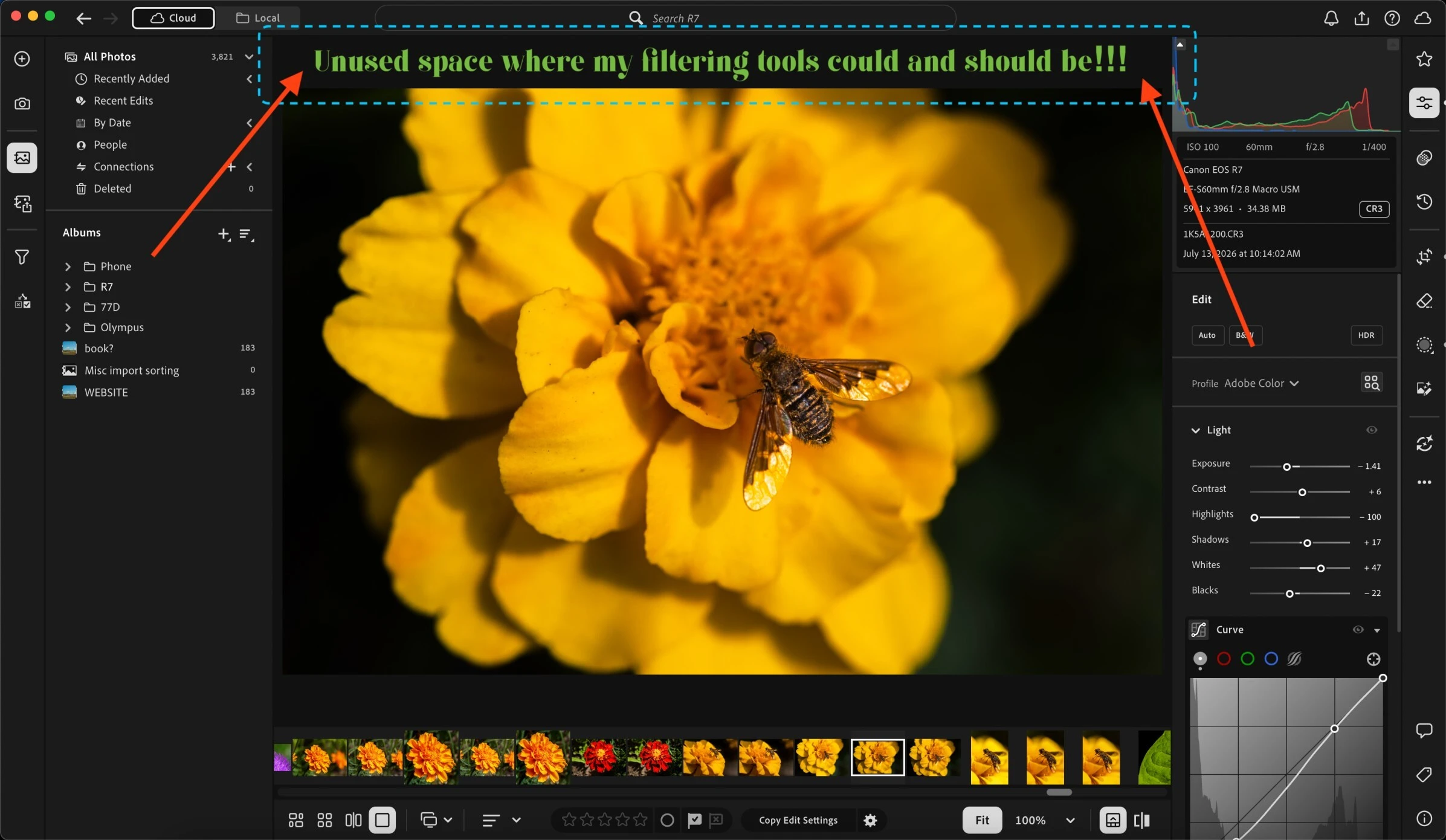
Filters being at the top was a significantly better layout. I don’t want to constantly swap my left panel back and forth between library (or whatever it may be) and filters; that is so inefficient. Plus, there is space at the top of the screen that can be filled by a toolbar! Whether that is filters or something else. It seems like culling is now combined with filtering on the left, and I think that is a bad idea. Culling should be with library/ import, and filters should be its own tab (at the TOP!!!).
See attached image for example of the wasted space at the top where my beloved filtering tools used to live. Sorry for the poor image quality, the 5mb image size limit for attached files is ridiculous so I had to compress it.
 AdChoices