
More Menus. More Clicks. Slower Workflow.
I know that this has been discussed several times over the last year or so, myself included in making a related post.
But again, why is the Express team so obsessed with hiding everything behind menus?
Here are the new examples in this latest update.
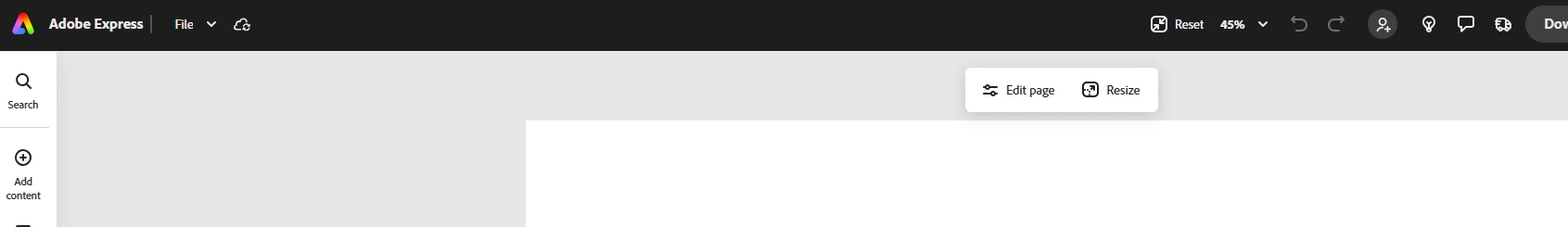
- Background Color
Accessing the background color of the page is now in the "Edit Page" menu that opens in the sidebar, instead of easily at the top of the page. Accessing the page background is also not accessible now if you have an element selected, so you must also first deselect anything.
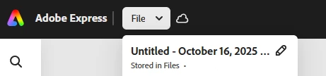
- Renaming FilesRenaming a file can no longer be done from the black bar at the top, and now must be done by clicking "File" and then the edit pencil. You used to be able to simply click in the top of the screen and type. It also meant the name of your file was visible to you while you worked on it - which now it is not.
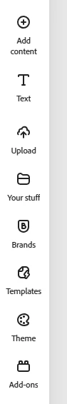
- Adding Content
- This is a change that was done some time ago, that was reverted due to horrible community feedback, and has now just been readded. Adding images, videos, shapes, etc to a project now requires that you click into "add content" first, and then select what you want to add.
Every single one of the things mentioned here used to be easily and quickly accessible on the screen. In an editing app, you want your usable tools clickable. Not hidden away behind menus. Who on the UI team is prioritizing a bunch of blank unused space? I would think nobody is asking for this. PLEASE listen to the users. Adobe understands the need for accessible tools, because every single other Adobe product has all of the tools available in toolbars. You can even edit your toolbars and frequently used tools in other apps. Why is this forgotten in express?
Additionally, you used to be able to access this community forum by clicking the lightbulb in the top right, you can no longer do that.
