
Participating Frequently
May 10, 2019
Question

Captivate 2019 quiz responsive problem on smartphone

  • May 10, 2019
  • 1 reply
  • 881 views

Hi at all, I am Dario an italian guy, I have a several problems with the quiz.

I am using Adobe Captivate 2019.

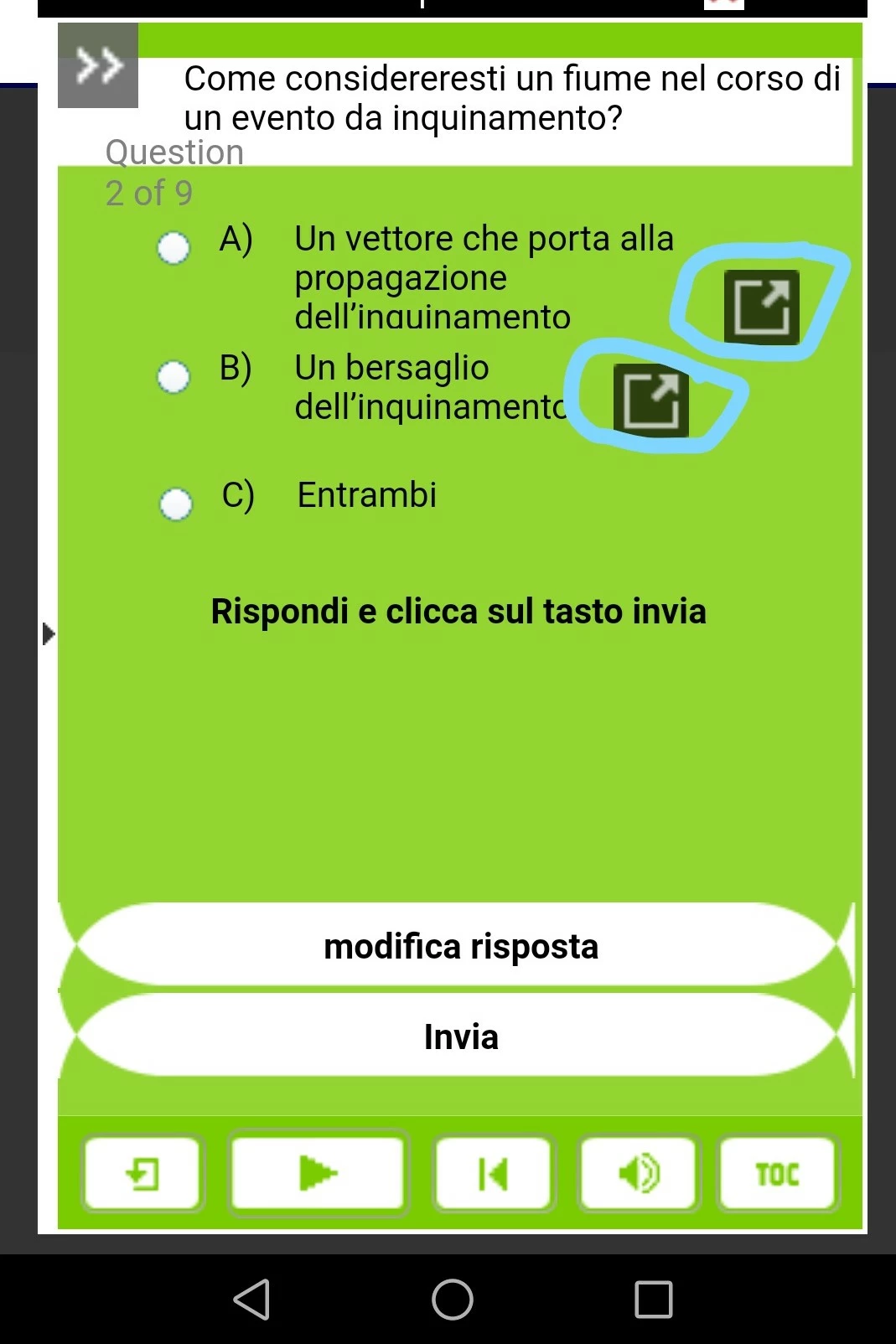
When I publish the SCORM with the quiz (responsive) into the e-learning portal if I try to use the smartphone I see these icons (look the image).

How Can I fix the problem?

Best regards.

Bye.
This topic has been closed for replies.

1 reply

Lilybiri
Legend
May 10, 2019

Those are the Expand icons. They appear when the text doesn't fit anymore in the text container, even when the font size has decreased to the minimum size. You are meant to click the icon to see the full text in a separate popup. You can decrease the minimum font size (10 or even8 will still do well) and/or reduce the amount of text. Lot depends also on the set up of the fluid boxes.

BTW check if you use the most recent version which is 11.0.1.266.

Participating Frequently
May 10, 2019

Hi Lilybiri,

thanks for your response.

So Should I reduce the font? Can I fix the problem?

Best regard.

Dario

Lilybiri
Legend
May 10, 2019

You can reduce the minimum font size, which you find in the Properties panel of the slide. Default is 14 points, decrease to 10 or even 8.

No guarantee that that icon will not appear on smartphones with lower browser resolution. It is not the screen resolution which is important, but the browser resolution. You can check that in sites like viewports (google for it).