petrk27901450
Inspiring
August 15, 2018
Question

Content Grid in Fluid Boxes

  • August 15, 2018
  • 2 replies
  • 857 views

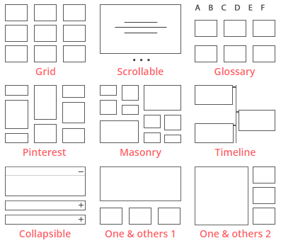
I am trying to arrange content inside a Fluid Box Responsive Project. I would like to create a grid like arrangement of content, with several rows of content and each row having several columns. I would like to be able to create a symmetrical grid (grid example below) but also an asymetrical grid (glossary, pinterest, masonry & one and others examples below). At the moment I am only working with images, but it would also be useful to be able to use different types of content in such a grid, especially image, text block, image, text block. Essentially layouts such as the below:

2-layouts-min.png

I am playing around with the different settings in the fluid box but can only get either one horizontal row or one vertical column. Is the only way to have one fluid box for each of these and split the content amongst them? If so, how can I add additional rows to a slide after it has been created or can this only be set once at the beginning. Also how would I then keep the content symmetrical from one fluid box to the other.

This is very straightforward to do using Breakpoint projects, how would I achieve this in Fluid Boxes?

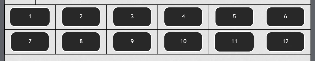
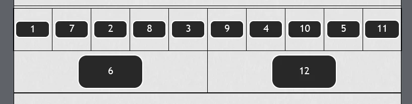
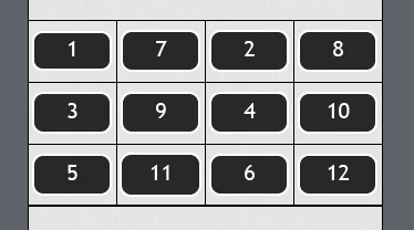
I have also tried the following but found when the screen is resized the parts of the grid change order:

    This topic has been closed for replies.

    2 replies

    RodWard
    Community Expert
    Community Expert
    August 15, 2018

    When I see questions like this one, I always think that perhaps people are missing the central idea when it comes to mobile delivery.  The layouts shown here in the graphics are way too complex to allow meaningful content for most mobile devices.

    If you take a good hard look at the layouts being displayed in most websites that are now designed for mobile consumers you will find that they basically boil down to only three or four: 

    • There's one that goes full width to display all text or maybe a single large graphic.
    • One that divides the width into two equal parts for either side-by-side graphics or text boxes.
    • One that has a graphic on the left side taking up about one third of the screen, and a variation of the same layout with the graphic on the right instead.

    And that's about it.  Very rarely do you ever see anything more complex.  There just isn't usually room on a typical mobile device screen to accommodate more complex layouts and still display meaningful content.  Mobile devices are simply NOT designed to work well with the kind of super-busy layouts that can easily be accommodated on a modern desktop computer with a large monitor.

    So while it may be technically possible to use fluid boxes and breakpoints to create the kind of complex layouts illustrated in this thread, my question would be: Is this really going to be THAT beneficial?

    Lilybiri
    Legend
    August 15, 2018

    Rod, I couldn't agree more. There is too much misunderstanding about responsive projects and the possible content that can really be 'consumed' on smaller screens. Web browsers on phones are still very limited in resolution even if you don't take into account the readability.

    Lilybiri
    Legend
    August 15, 2018

    Create master slides for each of the setups. Have a look at:

    Fluid Boxes and Master slides - Captivate blog

    Do not forget to use Guides, very useful:

    Guides and Fluid Boxes: Best Buddies! - Captivate blog

    petrk27901450
    Inspiring
    September 7, 2018

    Thank you for this. In the first link where you have 4 columns, I am curious how this looks on a mobile size screen.

    Lilybiri
    Legend
    September 7, 2018

    It depends how you set up the Flow in the parent fluid box. You can keep the 4 columns on all devices by 'Squeeze in a row'. If you want to have 2x2 columns in a portrait view on a small screen, set it to 'Symmetrical'.