Participant
July 31, 2017
Question

Fluid Box Wrapping

  • July 31, 2017
  • 2 replies
  • 420 views

Hi,

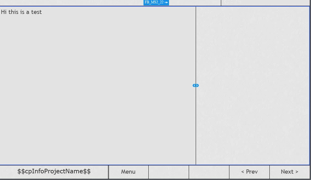
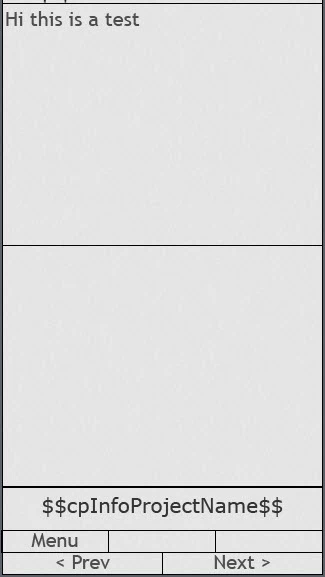
Essentially, I'm trying to retain the same 2/3 to 1/3 split of my central fluid boxes regardless of device it is being viewed on. However, when the box wraps to accommodate for the smaller screen size, the boxes seem to split 50/50. Is there a way of setting this up so that it retains the original split. Please note, current settings are:

Flow: Horizontal

Wrap: Wrap to next row

Screen shots to aid explanation:

Full Screen:

iPhone:

Thanks!

    This topic has been closed for replies.

    2 replies

    Participant
    July 31, 2017

    Thanks of your suggestion - this doesn't quite provide the solution for what I'm trying to achieve. Below is what we currently have in HTML format. I was hoping to recreate this in Captivate. You will see that in full screen mode, the text on the left hand side takes up 2/3 of the screen and the image 1/3. When in mobile view, even when wrapped, this ration remains the same. The image just gets cut off a little to accommodate for it. Can the fluid boxes and/or another feature of Captivate be set up to achieve this?

    Full Screen:

    Mobile view:

    Thanks!

    Lilybiri
    Legend
    August 1, 2017

    That is a 50/50 ratio in mobile, both fluid boxes have the same width. I understood that you didn't want that, now I'm totally confused.

    Lilybiri
    Legend
    July 31, 2017

    You allow the fluid boxes to wrap to next row, which means that the second one will get under the first fluid box when the screenwidth has reached its minimum. The second fluid box needs to have the same width as the screen which is what happens.

    You can try another Wrap method: squeez in a row to keep both fluid boxes, with their relative width in a horizontal row.