sarahamy_96
Participant
November 3, 2017
Answered

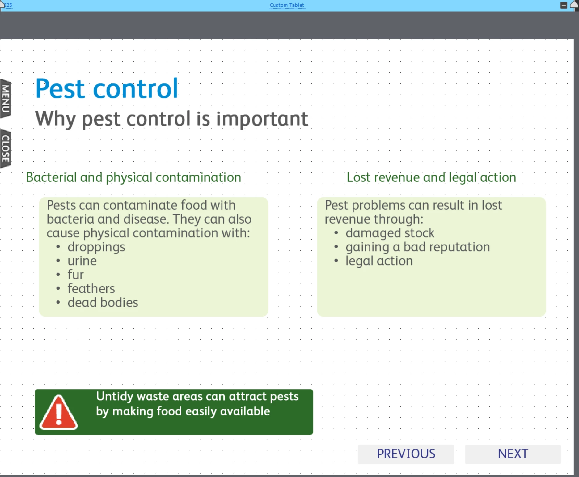
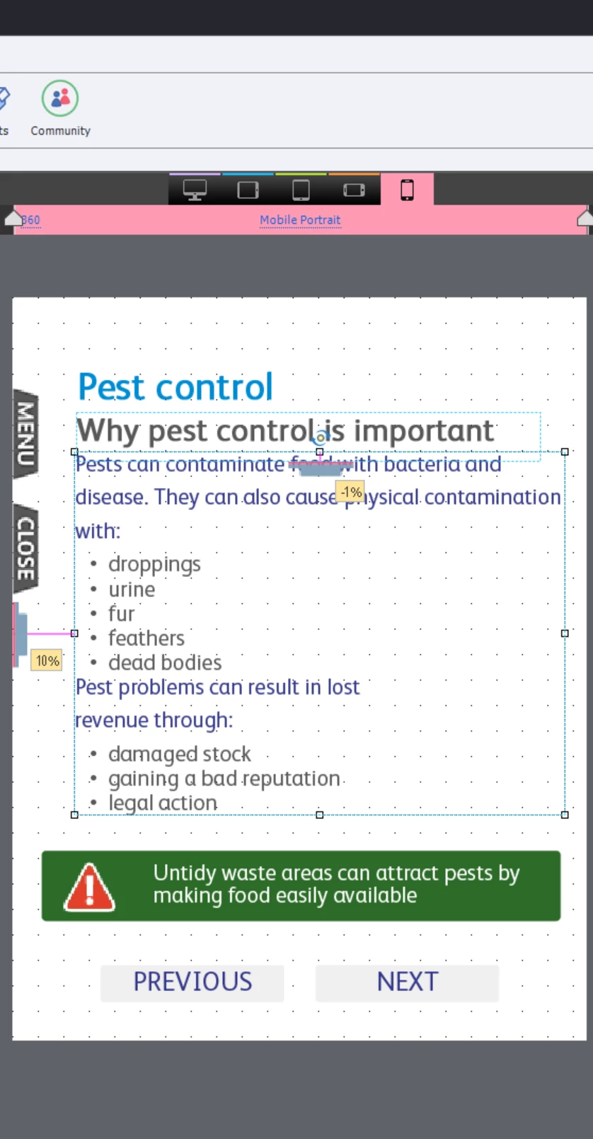
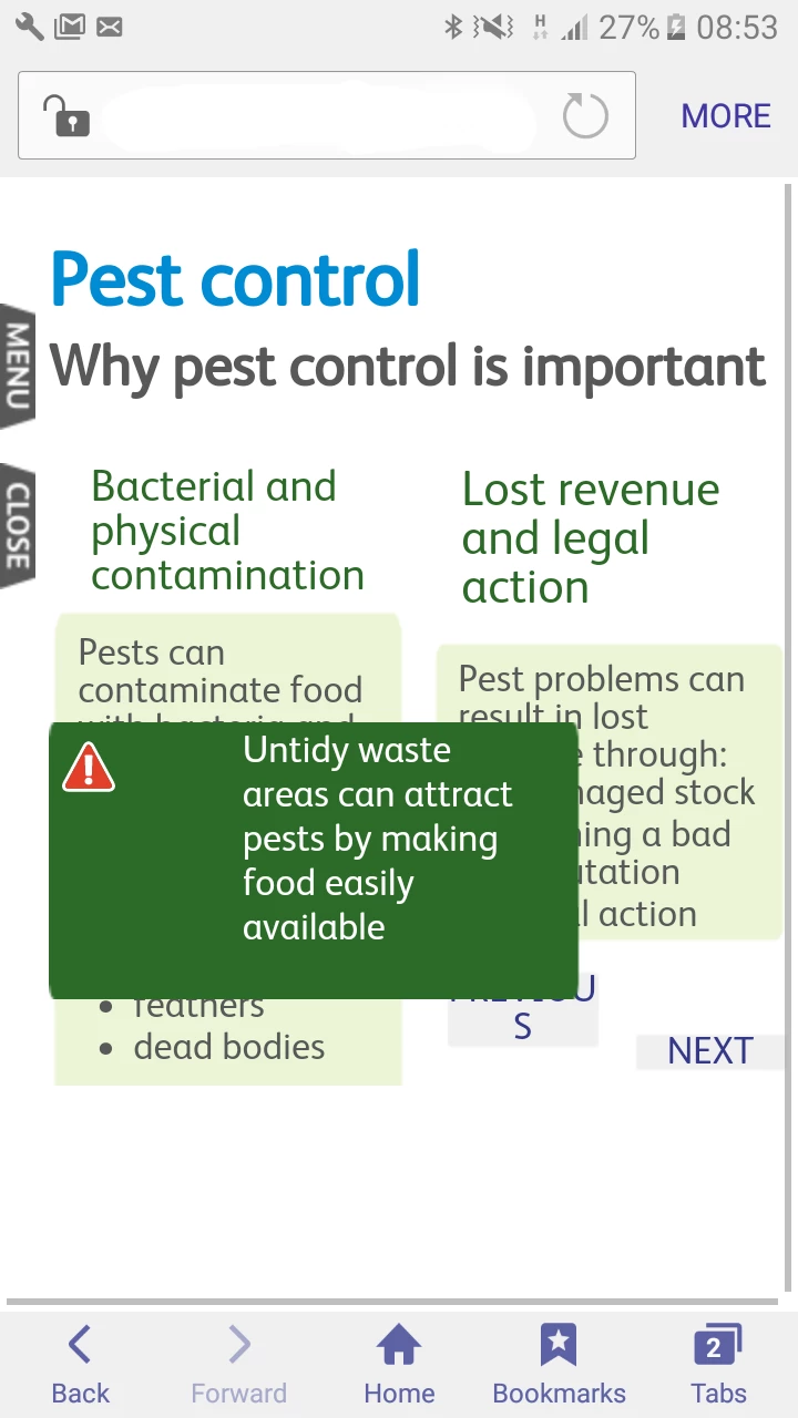
Issue with mobile views on Samsung Galaxy

  • November 3, 2017
  • 2 replies
  • 433 views

Hi all,

Please could you help me understand the problem and possible find the solution with this:

we have built a responsive project and are now testing it on mobiles. We adjusted several mobile screen sizes - 320, 360 and 414 and simplified the content to make it more mobile friendly. When viewing the content on smaller screens (320, Huawei) it works fine. When I view the same content on Samsung Galaxy it captures those screens that were developed for larger screens (tablet and desktop) and it does not show the intended content - it's all messed up. Do you know what could go wrong and why captivate assumes that Galaxy is a tablet/desktop?

I have attached the screens, thank you

    This topic has been closed for replies.
    Correct answer sarahamy_96

    OK, Rod was right, looks like captivate uses an amount of pixels as a indicator of how much content can be squeezed on the screen, that's why on better screens it shows desktop versions while still treating such screens as mobile screens (we switched off the landscape view). To fix this we changed all our object sizes to auto-% (previously it was a mixture of both pixels and % depending on an object), this tells captivate that objects should take that much space on the screen. We made changes on one slide to test this hypothesis and previewed it - it showed a mobile version of that screen, so it worked. Now I've changed quite a few slides and am testing it - again, it worked so far, fingers crossed!

    2 replies

    sarahamy_96
    sarahamy_96AuthorCorrect answer
    Participant
    November 3, 2017

    OK, Rod was right, looks like captivate uses an amount of pixels as a indicator of how much content can be squeezed on the screen, that's why on better screens it shows desktop versions while still treating such screens as mobile screens (we switched off the landscape view). To fix this we changed all our object sizes to auto-% (previously it was a mixture of both pixels and % depending on an object), this tells captivate that objects should take that much space on the screen. We made changes on one slide to test this hypothesis and previewed it - it showed a mobile version of that screen, so it worked. Now I've changed quite a few slides and am testing it - again, it worked so far, fingers crossed!

    RodWard
    Community Expert
    Community Expert
    November 3, 2017

    The responsive content is going to be looking at how many pixels wide the screen is.  You may find that the Galaxy screen actually has more pixel depth than you think.  The fact that it is a mobile phone screen doesn't mean it might not match the pixel dimension of a (physically) much larger computer monitor.  It all depends on how many pixels are crammed onto that small screen.  You need to test and find out.

    sarahamy_96
    Participant
    November 3, 2017

    thank you, what's the best way to test it?