Participant
May 18, 2023
Question

Responsive Background image - looks different in LMS than captivate

  • May 18, 2023
  • 1 reply
  • 362 views

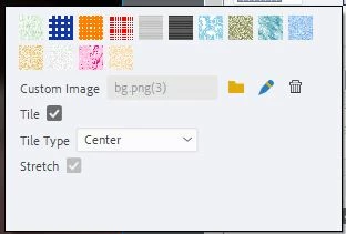
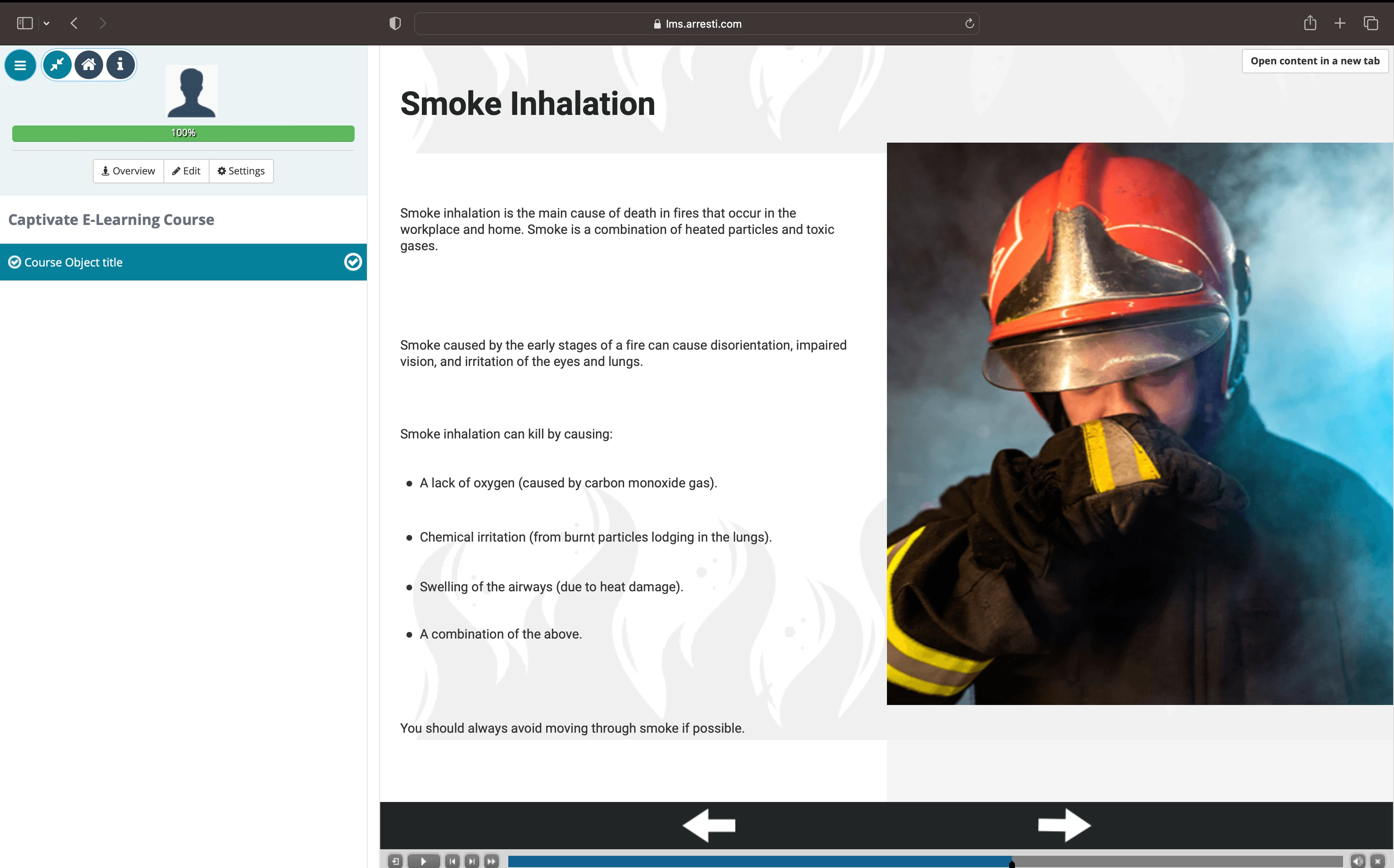
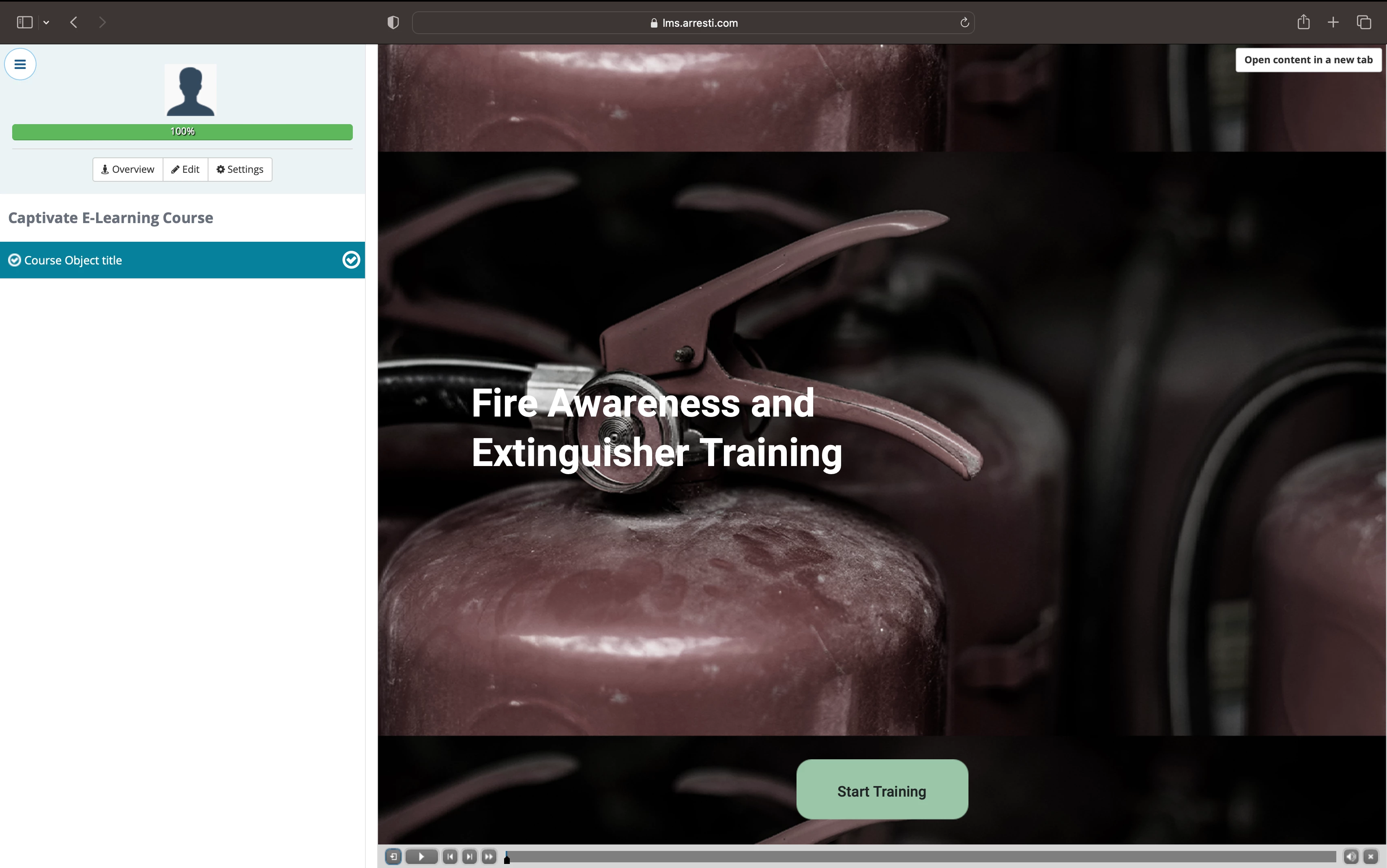
I'm currently creating responsive eLearning, and I only have 6 months of experience using Captivate. I cropped and resized the background image to the correct size and aspect ratio. The problem is that when I upload it to LMS, the background looks like this and won't reflect the design from the captivate. Please see the attached sample images below.


    This topic has been closed for replies.

    1 reply

    Lilybiri
    Legend
    May 18, 2023

    I really try to understand your problem, but from those screenshots this is not possible. I see that both are from the LMS environment, but cannot see a screenshot of the expected result. 

    First question: why do you need a responsive project? There are two types of responsive projects: using Fluid Boxes (which I suspect have been used) or using Breakpoint views.

    You mention that the image is a background image, and showed a screenshot of your setup for the image. Is this the setup for insertion in the main fluid box of the slide? Do you really want to stretch the image to any browser resolution? It is a photo as far as I can seen, will that be acceptable?


    toperweynAuthor
    Participant
    May 19, 2023

    Hi, thank you for your response. I'm expecting this kind of result when you reduce the size of the screen. 


    Lilybiri
    Legend
    May 19, 2023

    Can you please also answer my question about how you inserted that background image. Thanks for the new screenshot but it is not helping me understand. You also talked about cropping, was this in Captivate or in a dedicated graphic editor?